How HBO Max Can Beat Their Competition With A/B Tests

HBO is an American streaming and on-demand video subscription platform from WarnerMedia with over 10,000 hours of content. It offers a wide range of TV shows, movies, and Max original content. Some shows they offer include Friends, Looney Tunes Cartoons, and The Big Bang Theory. It’s owned by AT&T and launched in 2020 in the U.S. and in 2021 in Latin America and the Caribbean. They have over 67.5 million subscribers for both HBO and HBO max combined.
With the increasing competition for streaming services from Netflix, Disney+, Hulu and Amazon Prime to name a few, HBO Max needs to leverage experimentation to create the best possible user experience and to keep pace with the competition.
Web Experience
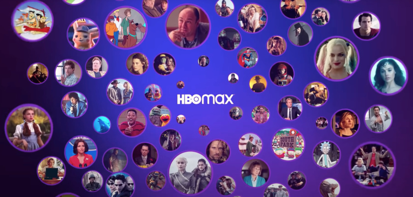
Upon clicking on the HBO Max website a user is taken to a landing page that highlights some of their top shows and movies along with a short subheading. An area of experimentation could be to change the copy using Taplytics Genius AI which generates copy suggestions for experiments. They could also experiment with the types of shows and movies highlighted and where on the page they show the price of $9.99 per month.
Because A/B testing is a method of getting statistically significant results by dividing a test group into two or more subgroups, each with half the size of the original group. The subgroups are then exposed to different changes, with one set of changes being delivered to one subgroup and a different set of changes being delivered to the other subgroup. The theory behind A/B testing is that the variation in the resulting data will result in patterns that allow for reliable statistical analysis of the effect of the variables. In other words, if there are two variations, it will be possible to determine which web experience performs better.
In the example above, once a user clicks into creating an account they’re taken to a page that highlights the monthly vs. yearly subscription with ads and ad-free. Here they highlight the amount of savings in signing up for a yearly account, but they could experiment with the messaging of the savings such as stating a dollar value vs. a percent.
They could also experiment with the content of the boxes such as center-aligning the copy or having a checklist as a side-by-side comparison of what the ads vs. ad-free options include. What’s great about this step is that they have numbers at the top telling a user how far along in the process they are. This sets user expectations for how long the onboarding process will take.
Next, a user is taken to a create your account step which simply asks for a user’s first and last name, email, and password. This account creation process is very simplistic. They could experiment with asking for more information in the account creation process or see if combining the question for first and last name makes a difference in form completions. Overall, this step is very user-friendly.
Offer a Free Trial
Finally, a user completes creating their account. The onboarding process was very fast with minimal questions. HBO Max could experiment with offering a free trial during the sign-up process to see if it would entice more users to join.
Ways to Increase Engagement
With Taplytics, HBO Max could incorporate no-code A/B testing on both web and mobile to increase engagement and drive conversions.
Learn more about why teams pick Taplytics over Optimizely and how our pricing compares.


