How A/B Testing Can Optimize Entertainment Tonight’s Website


Entertainment Tonight (ET) is a celebrity and entertainment news source owned by ViaComCBS Streaming. They’re an industry leader with the latest news and exclusive content that has been running since 1981. They offer both news broadcasting and a news magazine.
Table of Contents
Website Home Page
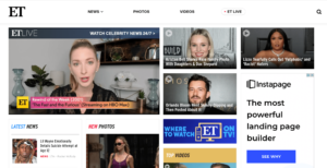
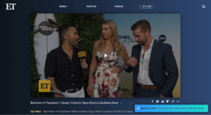
Upon entering the Entertainment Tonight home page, a video automatically plays with smaller stories on the side along with the “latest news” and “new photos” below. They could experiment with the layout of this page to see if moving certain elements like “latest news” and “new photos” higher on the page affects engagement.
Another recommendation would be to add a trending news section on the home page. They currently have trending news as a drop-down on the news section, but if it might be a section people want to see more of due to a story’s popularity so it would be worth experimenting with adding a section for trending news on the home page.
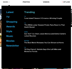
Their navigation bar is simplistic and user-friendly with only 4 sections. This clean look doesn’t feel overwhelming for a user and allows them to quickly find the news they’re looking for. Currently, a user has to click on the header to see the dropdowns. An experiment could be to see if hovering a user’s mouse over the header to show the drop-down menu increases engagement.
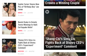
As a user scrolls down the home page there’s more celebrity news, simply with smaller visuals. The size of the images are smaller allowing for more stories to be shown. One thing to note is that they show a few of the same stories multiple times on the home page. For example, the headline on “Shang Chi’s Simu Liu Fights Back at Disney CEO’s ‘Experiment’ Comment” shows up twice, directly beside each other in both the smaller latest news section and as a larger story directly beside it. While this may be a “latest news” story and a story they want to feature, this is a missed opportunity for them to show more content. It also looks strange to see the same story right beside each other.
This isn’t the only instance the same story is shown twice. Several of the stories that had larger images were the same as the ones on the latest news section, just with bigger images. It would be worth testing if showing the same stories twice on one screen makes a difference in its engagement. Rather than having all the news stories combined together, they could organize it by sections such as celebrity news, movies, or reality TV as most of their stories surround reality TV stars.
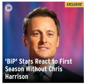
On the home page, they also have an “exclusive” tag above some stories. They could experiment with the color of this tag to see if changing the color increases views with the stories which include the tag.
Video Landing Page
The video’s landing page has a video that takes up the entire screen above the fold which creates a great user experience with no distractions for other content. They also have a “watch live” pop up which appears on the bottom right corner, but minimizes after being shown for a few sections. This is the same layout used in the “ET Live” tab.
Directly underneath the video is an “up next” section which gives the user relevant content similar to the video they just watched. If a user scrolls down, the video continues to play on a smaller screen on the top right corner of the page. One issue with the video is that when a user scrolls down, the button to close the video is covered by the search bar meaning users are unable to remove the video or stop it from playing. They should move the video slightly lower on the screen so the exit button isn’t hidden.
Directly under the video being played are other categories of video such as “Latest”, followed by “Featured”, “News”, “On Entertainment Tonight”, and so on. A recommendation would be to have a section with related videos directly below the video player. For example, since the video playing was a Bachelor in Paradise interview they should have a section directly underneath with other videos or articles on Bachelor in Paradise or other shows in the franchise such as The Bachelor or The Bachelorette. This would show users the content they’re interested in since it is related to the video they just watched.
News Pages
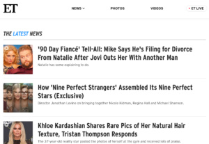
The “latest news” section on the news drop down shows news headlines in a list rather than in boxes with images as seen in the image below. Every other section on the drop-down presents news with a header image of a top story and boxes of other stories below it with a navigation bar.
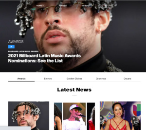
For example, on the awards page, there’s a featured story in the header image with filters for different awards from the Emmys, Golden Globes, Grammys, and Oscars with the latest news directly below. This is a very well-organized layout that allows users to easily find stories they’re looking for.
Articles
Once a user clicks into the header for a story, they’re taken to a page with a video along with a blog explaining the details from the story. There is a significant flicker effect when entering this page which Entertainment Tonight should improve since it could deter users and negatively affect their SEO.
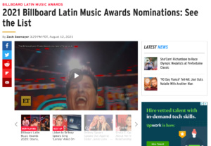
Once a user scrolls down the page to read the article, the video appears at the bottom right corner of the page and does not block any of the text. An area for experimentation on this page would be to optimize their “next up” videos as the next 2 videos that were going to play right after were about Britney Spears. While this is similar to the topic of music, the user had clicked into this from the awards section, so it may be better if they show more content relating to awards.
On the side of the video, they show the latest news, but they should experiment with showing other stories relating to awards or the video or article the user is currently viewing. The options to share a story are on Facebook, Twitter, Reddit, Flipboard, and email. When clicking on the share icons, a new tab is opened rather than leaving the current page the user is on which creates a great user experience since the user doesn’t lose the page they were viewing. They could experiment with adding more social sites such as Instagram, Facebook Messenger, Whatsapp, or iMessage for those who are iPhone users.
Photos
When a user clicks on the photos tab, they are taken to a page with a list of photo albums they can view. The layout is the same as the list on the “latest news” dropdown. From there, they can click into a gallery where they are shown images with a short description and navigation on the side informing them how many photos they’ve seen out of the album.
In this experience, the user has to scroll down to view photos, however, it would be a great experiment to see if scrolling horizontally rather than vertically makes for a better user experience. They could find out through an A/B test with Taplytics.

One downside of this photos page was that the page was slightly broken with the header bar not being at the top completely and a bit of the text bleeding above it.
Overall, the Entertainment Tonight Website is very user-friendly and easy to navigate. There are some areas they could improve upon such as their flicker effect and broken header bar on the photos page and exit button on the videos page. They also have several areas they could run experiments to create an even better user experience.
With Taplytics Entertainment Tonight could incorporate no-code A/B testing on both web and mobile to increase engagement and drive conversions.
Learn more about why teams pick Taplytics over Optimizely and how our pricing compares.