How To Improve User Experience by Running Split Tests


Quicken Loans is a Detroit-based mortgage lending company that changed its name to Rocket Mortgage on July 31, 2021. They’re the largest mortgage lender in North America with the goal of making the complicated mortgage process as easy as possible for their customers through leveraging technology.
We’ll be looking into their web experience to determine how they can improve their e-commerce site while providing experiment recommendations.
Table of Contents
Website
Home Page
The Quicken Loans home page has a header indicating that Quicken Loans changed its name to Rocket Mortgage. Rather than still using the old Quicken site, they should transition everything onto new Rocket Mortgage pages while adding a pop-up that says “you’re in the right place” with a short explanation that they’ve rebranded to Rocket Mortgage.
Throughout the web experience with Quicken/Rocket, the web pages rotate between the two sites depending on what landing page the user is on, so transitioning everything over to one site could make the experience smoother and prevent any confusion.
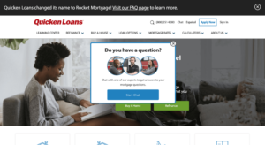
After spending a few seconds on the Quicken site, a pop-up appears prompting the user to start a chat if they have any questions. For the pop up they could experiment with the image used, the copy on the pop-up, and the color of the buttons. They could also test if using a different hero image would affect engagement or try replacing the static image with a carousel or video.
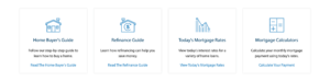
Under the hero image, they have 4 sections broken down into the home buyers guide, a refinance guide, today’s mortgage rates, and mortgage calculators. Currently, the boxes only include text with icons rather than images. They could experiment with the copy used in this section, the CTA, and the icons used. They could also test if using an image rather than an icon would lead to higher engagement.
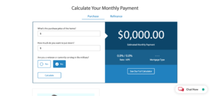
Under the 4 boxes is a monthly payment calculator where a user can input how much they want to put for their down payment, and what the price of their home is. This calculator gives an estimated monthly payment with a rate and APR. This is a great calculator which instantly provides value to the user. They could experiment if moving the location of this calculator higher on the page helps with engagement as this provides immediate value for the use. With Taplytics Web Visual Editor they could run an experiment testing the order of each section on the home page to see which order performs the best.
Under the mortgage calculator, they have blog posts on common mortgage topics along with social proof of their great customer service. Quicken could experiment with making the social proof badges smaller or adding them higher up above the fold as it currently takes up a large section at the bottom of the page.
They could also experiment with the placement of the blogs and test the format that they’re shown in. Currently, the blog titles are simply listed with no images which doesn’t make reading them intriguing for a user.
Quicken’s Navigation bar has 7 sections which include their learning center, refinance, buy a house, loan options, mortgage rates, calculators, and their about us page. Users can hover over each section to see further subsections. One downside of the Quicken site is that they have a significant flicker effect. They should try optimizing their site since this could deter users and negatively impact their SEO.
Using Their Products
Upon clicking on “buying a house for the first time”, users are asked for their location with the U.S. and Canada being the only 2 options. The page for first-time homebuyers is very plain so they should experiment with changing the hero image, or replacing it with a video.

The font used also looks unappealing, so they could test using a new font. Under the header image are 2 boxes for “find answers quickly” and “talk to a home expert”. These boxes did not have images which they should try adding along with experimenting with the copy and format of the text. Currently, the text is left-aligned, however, it could make the page look better if it was centered. Other experiments they could run on this page include changing the copy on the buttons, the color of the buttons, and the overall layout of the page.
Under the 2 sections, they have a “how to get started with Quicken” header which has prompts that explain how Quicken works. It’s not aesthetically pleasing and there’s a lot of text which is distracting. They could try changing the font, or change the layout completely.
A recommendation would be to have all of the topic headers listed with arrows users can click on to expand the answers for a topic. This way users can see all the topics without being overwhelmed with all the text which currently makes the page look very busy. This landing page only had 1 image on the page which is the header image. They should experiment with adding images and videos throughout the page and not only at the top to make the page more visually appealing.
Rocket Mortgage
Once a user clicks into the “find answers quickly online” section they’re taken to the Rocket Mortgage page which is far more visually appealing than the Quicken site. Quicken should make the full transition over to Rocket as moving from the Quicken to the Rocket site could confuse users.
The Rocket site is more user-friendly since it has more images, short and succinct copy, and has clear sections on the landing page that highlight what a user may be looking for. They also have fun graphics that are consistently dispersed throughout the site making the browsing experience feel more cohesive.
Account Creation
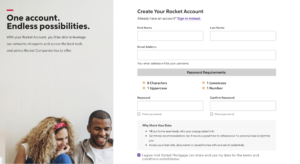
The account creation process does not include any social sign-in options which would make the experience faster. Onboarding is extremely important so working on optimizing this step is crucial to Quicken/Rocket’s success. They could experiment with the images used during the onboarding process. A recommendation would be to replace the image on the account creation screen with the graphics they use throughout the site as it would create a more cohesive experience with consistent imagery.
Home Approval
The home approval process was extremely easy to follow and user-friendly. They provided clear numbered steps at the top to show how far along in the approval process a user is. This is great for setting expectations on how long it will take. Each step asked different questions about a user’s current home, future home, followed by the user’s info and approval.
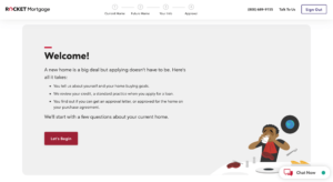
Throughout the questionnaire, Rocket showed related content based on the users’ answers. For example, if a user stated that they’re currently looking for a house they would be shown a recommendation to read an article from Quicken about buying your first home on an informational bar that appeared on the left of the screen.

The first section of questions relating to a user’s current home only asked a few questions but the following sections’ questions are much longer. To manage a user’s expectations, Quicken could experiment with having a bar at the top that moves after each question is answered to provide more detail on how long each section will take. Overall, the process was very straightforward and the questions were clear to understand.
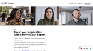
The questionnaire ended with a fun gif saying they’re reviewing your information before being brought to a page prompting the user to finish their application by talking to a home loan expert. One thing Quicken may want to change is that the CTA button to chat with a loan expert was below the fold so they should try moving it above the fold so a user can see it right away. They also had a “chat now” button which prompted a chatbot to appear. They could try adding a button to email a Quicken representative or call them as people may want to carry on a conversation outside of the web page. This would also be a great opportunity for Quicken to keep in touch with users through email once they’ve left the site.
Areas for Improvement
The Quicken website has several areas they could experiment with. Improving the overall aesthetics of the site while changing the format to be more user-friendly should be their priority. However, with the transition to Rocket Mortgage, another option would be for them to redirect all their Quicken links to a Rocket Mortgage page with a pop-up explaining the rebrand to their users. This option may be easier and help maintain consistency across the site. On their Rocket Mortgage pages, the information is easier to follow with user-friendly steps to finding out more about a user’s mortgage. Leveraging experimentation could help Quicken increase form completions and user engagement on their website.
With Taplytics Quicken could incorporate push notifications, no-code A/B testing on both web and mobile to increase engagement and drive conversions.
Learn more about why teams pick Taplytics over Optimizely and how our pricing compares.