Charles Schwab Increases the Customer Experience By A/B Testing

Charles Schwab is a financial services company that has been operating for over 40 years. They are one of Forbes’ most admired companies ranking #1 in customer satisfaction 3 years in a row for direct retail banking. They offer a wide range of services from retirement planning, lending, robo advising, and brokerage and trading.
Table of Contents
Website
Upon entering the Charles Schwab website there’s a banner at the top which asks the user to specify their location. They could experiment with having this as a pop-up rather than a banner so it doesn’t take up too much space above the fold and block out important information. They could also experiment with when this pop-up appears such as showing it as soon as a user lands on the site or a few seconds into exploring the page. Alternatively, they could just use the location a user has set on their device and ask if it’s correct.
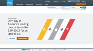
Their hero image showcases their stock slices with some of the leading companies offered in their stock slices. Here, they could experiment with the copy on their CTAs or the color of the buttons. They could also experiment with which stocks are shown to see if certain ones perform better in getting a user’s attention.

Under the header image, they have 3 columns with ways they add value to a customer followed by 3 of their main offerings which are their trading platform, robo-advisor, and personalized guidance from a financial consultant. They could experiment with the order that these are shown in and experiment with the images. Currently, the images on the homepage are all static, but they could see if including a video or changing the images helps increase engagement.
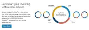
A recommendation would for users to be able to interact with the “Jumpstart your investing with a robo-advisor” section. They could include a small bar that shows risk level, and other factors taken into consideration when building a user’s portfolio, and based on how a user toggles the bar, the pie chart changes to reflect how a user answers. From there, they could also add a CTA that says “build my portfolio” rather than “learn more” to entice a user to start using the product.
After clicking on “learn more” under the robo-advisor section users are taken to a landing page explaining the benefits of the robo advisor. The options to see how an account works or open an account are at the bottom of the page which means not all users may see it right away. A solution would be to have the account creation section at the top of the page so it’s the first thing a user sees after clicking on “learn more”.

Once a user clicks on “see how it works” they’re redirected to a page that has a demo video. The demo video looks a bit awkward on the page as it’s on the top right with no white space above it. They could experiment with the placement of the video by having it in the center of the page or adding it earlier on in the discovery process such as on the home page or the initial “learn more page”. They could also experiment with the content of the video. Currently, the video has a slow intro that talks about financial goals. This isn’t that engaging and may deter users from watching the rest of the video, so a recommendation would be to jump right into the demo of the product.
Another suggestion would be to minimize the amount of white space on their pages. They could do this by increasing the font of their text or including more images. They could also include client testimonials as a form of social proof.
Opening An Account
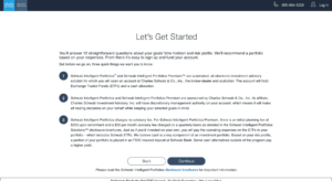
Upon clicking on creating an account, a user is taken to a page with some information to note before they get started. This has all text and has no images which looks overwhelming. Even though they do need to inform users of all the information on the page they could try to present it in a more visually appealing way.
The questionnaire begins by asking what the goals for the account are. To make the experience more user-friendly, they could add a bar at the top of the screen that indicates how far along in the process users are to help manage expectations.
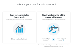
Once a user clicks on one of the two options, they have to click on the “next” button which is below the fold, meaning a user takes longer to get to the next page. They should experiment with automatically bringing users to the next page without having to click the next button or having the “next” button above the fold so the user can see it without having to scroll down.

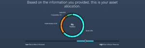
Afterward, a user is asked to state the goal of the account and there’s an image showing how much of the portfolio will be fixed income vs. cash. Based on the option you click, the pie chart changes to show what your portfolio will be composed of.

They also ask for a user’s knowledge of stocks, bonds, and ETFs, their risk level, and what they would do if your investments were to decrease by 20% along with how involved they would like to be in making financial decisions. They also ask questions related to how much of an initial investment a user wants to make, their comfort level for fluctuation, monthly contributions to the account, and when they’ll use the money. The interactive tools to slide to specify an answer are incredibly helpful and make the experience more enjoyable for a user as they’re able to interact with the site and see how their answers affect the portfolio pie chart. Here, they could experiment with the ranges they show users. For example, the initial investment amount starts at $5,000 but they could experiment with making this amount higher or lower.
Finally, they ask if you want a taxable or tax-advantage account. Here they could add an explanation for what these accounts mean as they simply state the kind of accounts and could provide more information for users who are less financially savvy.
They end the questionnaire with a chart that shows a user’s asset allocation based on how they answered the questions with a fluctuation amount a user can change based on if they want a higher or lower risk portfolio.
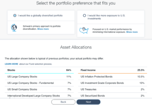
Users can also choose if they want to invest globally or just in the U.S., this could be a great place to add explainer videos on the difference between the two options and the pros and cons of each.
Charles Schwab does a great job of breaking down how assets will be allocated. An additional piece they could add is the option where if a user hovers over each asset they’re shown a short explanation on the asset.
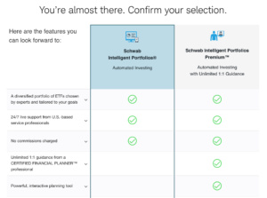
Once a user has reviewed the breakdown of their portfolio they’re taken to a section to confirm the type of portfolio a user wants with side-by-side comparisons of the 2 options. This is very user-friendly and allows for information to clearly be processed. At the very end, users are asked to log in or create an account. They could experiment if logging in or creating an account at the beginning would lead to higher form completions.
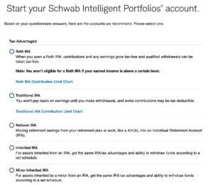
The final step is to select the kind of account a user wants to sign up for based on how they answered the questionnaire. They could experiment with adding photos or they could number the recommendations from highest recommended to least recommended. They could also add questions surrounding what the money will be used for to narrow down the list of options. This way if a user wants to save for retirement, they only suggest accounts best for retirement savings or they can list the accounts from most to least recommended with ones surrounding retirement as the top options
This process was very user-friendly. The breakdown of the portfolio pie chart made it easy to understand what a user’s portfolio would be composed of. A recommendation would be to add a video or gif showing how they create a plan for the user based on how they answer questions on the home page as that’s the biggest value add for a user and it shows how their product is personalized for a user.
With Taplytics Charles Schwab could incorporate no-code A/B testing on both web and mobile to increase engagement and drive conversions.
Learn more about why teams pick Taplytics over Optimizely and how our pricing compares.