Leveraging Experimentation to Optimize ChowNow’s Website and Mobile App
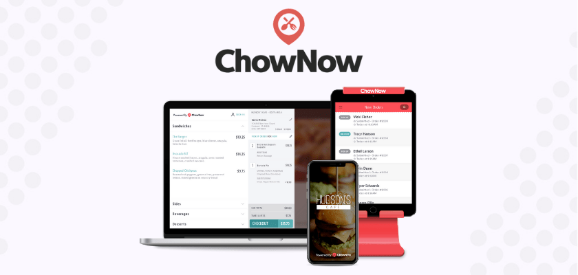

ChowNow is an online food ordering app and website founded in 2011. They offer delivery and pick-up options and are based in Los Angeles California. The app is commission and fee-free with over 14,000 restaurants using their platform in the United States. They earn money through a monthly subscription with restaurants which creates a sustainable and fair method for restaurants to reach diners.
Table of Contents
Website
The home landing page for ChowNow is clean and minimalistic with only text and no visuals. Here, they could experiment with the copy in their header and the CTA along with the color of the page and text. They could also experiment with the icon for the pop-up and the message a user receives.
An experimentation idea could be seeing if adding an emoji in the pop-up message increases engagement or they could use Taplytics Genius AI to A/B test different messages to determine one that performs best. Another experiment could be seeing if the plain background is more appealing to customers or if adding an image works better.
Directly below the fold is a video, however, the video is larger than the screen meaning the top and bottom are slightly cut off. ChowNow should make the video a little bit smaller so the entire video fits on the screen. In addition, the video didn’t play upon clicking it so they should look into fixing this.
Directly underneath the video are 3 reasons to use ChowNow. A suggestion would be to change the copy from “Introduction” to “3 reasons to get started with ChowNow” or “3 Reasons ChowNow will help your business” so the viewer knows what they’re reading rather than having a broad term like “Introduction”. They could leverage Taplytics Genius AI to determine different AI-generated copy variations for this section of their website.

Beside each reason to use ChowNow is a video that loops on repeat. The video that plays beside each reason is aesthetically pleasing, however, the home page includes a lot of scrolling since elements are so far away from each other. An experiment idea would be to change the format of this section on the home page to have less white space so the user doesn’t have to scroll as long to get to the next section or to simply have 3 boxes beside each other highlighting all the benefits so a user can view them all at the same time.
Further down on the page they include a social proof section. They should experiment with making the text bigger and the images smaller to focus more on the quotes from their customers and include more logos that are recognizable. The focus should be on the restaurants they partner with and the quotes from customers rather than their photos.

They also have a section that includes statistics on their success that gradually rotate through a carousel. A recommendation would be to have all the statistics show up on the screen at the same time. This would mean having 4 boxes horizontally beside each other with each box highlighting a different statistic. This way a viewer can see all of their statistics at once.
Another suggestion would be to include icons to match the statistic. For example, adding an icon of hands shaking for the 20,000+ restaurant partners, or a knife and fork for how many diners have been served.
App
Upon downloading the ChowNow app users are immediately asked to opt-in to push notifications. They don’t state the benefits of opting in so they should experiment with changing the copy to inform the user of the benefits such as getting updates on their order or hearing about the latest deals.

They could also experiment with adding a bar at the top or bottom of the screen showing how far along in the onboarding process there are. Users are shown a few screens before they enter the app, so having a signal on how long the onboarding process takes could help set user expectations.
Along with asking for push opt-in right away they also ask for location. They should state the benefits of sharing location and experiment with when they ask users to opt into notifications and sharing their location.
Home Screen
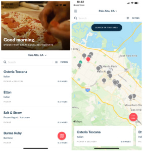
The first screen a user sees once they’ve gone through the onboarding flow shows a video at the top of food being prepared along with a list of restaurants in their area. A user can also click on the map icon to show a map of restaurants in their area.
The ChowNow app does not require users to log in right away and does not prompt users to sign up or log in to their account. They could experiment with when or if they ask users to complete this step.
The main improvement ChowNow should make to this page is to add images. People eat with their eyes so it would be a good idea to include a photo of the most popular dish from each restaurant in the browsing section. Each restaurant on the explore page shows the distance from a user’s location and if they’re available for pickup or delivery but they should also include information such as the restaurant’s rating from Google or Yelp and a dollar sign icon to indicate how expensive it is.
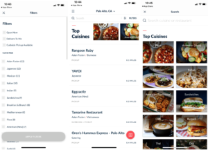
At the top of the screen, they have a filters section to specify the types of cuisines available along with how many restaurants from each cuisine type are available. Users can also filter to show restaurants that are open now, deliver to them and have a curbside pickup option.
In order to see any images of food, users have to scroll down to see a horizontal list of cuisines. Once a user clicks into one of these images they’re taken to a page that is formatted with boxes of each cuisine type. A recommendation would be to have this layout of cuisines replace the current list of restaurants they have on the homepage to make the experience more user-friendly and visually appealing.
It would also allow users to quickly find restaurants based on the kind of food they’re looking for. They should experiment with the order of the restaurants a user sees. For example, they should change the order of the categories to show food based on the time of day like showing breakfast restaurants and cafes at the top during the morning.
Placing an Order
Once a user clicks into a category such as pizza, they’re shown a list of restaurants or they can use the map view.
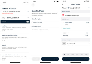
When ordering, ChowNow should state if the restaurant is opened or closed before a user clicks into it. A user only can tell when the restaurant opens once they’ve selected it which could cause friction and frustration. Upon clicking on a restaurant, they have different sections and state how many items are available for each section. A recommendation would be to add a “popular items” section at the top for people who don’t know what to order along with adding images of each item.
They should also change the order that categories are displayed. For Osteria Toscana, the first category shown was red wine rather than appetizers and the rest of the beverage options were at the bottom. This creates a strange user experience to have these sections separated.
They have good descriptions of the food along with the ability to add special instructions on the order. A missed opportunity to increase bill size is that they don’t suggest additional add-on items like ordering a drink or an appetizer.
Another recommendation would be to add a small blurb about the history of the restaurant. The differentiator for ChowNow is that they provide a fair subscription service to restaurant owners without commissions. To emphasize this and make diners feel a connection to the restaurants and ChowNow’s platform, including a short blurb on how the restaurant was created or why the owners wanted to start the restaurant could help build brand loyalty.
They could also add a section at the top with the owner’s or chef’s favorite meal and a short blurb on why they love it so first-time diners have a suggestion on what to try for their first dining experience with the restaurant.
Logging In/Account Creation
The only time during the ordering process that a user is prompted to log in or create an account is when they click on “have a promo” during the checkout process. They should experiment with when they prompt a user to create an account.
There is the option to create an account by swiping to the left of the app, however, this is not brought to a user’s attention and is hidden from the home page. One of the great things about signing up is that they offer several social sign-in options to create a smoothing account creation process.
Overall, ChowNow has a very user-friendly website and app however several areas could be improved from the use of imagery on the app to the layout of their website. We recommend they leverage their messaging around being 100% commission-free and highlight supporting local restaurants more in their app.
They could use the Taplytics Web and Mobile Visual Editor to create no-code experiments on their site and app. Learn more about why teams pick Taplytics over Optimizely and how our pricing compares.