Implement A/B Tests to Drive More Conversions

Union Bank, formerly known as The Bank of California was originally founded in 1864 and rebranded to Union Bank in 1996. With headquarters in New York, they operate in Washington and California with 2 international offices and branches in New York, Chicago, Houston, and Dallas. They offer personal, commercial, and business banking, private banking, corporate accounts, and investments and are owned by MUFG bank.
Table of Contents
Improving Your Website
Making updates to your website is a great way to create a better user experience. Your website is the first thing a user sees when interacting with your brand so optimizing the experience is key to building a strong first impression with users and allowing them to gain access to the information they need to convert.
Home Page
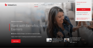
The home page has a clean design with a pop-up that appears in the upper right corner. There’s no way to click out of the pop-up or minimize it from the screen, so Union Bank should experiment with adding the ability for a user to minimize it since it takes up a bit of space on the screen and can be distracting.
They can also experiment with the copy on the home page by using Taplytics Genius AI to generate new AI copy suggestions. Other areas for experimentation could be changing the header image, the CTA on the “learn more” button, or changing the blog posts at the bottom to special offers or promotions.
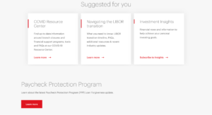
Below the fold, they have a “suggested for you” section. While this is a clean look, they could try adding icons or images to see if it helps increase engagement. This could also make this section look more visually appealing as there is only text on this section of the page.

Further down on the page, images gradually appear as a user scrolls down highlighting big life moments from having a child to graduation, moving into your first home, running a business, and retirement. This is a smart way for them to organize their product offerings since banking can be confusing and sorting it down into life milestones can help a user easily determine what stage of life they’re in and click into that section.
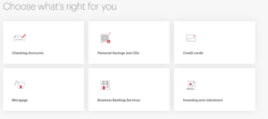
At the very bottom of the homepage is a section with all their account options. This layout is easy to navigate and doesn’t complicate the selection process for the user which is common with financial websites, especially bank pages which tend to overwhelm the user with too much information. They could experiment with the layout of these boxes to see if making the icons bigger or aligning the text and icons in the center rather than left-aligned makes a difference in engagement.
Finding A Location
Throughout the Union Bank website, there are several CTAs to find a location rather than creating an account online. When a user clicks on the “find a branch” button, they are taken to a page where they are asked to share their location or type in their location.
A suggestion would be to have a map of the United States with dots highlighting their branches. This would look aesthetically pleasing and be informative to the user. Upon typing in “California” as a location, nothing comes up which is due to their small initial search radius. The radius for locations on the map is set to 10 miles, however, they should experiment with making this initial search radius larger to 50 miles. It’s a better experience for a user if they find a location further away rather than not having any locations appear based on their search.

Once a location has been found, it includes information on the branch and offers directions through opening up another tab with Google Maps directions to the bank. This is extremely helpful and creates a great experience for the user. They also include hours of operation and a phone number for the locations. Each location also includes a money and circle icon at the bottom which a user can’t click on. These icons seem redundant since they add no value to the page.
One downside of this page is that every time a user’s mouse scrolls over the header it drops down covering the entire page so a suggestion would be to only show the information in the drop-downs if a user clicks on it for this section to prevent this from happening.
Onboarding For Personal Savings

Upon clicking on the personal savings box, a user is taken to a landing page that showcases a hero image with clear copy and a minimalistic header. They could experiment with the copy or the CTA on the red button since it is a bit long with Taplytics Genius AI. Another suggestion would be to have a section showcasing how their savings accounts differ from other banks and why someone should choose them over a competitor.
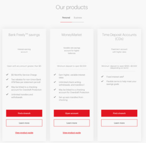
Below the hero image are 3 clear options for the types of savings accounts a user can open. They have 3 personal and 2 business savings options. Having only a few options creates a user-friendly experience and it is not overwhelming. They clearly state the benefits and differences between all the accounts. One thing to note is that to open a savings account a user has to visit a branch for 2 out of the 3 options. This may prevent a user from taking action so they should include a short blurb explaining why visiting a branch is necessary to open the account.

Upon clicking on opening a Money Market savings account, the landing page looks completely different than the rest of the website. The onboarding forms look old and are not aesthetically pleasing. Union Bank should experiment with changing the overall appearance of the onboarding flow to match the rest of their website.

A good thing about the onboarding process is that they have clear steps at the top which highlight what a user needs to do to set up an account. They could include a time estimate for how long the process will take to set user expectations or add a small bar at the top which moves after each form is completed. A downside of this page is that there is no way to exit and go back to the home page aside from clicking on the “change account type” CTA at the top.
Learn More with Taplytics
Overall, Union Bank has a minimalistic website that is easy to navigate and leaves a user not feeling overwhelmed. While their onboarding process could be updated to be more visually appealing the process is not confusing for users. They have several areas ripe for experimentation from the imagery on their page, CTAs, and onboarding flow which could easily be improved upon with Taplytics.
With Taplytics, Union Bank could incorporate no-code A/B testing to incorporate those changes and drive conversions.
Learn more about why teams pick Taplytics over Optimizely and how our pricing compares.