How the most popular dining apps perfected the user experience
What is A/B Testing?
With A/B testing, teams can compare two versions of the same marketing asset and measure the difference in performance. For instance, one variation of a page might have a higher click-through rate than another. By implementing A/B testing, companies will be able to see what works and what doesn’t and then adjust their strategy accordingly.
Let’s say you wanted to increase the number of clicks on the “Buy now” button. As a best practice, running an A/B test could be the way to go. An experiment could consist of two different colors for the button, green or blue. From there, you could see which button colour performs the best and use the winning variation moving forward.
When you have a successful A/B test, you can confidently make the switch and start reaping the benefits of your conversion rate increasing.
How to Perfect a Dining App User Experience
There are numerous apps in the marketplace for users with a hungry stomach, and many go above and beyond to personalize in-app experiences for their customers. With so many techniques for retaining users, here are five A/B tests you can run to discover how to turn first-time downloaders into lifelong customers who always reach for your app when they’re looking for a quick eat.
1.Referral Programs
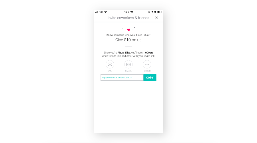
It’s a great idea to test referral programs. Referrals are a way to encourage account creation. Ritual attains customers by encouraging current customers to share a code with their friends and family who don’t use the app yet. Once the code is shared, they each get $10 on their accounts. You can easily test what rewards work best to attract the most customers.
2. Sign Up Forms
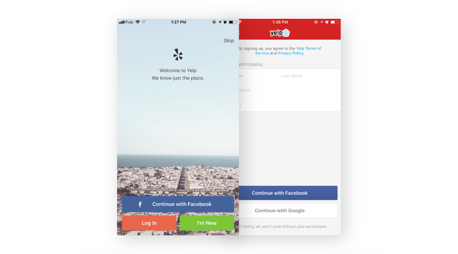
There’s nothing scarier than a huge form to fill in when you first sign up for an app with all of your personal information. That’s why you should test sign up flows. Social media signups (like Facebook) make login quick and easy, and less daunting for the user. Test which ones work best for your guests (email, facebook, long-form) and encourage the most sign-ups. Yelp uses Facebook and Google to help their users to sign up faster.
3. Checkout flow and Payment Setup
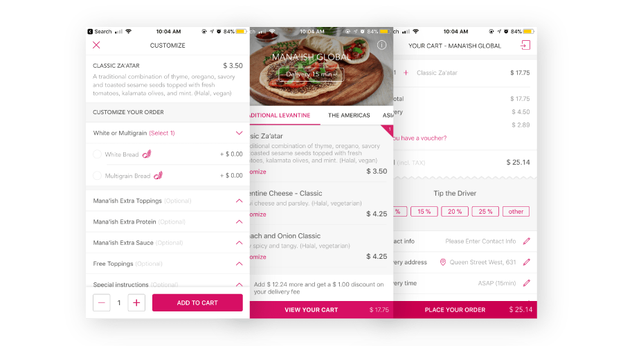
Try testing your checkout flow by having a one-step checkout instead of a shopping cart and a checkout. Fewer steps for your customers can help increase conversions. Similar to app sign-ins, setting up payments should be quick and easy because if not, users may feel frustrated and abandon their cart or the app. Third party payments like Paypal or Apple Pay can make setting up payment easy – It’s important to test what services you users like best. Another option to simplify the payment process is to add photo recognition to your credit cards so your users don’t have to input their information manually.
4. Recommendations
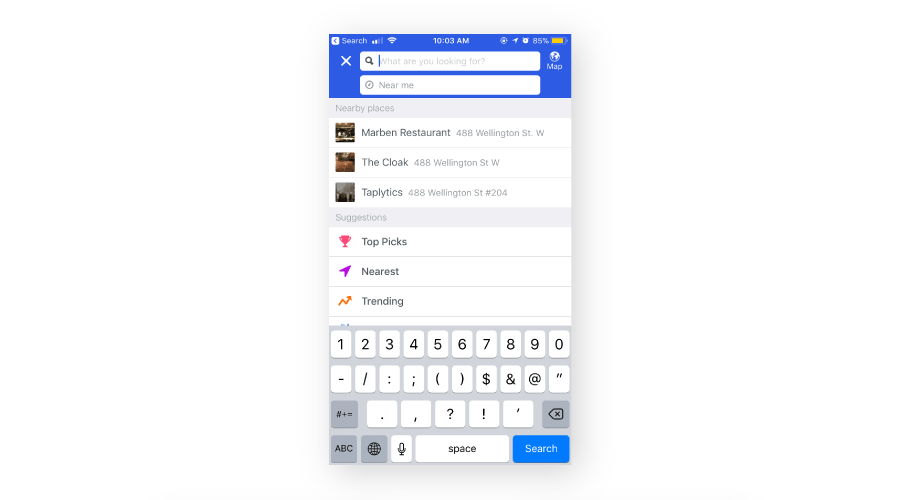
Personalization is extremely important in your app. Try placing previously ordered items on the home screen to make re-ordering fast and efficient. Recommend nearby items and popular items to encourage your customers to keep purchasing with your app.
5. Promotions
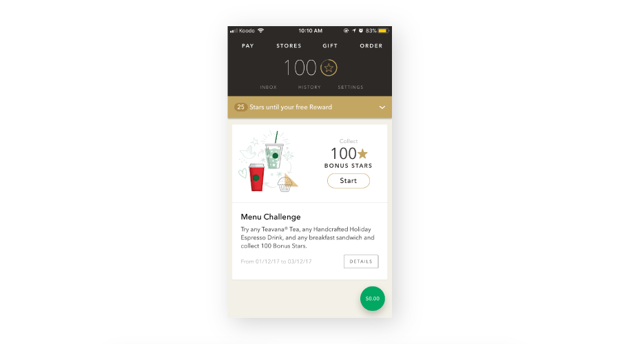
There are multiple ways you can send a promotion to your customer. See what performs best and try testing push notifications, takeover pop up screens, highlighted product views, and bolded text and images on the homepage. Starbucks has their promotions on display right when the user opens the app to attract them immediately.
With a great referral program, short sign up form, fast payment setup, seamless checkout flow, personalization, and exciting promotions you can take your food app to the next level. Quickly test the alternatives by running mobile A/B tests to see which best satisfy the hunger for a great user experience!
The Importance of A/B Testing
When you apply A/B testing principles to your food delivery app, the benefits are incredibly impactful. Simply generating a 1% increase in clicks on your buy button could result in thousands of dollars in extra sales.
Everyone has an opinion on what works best for your site. Designing your app can be an extremely subjective process, with everyone having their own visual preferences or making suggestions to mimic industry leaders. By continuously running different A/B tests, you can offer a data-driven approach to design and remove subjectivity from the process.
In this new era, companies must make sure their homepage is designed to speak to customers. Every brand has a specific audience and the design will vary from company to company, but what works for one brand won’t work for yours. A/B testing allows you to generate results that are hyper-targeted and specific to your business and customers.
Your homepage is probably one of the most revisited pages on your website. Making even a few design changes to it is bound to create a jarring experience for your customers. The answer? A/B testing. You can make these changes without sacrificing long-term customer retention, loyalty, or brand awareness by testing such changes in a controlled environment.

