The Good and Bad of Mobile Onboarding

Developing a mobile application is a tough job. You slave for months making sure your product is perfect and then work even harder trying to get people hooked. You also probably spend a decent amount of money on advertising, trying to encourage people to download your app. I personally love discovering new apps that will entertain me, and make my life just a little easier.
Recently, I came across a few too many apps that I have been eager to try but was so frustrated by their onboarding process, I called it quits and never looked back. One of the toughest challenges for mobile applications is finding the balance between offering and collecting enough information, without losing users in the process.
My last few downloads have inspired me to write this post to try and find some of the best and worst mobile onboarding experiences. I know there are many different mobile onboarding strategies, but I am going to focus on three that I think will make or break whether a user sticks around.
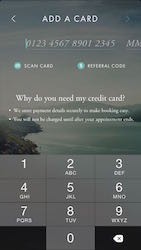
Mobile commerce is becoming extremely popular for both retail and services. One of the biggest challenges for these applications is knowing the appropriate time to collect credit card information. I came across an app recently called MassageNow, it sounded great “book same day massage appointments at a fraction of the cost”. It sounded so great that I downloaded it. When I first opened the app it looked very well designed and I was able to easily create an account. The problem with their onboarding process was that by only the third, they were already asking me for my credit card information.

Like most people, before I offer up that kind of information I want to see what the service is offering and get to see how the app works. Why not ask for this information when I am committed and ready to book? Is it crucial that you get this information right at login?
On the flip side, Etsy knows how to get a user hooked before asking for information. When you first download their app you are given two options.
- You can sign up for an account,
- or you can start searching the store and take a look at trending items.
You are only asked to sign up for an account once you are ready to make a purchase. Etsy is getting their users hooked and wanting to buy something before they force them to give up their information.

Another common onboarding approach is to provide a tutorial to teach your users how to use your application. This concept can be extremely powerful when done well. When I talked to one of my colleagues about this approach, he introduced me to an application called Nintype. Nintype is an advanced iPhone keyboard and I am sure once you start using the product it’s extremely powerful and easy to use. However, the tutorial they have put together is an information overload. If anyone completes this tutorial and is happy with what it taught you, I would love to hear your thoughts.
I think a better approach is to teach your users enough to get them started and if required, add follow-up tutorials to teach advanced features after users are given an opportunity to master the basics. Mailbox has done a great job with their tutorial. They teach you everything you need in order to successfully use their mail platform without going into too many details. The tutorial is interactive and lets you try out the gestures as they teach you. Once complete you will be well on your way to organizing your mail.

Bombarding your users with permission settings
The last onboarding mistake is asking your users for permission both too early and also asking them for access to too many things. When you open a new application the last thing, you want to see, is multiple popups in a row asking for permission to a laundry list of items.
- App X would like to send you push Notifications
- App X would like to access your locations
- App X would like access your contacts
- App X would like to access your camera
For some applications, getting your users to allow these permissions is critical to the functionality and overall user experience. So during onboarding try and keep the questions to a minimum. If this permission is critical, find the right time to ask it and tell the user why you need access. That way they understand the benefit of giving you this permission.
Cluster does a great job of this. Instead of asking for access to my contacts as soon as I open their application, they hold off and ask for it when it’s going to benefit me. When you first open the cluster application there is a short tutorial to explain what the application is all about.

They then continue and guide you through the process of creating your first photo sharing group.

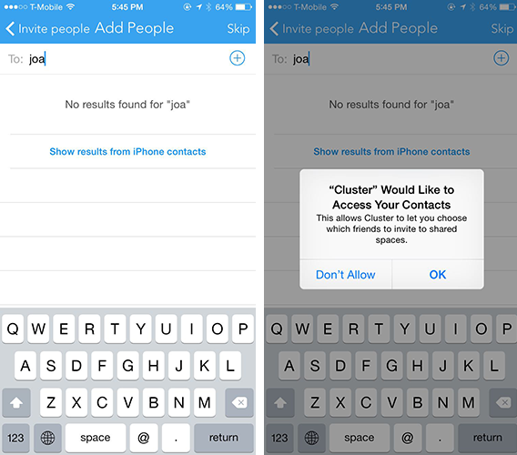
When it’s time to invite your friends, you can search for their name in the search window. Since Cluster currently doesn’t have access to your contacts, you have the option to “show results from iPhone contacts”.

Once you click that button, cluster asks permission to access your contacts. They even go one step further and explain why they would like to access my contacts in the popup window. Hitting yes to this popup is a no-brainer. I understand that by allowing cluster access to my contacts I can easily add my contacts to my newly created photo group.
Finding the best mobile onboarding experience takes time, and I can guarantee you that your first onboarding flow will probably have flaws. By studying best practices and constantly testing and changing your process to create the best possible user experience, your users will stick around to see what you have worked so hard to create.

