Fintech Apps Masterclass

There’s no doubt that FinTech is on the rise. In Western countries adoption of FinTech is being driven by an unmet demand for financial services. FinTech promises to provide greater financial inclusion. In other economies, adoption can be related to the high cost of traditional finance, a supportive regulatory environment and other macroeconomic factors.
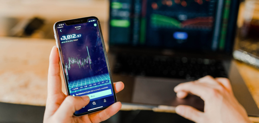
Watch our Fintech App Masterclass on demand and get started with a free feature management account on DevCycle
Table of Contents
The Rise of FinTech
Demographics play a very important role in the rise of FinTech as younger cohorts are more likely to trust and adopt FinTech services. FinTech startups are on the rise globally. In 2019, there were over 5,000 FinTech startups in the Americas, over 3000 in Europe, Middle East, and Africa and over 2000 in Asia Pacific. Artificial intelligence and blockchain are groundbreaking technologies that have revolutionized financial industries and created new ways to do business.

FinTech has disrupted several industries including insurance, loans, electronic payments, personal finance, venture capital, and wealth management. It’s crucial that FinTech companies work to provide a seamless digital experience for their customers. The rising expectation of customers has given rise to new partnerships between established financial companies like banks, FinTech startups, and other technology companies.
FinTech is on the rise globally. As the global financial sector is expected to be worth $26.5 trillion USD in 2022 with a compound annual growth rate of 6%. 60% of credit unions and 49% of banks in the U.S. believe that FinTech partnerships are important. One of the biggest FinTech products is digital payment, which holds 25% of the FinTech market.
Not surprisingly, e-commerce is one of the biggest drivers of FinTech with a compound annual growth rate of 10 to 12% thanks to consumer behavior that shifted with a move to online shopping. 64% of consumers worldwide have used at least one or more FinTech platforms which is up from 33% in 2017.
60% of customers want to transact with financial institutions that provide a single platform such as social media or mobile banking apps and 96% of global consumers are aware of at least one FinTech service or company, which proves just how much the world is moving towards FinTech.
Online Trading App Adoption
Robinhood, which is one of the more popular platforms for buying stocks in the U.S. has made trading stocks available to everyone at an extremely low cost.
In the past few years, most trading platforms have lowered their fees and opened up their services to compete with Robinhood. On the other side of the trading world, Bitcoin is exchanged and traded daily. Top exchanges include Coinbase and Kraken, which help new coins gain exposure through their platform.

Coinbase is the most popular U.S. cryptocurrency exchange platform, which has built a platform for crypto to be integrated into payment solutions and e-commerce websites. There’s an undeniable surge in online trading app users. As of 2021 Coinbase has around 30 million users and 6.1M monthly active users.
The ability to perform any financial task with a smartphone and mobile app has shaped the user experience around FinTech products. The ease of access to set up a bank, crypto, or trading account on mobile enables the ability for consumers to make payments through their handheld devices, which is being led by payment service companies.
This year, 90% of people will use mobile payment with their smartphones. By the year 2022, mobile transactions are projected to grow by 121%. This will eventually compromise 88% of all banking transactions. Consumer spending in the app store is projected to increase by 92% to $157 billion worldwide in 2022.
By 2022, almost 78% of the United States millennial population will become digital banking users. The use of cash at all points of sale has dropped by 42% since 2019 and is expected to be the least used payment method within the next four years. (Source: Business of Apps)
Dimensions of Fintech Apps
In order to evaluate each of the FinTech apps, we need to look at six different dimensions.

Onboarding
We’ll be looking at how easy it is to create an account, the information required to create them, and how they layer education and features. We’ll also look into whether they’re introducing them methodically over time, as opposed to all at once. Then we’ll be looking at how they communicate the progress of the signup process, especially for the FinTech apps that have a longer in-depth onboarding because of government regulations.
Security and Privacy
We’ll be looking at what encryption technologies they have, whether or not they use two-factor authentication as well as the usage of fraud detection in case there’s any sort of nefarious activity that’s going on if a user’s account has been compromised.
Dashboard
We’ll be evaluating FinTech apps on how they leverage their dashboards in order to communicate to their users how to understand their financial status or the performance of their portfolios when it comes to stocks or even cryptocurrency. We’ll evaluate if the information is presenting in a way that’s easily digestible and interspersed with clear calls to actions, recommendations of what to do with respect to the progress of their personal finances, and how they provide prompts to educate or provide recommendations to their customers.
Real-Time Notifications
We’ll be looking at how they leverage real-time notifications in order to communicate to their users what’s going on with respect to the transactions that they’re completing in real-time. We’ll also be looking at whether or not they’re instantaneous or informative and whether or not they’re using their messaging on different channels from push notifications or email or within the app itself.
Bill Payment, Transfers, and Investments
We’ll be taking a look at how each of these apps will be handling bill payments, transfers, and investments along with how long it takes to complete a transaction, and how timely those confirmations of purchases and deposits are.
Customer Support
Lastly, and probably the most important dimension is how strong their customer support is and seeing how timely their response times and resolutions are. Whether it’s through a help center resources for frequently asked questions, how they actually deliver customer support, whether it’s phone chat or email support.
We’ll be reviewing Coinbase, You Need A Budget, and Wealthsimple.
Wealthsimple
Wealthsimple Trade is a commission-free stock trading app that lets you buy thousands of stocks and ETFs across major stock exchanges in Canada and the U.S. It is part of a greater family of Wealthsimple financial products, such as Wealthsimple cash and their flagship, robo advisor invest product.
Onboarding
Welathsimple’s onboarding process is quite lengthy. Wealthsimple can do a few things to manage expectations in the sign-up process. They could provide a progress bar in terms of how far along you are in the process.
In terms of getting permission to track activity across not only mobile app and websites we think this is primarily due to Apple’s new privacy guidelines and they have to do this in order to actually start getting that user engagement data right from the sign up process which explains why they’re asking for it upfront. It’s likely something that has to do with how they’re instrumenting their analytics platform so they can measure their user analytics right away.
Push Opt-In
Wealthsimple communicates the benefits of opting into push notifications during the onboarding flow. However, we feel it’s a little bit too early to ask for it in the onboarding or signup process.

A great experiment that we usually recommend to FinTech companies that we work with is when is the most beneficial to present a push opt-in screen. Some options could be presenting it after you complete the transaction and letting users know that by opting into push notifications they’re getting real-time notifications as the trades are being confirmed. They can also experiment with the timing when they ask for permission, copy, imagery, or iconography as well in order to further boost push notification opt-in rates.
Wealthsimple had 18 other data points that they asked for in order to finally get through the onboarding process and actually use the product. Opening an account with the Wealthsimple Trade app is quite a lengthy endeavor, but because of stringent regulations in Canada, they need to ask several questions. The only 2 questions that weren’t necessary were gender and how you heard of Wealthsimple.
They could experiment on whether the exclusion of these questions makes a difference. However, if you’re already in step 35 it’s unlikely that people would abandon the signup process when they’re committed to trying to sign up. Luckily, that’s where experimentation can come into play in order for them to understand how these are beneficial to their onboarding process.
Adding Funds Once You’ve Signed Up
When adding funds to your account upon signing up you are given the option to choose what type of account you’re going to be funding with. Whether it’s a tax shelter, retirement savings account, or personal trading that could be taxable we really enjoyed the focus on prompting the user to the next action which made it dead simple for the user in order to get to that “aha” moment of making their first trade.

In order to inform users on new features, they use their navigation menu to highlight new or premium features that they can be up-sold on. We really liked that they included short, succinct, copy that details the key benefits of a particular feature.
Notifications
Along with in-app messaging, they also leverage push notifications and emails. Their notifications are instant and helpful. For first-time users, it’s reassuring to get notified instantaneously of deposits going through as well as successful trades. With regards to how to complete trades, they broke it down to steps where you’re just choosing the stock, choosing which account to fund, and how many shares to purchase.
After making a purchase they let you know that you’ve completed the purchase, the number of shares that you bought, and then instantaneously, you’re notified through push notification that it’s been confirmed on their end.
Dashboard
Upon logging in, Wealthsimple users are presented with a helpful, intuitive dashboard that gives them a quick pulse of how their portfolio is performing over different time periods. Whether you’re looking at the performance of your portfolio today, last week or last month, the graphs on the screen will instantly change and let you know how you are performing over time. As you scroll within the same screen you can access the individual performance of the stocks and ETFs in your portfolio alongside the watch list of stocks you might be interested in.
We really enjoyed the design of how easy and accessible everything is without having to jump through multiple screens in order to access information to make decisions to purchase.
Customer Support
We emailed them in order to get some help setting up our account. They have a phone number that was easy to find on their website so we hopped on the phone and had some issues resolved seamlessly. They had a great customer support team and they were easily able to answer questions in real-time which helped build trust with the Wealthsimple family of products.
Coinbase
Coinbase had a very smooth onboarding process. The first onboarding screen was very clean and minimalistic. When you went to create your account, there were no auto-fill or social sign-in options that they may want to experiment with to make onboarding time faster.

One thing we liked is that they had a bar at the top during the onboarding process to show you how far along you are. After creating your account you have to verify your email. They had a “check my inbox” button which took us straight to Gmail, saving time in the onboarding process while creating a really smooth experience.
From there we were prompted to secure the account. What we liked about this process is it told us exactly how long each step is going to be in minutes. This set expectations for us as a new user so we knew how long it was going to take.
Notifications
The next part was two-step verification where they texted us a verification code. After confirming the verification code, we were prompted to opt in to notifications. They did a great job at clearly stating the benefits of opting into notifications stating that they’ll give updates on our balance and if any security alerts. One thing we did notice, however, is that we never got any push notifications from Coinbase despite opting in.
Initially, we downloaded the app and make a purchase. It would have been a good idea for Coinbase to send a notification saying, “Hey, we saw you set up your account, make your first purchase” or a prompt saying “now’s a great time to buy”. This would encourage the user to start interacting with the app. After the two-step verification process, we were taken to the home screen where we could add a payment method.
Linking Your Account
We found it interesting that you could link your credit card, debit card, and PayPal account. However, you could only use PayPal for withdrawing. When you add in your card, you have to manually add in information. It would be interesting if they had the option to scan your credit card so the information is added automatically which would reduce the onboarding time for a user.

Finally, we got a message saying the account was successfully added. We would have added the option to scan your credit card so a user doesn’t have to manually type in their credit card information. It would make the process a lot faster.
Home Screen Layout
After adding your banking information you’re brought back to the home screen. The home screen is packed with a lot of valuable information. They have a watch list at the top which shows how Bitcoin is performing along with other top movers. Under top movers, they had information on Polygon explaining what it is as well as how long the educational video on it would be.
The learn more section changes frequently with different forms of crypto. If you watch one of the videos you can earn crypto but you have to upload a photo of your ID in order to earn points and you also have to take a photo of yourself. The photo verification had to be a selfie and you can’t pick something from your album. That could be a point of friction if a user isn’t in the mood to take a photo, or if they’re out in public and don’t want to take a selfie.
There were also incentives to invite your friends which is a great way to get more people to download the app since word of mouth is extremely effective. Finally, they ended the homepage with a news section. This layout was both educational and gave great value to the user by allowing them to earn points through watching educational videos. This is also great for the assets that you could purchase since it gives visibility for new forms of crypto that users may not be familiar with.
One thing we would change is that to view a video, you have to upload your ID and it takes a while for the ID to be verified. When we went to click and watch the video, we had to upload the ID, take a selfie and then wait for the ID to be verified in order to actually watch the video which took quite some time.
By the time the ID was verified, we had already left the app. A solution for this would be to have the crypto that they earned from watching the video in a wallet that users could then redeem once they uploaded their ID. This gives users an incentive to upload their ID and watch the video immediately, rather than having them upload it and wait for it to be verified. By a user’s ID has been verified, it’s likely they have already left the app.
Making Your First Purchase
When you click the icon to make a transaction, a pop-up on the screen appears. From there, you can buy, sell, convert, send, or receive. If you click the buy option, you can select which asset you want to purchase along with viewing how well it’s performing, which is very useful information.

If you click the blue bar that says “unsure what to buy”, it leads you to a video that’s aesthetically pleasing, and very informative which incentivizes you to sign up for dollar-cost averaging where a user has a certain amount of money that they put in each week. This minimizes the amount of time they need to spend on the app deciding what to buy and also provides a reoccurring purchase at regular intervals, and it guarantees that you’ll regularly purchase cryptocurrencies without having to think about the time for the dip when you buy at lower prices.
Once you want to make a purchase, you have to complete an ID verification step in order to buy. Similar to the onboarding process, it shows the user blue bars at the top which show your progress. This step allows you to take a photo of the front and the back of your ID with a prompt to see if it’s clear enough.
In order to do anything on the app like make a transaction or earn crypto by viewing a video, you need to add your ID verification. It may be a good test for Coinbase to see if they should add this as part of the initial onboarding process since you need to complete this step to do almost anything on the app.
Plus as a user, it’s frustrating when you think you’re done the onboarding process at the beginning, just to have to complete ID verification as soon as you want to take any action on the app. We would recommend that they see if adding this process during the initial onboarding makes a difference in user engagement, which would be a great experiment for them to run.
Unfortunately, we had trouble making our first purchase. We went to make a purchase and it prompted us if we wanted to make repeat purchases, which is great for increasing customer LTV. However, we were declined due to a suspicious activity warning so we went to their customer service site outside of the app to see why we might be experiencing this issue.

One thing we didn’t like is that we had to leave the app for support and we were speaking to an automated chatbot. The chatbot didn’t have any options for the error we were facing and we had to fill out a lengthy form to get in contact with someone. We sent the “contact us” form and still didn’t hear back over a week later.
This is obviously a huge friction point for users to have to leave the app and fill out such a long form. There was no follow up and it would have been nice to have a number to call or a “contact us” button in the app when we faced this issue rather than simply receiving a “dismiss” message on the second screen above. This is an opportunity for them to test different messaging on the dismiss button.
A few days after the initial failed purchase, we tried again and were successful. We’re not too sure why it worked on the second time, since we took exactly the same steps we did the first time. One thing to note is that we never heard back from their support team, never got a notification or an email as a reminder to make a purchase so if it wasn’t for us taking action, we wouldn’t have been reminded to use the app which is a huge missed opportunity for them. Once we made the purchase, we were again prompted to make a reoccurring buy which is great. Then we got a screen and saying the order was successful. From there we could go to the portfolio tab to see how the asset was performing.
Post-Puchase Experience
The post-purchase experience wasn’t much different than the pre-purchase experience. The homepage was the same as mentioned before. The upsell and cross-sell experiences were the same pre and post-purchase.

After making a purchase we tried to view a video to earn assets. However, they required us to re-upload our ID and take a photo even though we already verified our ID. Since we uploaded our ID to make a purchase, we don’t see why they would need the ID to be uploaded again.
One thing that did change post-purchase is that we received an email confirmation about our purchase and we could see our portfolio balance. A big disappointment was that we never received any push notifications throughout our journey with Coinbase. They missed out on the opportunity to say, congratulations on your first purchase, prompt us to learn more about other actions we could take on the app, or have a notification prompting us about the rewards or the $10 that you can earn by referring a friend. Overall, the lack of push notifications was a major missed opportunity for Coinbase to build a relationship with a new customer.
You Need A Budget
You Need A Budget.com or abbreviated to YNAB is an online budgeting tool that allows you to budget and plan for your wealth using their unique methodology that’s supplemented by their email course and extensive library of how-to videos, and personal finance tips on YouTube.
Onboarding
YNAB’s onboarding flow is quite extensive. One of the things that we noticed is that they didn’t have any progress bars or number of steps remaining or time estimation. It would have been helpful to manage drop-offs for other users who might not be as patient as us during the onboarding process. Upon sign up we enjoyed their real customer success stories and social proof from people with very relatable stories, such as paying down student loans, credit card debt, to taking the first steps of making sound financial decisions to start building and growing their personal wealth. We thought it was a very nice touch.

Upon hitting the “try for free” call to action they have their account creation screen that details the options of how to sign up with Google or Apple’s one-click authentication method. It would have been nice to see other sign up options. They didn’t emphasize the risk-free 34-day trial which they make quite apparent on their website. It would have been an interesting experiment to include that copy on their onboarding flow.
Sign up Flow for Email
If you choose not to use either Google or Apple’s one-click authentication methods there are only two options; entering your email and your password or signing up. This lowers the amount of friction for the user, which is great since the onboarding for FinTech related products usually takes a long time.
Upon signing up with social sign-on with Google they made it super easy to create your account in one click. After reading the terms of service they do a good job of providing prompts. They could have made some call to actions with explainer text of how and why you’re adding bank accounts.
Adding an Unlinked Tracking Account
Adding an unlinked tracking account for manual entry was straightforward. We enjoyed that they kept the steps to what was absolutely necessary in order to help unlock value to get to the “aha” moment, which is key to activating users and retaining them.
They use Plaids API’s to connect to your bank account. We felt as if there’s a missed opportunity in this step where there could have been some effort to supplement this information beforehand provided by Plaid in addition to using trust marks of what level of encryption technology they’re using to help us feel safer as a new user.
When taking into consideration that they are using a third-party service to aggregate personal financial data into YNAB itself they have a lot of literature and help center articles around how secure their platform is. It would have been nice to have links to these articles within the app itself, to add further context of their security protocols to provide more reassurances on how they handle personal customer data and privacy.
Being able to balance how much time you’ll take for onboarding their users with tooltips or success prompts for customers to onboard is really key to helping drive lower acquisition campaigns by having an optimized onboarding experience. This is where experimentation can come into play in order to determine what screens are absolutely necessary and the copy involved as well as the success indicators to let us know that we’re on the right track of getting to using the app.

After successfully connecting a bank account and pulling in some transactions there were clear calls to action right away for us to pay attention to. As for education and feature adoption, they had a call to action to their adding transactions mobile feature, where they had opted for a full-screen takeover modal to educate the user.
Dashboards
After successfully connecting our app to the bank account they provided intuitive dashboards which give a really good understanding of what a user’s personal financial situation looks like in real-time. They also have helpful reports to help you understand your financial health, one of them being net worth.

They communicate with users using push notifications to inform and communicate to their customers what’s going on with their personal finances. In terms of how they deliver their educational content, they leverage educational email drip campaigns during critical points during their 34-day free trial where they drive traffic to their YouTube channel to help answer the most important personal finance questions alongside budgeting strategies.
Customer Support
Finally, their real-time support was quite helpful. To get support all we had to do was click on a button that was easy to find within the web app.

App Report Cards

Wealthsimple
Moving along to our report card. We’re going to give the Wealthsimple Trading app an eight out of 10. Despite the super long onboarding flow, they couldn’t get around that because of the regulatory environment in Canada. We really enjoyed their clean, intuitive app design and their timely communications, and lightning-fast app. However, there are a few hiccups here and there, where they had lower thresholds in terms of funding the trading app in order to actually buy some purchases.
To give a bit of context we wanted to get on the Coinbase IPO but had bumped into some issues getting access to the full amount that we deposited. So we had to wait a few more days in order to do that. Another plus is their no commission fees and transparent pricing alongside all the educational content they provide where they genuinely try to help their customers build their wealth over time.
Coinbase
Unfortunately, we have to give Coinbase a six out of 10. Despite an aesthetically pleasing user experience that was easy to navigate and relevant educational videos and incentives we weren’t able to make a purchase or even view a video since it took so long for our ID to be verified.
We also had a hard time contacting them so they missed out on the opportunity of sending push notifications or emails since we originally created the account and didn’t make any purchases. We also never heard back from their customer support team and while we were able to eventually buy some Bitcoin, it was because we went back to the app to try again, not because they contacted us to offer support, send us a push notification, or an email reminding us to do so.
In addition, Coinbase has a high transaction fee compared to competitors. Hopefully being a market leader, there’ll be able to reduce these fees to remain competitive.
You Need A Budget
Lastly, we’re going to give YNAB a nine out of 10. Despite a longer onboarding experience, it was easy to sign up for their products. We enjoyed that they have transparent pricing and they intersperse their education piece of how to learn how to use their products.
Final Takeaways
The first takeaway is to continuously test across all channels. Every part of the user experience is ripe for experimentation in order to learn and build better products to drive the KPIs that you’re looking to optimize. You should also never underestimate how a small UX or UI tweak can affect your business. At Taplytics we’ve seen with some of our customers that making a small change can have a massive impact on engagement.
You should also be on the lookout for smaller changes you can make to your copy, images, CTAs, and user flows. Also communicating how long onboarding will take is extremely important. With Coinbase our favorite part of the onboarding process is that they told us how long each step was going to take. It sets expectations for new users and it doesn’t make them feel like they’re entering a never-ending onboarding flow.
Lastly, customer support is a really important part of the FinTech product mix and having different ways to address customer questions and concerns, whether it’s through phone, email or real-time chatbots is extremely important.