How Experimentation Can Optimize Artlist’s Website

Artlist is a music, sound, and video licensing platform with an extensive library. Founded in 2016 in Israel, they raised $48M in funding for their first round on June 19, 2020. Their most recent investors are Elephant and Kohlberg Kravis Roberts. In December 2020 Artlist acquired Motion Array for $65M.
Table of Contents
Home Page
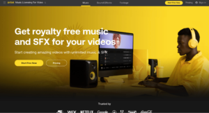
The Artlist home page has a great color scheme that’s aesthetically pleasing and consistent throughout their site. A few areas for experimentation could be the copy used, the CTA on their buttons, the placement of the buttons, and the hero image. They could leverage Taplytics Genius AI to create AI-generated copy suggestions for this experiment. They could also experiment with replacing the static image with a video or animation to see which variation performs better.
They also have an exceptional social proof bar with highly recognizable brands. If they have quotes from any of the companies that use their product that would be a great addition to their brag bar.
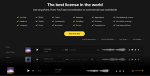
Directly below the hero image are all the places their music and audio effects can be used. Currently, they use checkmarks, however, they could see if replacing the check marks with icons helps increase engagement.
After scrolling down, a music player pops up at the bottom which provides immediate value for the user by showcasing the product. Artlist could experiment with what song a user is shown first. One downside of this bar is that there’s no way to remove the player. It would be a great experiment to see if adding a button to minimize the audio player is preferred by users.
Filters
The page has a wide range of sounds along with detailed filters. The main filters are mood, video theme, genre, instrument, and spotlight. From there, there are even more details a user can search into to find a sound.
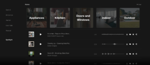
Under the Sound Effects tab, they start with showcasing different effects. After clicking on the home category, they have even more effects within such as appliances, kitchen, doors and windows, and outdoors. The search can then get even more specific. In the appliances category, there are more detailed sounds like cooking, squeaking, crunching, and crushing. These filters are great for helping users find exactly what they’re looking for. Another search option would be to have a search by sound feature where users can upload a sound or specify a certain sound in a YouTube video that they want to find similar sounds based on.
Saving and Sharing Sounds
Once a user has found a sound they like they have the option to download, save, star, or share it. Downloading a sound saves it to a user’s device as an MP3, however, they’re prompted to subscribe to get higher quality WAV files. This is a great prompt and timing to ask a user to take action since it shows the value of subscribing.
Users can also create collections by clicking on the folder icon. Users can name their own collections and create as many as they want. An experimentation idea would be to have a prompt that says “take me to my collection” after adding a song. Once on the collection page, Aritslty should recommend sound suggestions based on the collection similar to how Spotify will provide song recommendations to add to your playlists. This could help users discover new sounds, increase engagement and build loyalty to the app.
Starting a sound is similar to liking it. Once a user clicks on the start button they’re prompted to create an account to access this capability. The share button allows users to share through copying a link, sharing directly on Facebook, Messenger, Twitter, Whatsapp, and email. They could also try including iMessage and Instagram.
Create An Account
When a user wants to create an account they’re given two options; to subscribe or start for free. Upon clicking on start for free, they have social sign-in options which create a smooth user experience and minimize friction.
They could experiment with the imagery used to see if changing the image or replacing it with a gif, graphic, or video helps increase form submissions.
After signing up, users are brought to a plan page. They could experiment with their pricing to see if charging a slightly higher or lower price impacts sign-ups or seeing if changing the price for certain users makes an impact. This could be done by running an experiment with Taplytics. Other options include testing if adding a coupon or discount code increases sign-ups as word of mouth is an incredibly effective way to gain new customers.
In addition, they could experiment with changing the layout of the gestures to list all the features available in a chart and have a check or x to visually let users see the difference between all of the plans.
Overall, Artlist has a great website that’s easy to navigate and aesthetically pleasing. They still have several opportunities for experimentation through copy, page layout, pricing, and imagery.
With Taplytics, Artlist could incorporate no-code A/B testing along with the Web Visual Editor to incorporate those changes and drive conversions.
Learn more about why teams pick Taplytics over Optimizely and how our pricing compares.


