How CNN Can Keep Up With Their Competition Through Experimentation


CNN is an international news organization with headquarters in Atlanta which was founded in 1980. They’re owned by WarnerMedia with over 4,000 journalists worldwide which provide 24-hour coverage. They had 914,000 viewers in Q2 of 2021 for cable news, making them the third most-watched prime time show.
With the rising competition of news sites to grab readers’ attention, it’s crucial to have a seamless user experience while leveraging experimentation to optimize all aspects of the web and mobile experience. We’ll dive into both CNN’s web and mobile experience to provide experimentation recommendations and areas they could improve.
Table of Contents
Website Home Page
CNN’s home page has a big flicker effect. They should look into fixing this since it can negatively impact their SEO and deter users from staying on their site if articles take too long to load. Their pages are also loading longer than their competition. Their first contentful paint takes 3.7s compared to 1.2s on USA Today. Their first input delay is 34ms vs 19ms, their largest contentful paint is 5s vs 1.6s and their cumulative layout shift is 0.38 vs 0.02s with USA Today. This gives CNN an overall score of 15 compared to USA Today’s score of 80. This proves their need to increase their site speed as their main competitor is significantly faster.

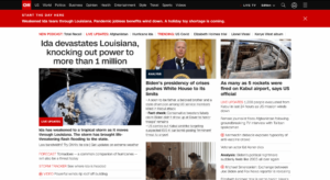
They have a red bar at the top that rotates throughout the day. This “start the day” prompt is great for showing users top stories and catching their attention. They could experiment with the size of the bar, where it’s located, and how much room it takes up on the page.
Other areas for experimentation include the overall format of the page. They could see if changing the order of the news sections in the header bar improves engagement or see if playing a video compared to showing a static image or carousel of images for the live update increases conversion. For the live update on the tropical storm image, they used a carousel, which shows the user several images, however, it would be worth experimenting to see if a video or static image performs better for this section of the home page. For the live updates article, they could also experiment with where the “live updates” tab is. Currently, it’s at the bottom left corner, but they could see if moving it to the top would increase engagement.
They could also test the number of images on the page. Above the fold, they show 4 images but they could see if increasing or decreasing the number of images has an effect on engagement.
Another recommendation would be to test adding an estimated time to read the article or watch the video. This can help set expectations with the reader and help them find something they’re interested in reading based on the time commitment they want to spend on a news story.

Below the fold, they have a news and buzz section with a list of articles and videos along with a life in the pandemic section and a couple of ads. Under the 2 ads there is a bit of white space so they could try adding another advertisement to make more money or replace the while section with another article.

Even further down on the home page they have sections for different types of news from World, US, Travel, and Entertainment to name a few. Here, they could experiment with the order of these categories and the stories shown.
World News

Upon clicking on the World News section, there’s a big flicker effect which users also experience on the home page. This section of the website has only one main story as the focal point with an advertisement on the side. They could experiment with having a carousel of rotating stories in the header section to show a wider variety of stories. This page also has a lot of white space, giving them the opportunity to add more stories above the fold or to experiment with making the image larger.
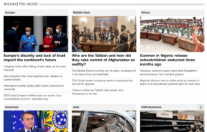
Further down on the page, they have an “Around the world” section with top stories from different regions. They could experiment with rotating the images in the top story for each section by adding arrows where readers can click to see a new story for each region in the main story section for a certain region.
In terms of the layout, they could add a fun visual such as a world map with the headline from top stories pointing off of the country they’re from. This would be a unique way to showcase top news stories while giving readers a glimpse into what’s happening around the world.

Another alternative would be for certain countries to be filled out in red and the reader could hover their mouse over a country that’s colored to have a story from that country appear which they could click into like in the example above. This would add an interactive element to the page while giving the ability to quickly see what’s happening around the world in a glimpse.
App
Onboarding
Once a user downloads the CNN app they’re asked to find and connect to devices on their local network. CNN does a great job at explaining why it’s beneficial for the user to opt-in, however, they should still experiment with the messaging since onboarding is such an important step. To create new messaging they could leverage Taplytics Genius AI to receive AI-generated copy suggestions.
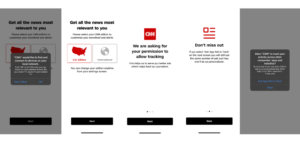
Next, they ask if the user would like U.S. or International news and they ask for tracking permissions. Again, they do a great job at explaining how this is beneficial and how tracking helps fund their journalism which gives users a reason to opt-in. A great thing about this onboarding process is that they have small dots at the bottom of the screen indicating how long the process will take.
CNN does a great job at enticing users to opt into push notifications. Users are given a list of news topics they’re interested in and after selecting a few, they’re then asked if they want to receive alerts on the topics they selected. This is a great way to show the benefits of opting into push notifications since the reader tells CNN what kind of news they’re interested in seeing, then they’re asked if they want to receive alerts for those topics which province’s immediate value.
One thing to note is that CNN never asks a user to sign in or create an account during the onboarding flow. They could experiment with adding this step.
App Home Page
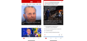
After completing the onboarding flow users are taken to the home tab which has a “start the day here” prompt at the top of the page with a top story. Underneath, they have a larger header image which takes up almost the entire page. The home tab has a lot of large images and very little text.
At the top of the page, they have a list of categories that users can scroll horizontally to see. It would be beneficial to test if having these news categories on another tab like the search tab in an easier-to-view way would increase engagement. Currently, users don’t see a lot of stories due to the large images and little text. If they had a tab with categories that highlighted a top story from each news category it would show users more content and it would increase the chances of users seeing something they’re interested in.
It would also be beneficial to experiment by adding a short blurb about each article. This could be done by making the image smaller and adding a small bit of text underneath explaining more about the story rather than just showing the headline.
Reading an Article
Once a user clicks into an article it shows a video at the top with a rotating section of “more coverage” which shows articles that are related to the story the reader is on. A great addition would be to add an estimated time to read the article at the top so a user knows how long it will take before beginning to read. If a user is taking a short break and doesn’t want to commit to reading a long story this could help them find something that fits within the time they have.

After scrolling through the article the large video turns into a small header at the top. This isn’t user-friendly as it blocks part of the text and there’s no way for a user to minimize the video screen. Even if a user swipes up on the video, it stays at the top so they should provide readers with a way to remove the video as they begin to scroll further down the page.
Share and Save
A great thing about the CNN app is that it’s easy to share and save articles. There are clear icons at the top which allow readers to easily share it or bookmark it for later. Upon clicking on the save button for the first time, a pop-up appears which informs users that the story was saved and where they can access it. An idea for CNN would be to add a small animation during this section of an arrow that points directly to the saved tab so users are immediately shown where to access it for later.
On the saved tab, there’s a list of all the stories a user has saved. The only action available on this tab is to read or delete the stories. CNN could add the ability to add folders for saved stories so users can categorize them. They could either let users name their own folders or provide recommendations for folders such as world news, entertainment, or whatever section the article was under. This would add another element of personalization to the app and let users quickly come back to articles they want to read.
Search
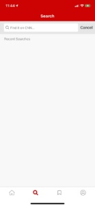
The search tab is simply a plain screen that allows users to look up stories. This tab would be a great place to show blocks with different news categories that users can click into. CNN could add the news categories that show up on the top of the home tab on this tab. Alternatively, they could offer search suggestions such as world, news, politics, business, and opinion to help get a user started on looking up a news story.
Another suggestion for the CNN app could be to add a “for you” tab with news stories that the reader opted in to see notifications for. They could also allow a reader to customize the “for you” tab by selecting the types of stories they want to see, or they could create a curated list of stories based on a user’s reading habits on the app. This would help create a more personalized experience for the reader and allow them to see content they’re interested in which in turn would result in them spending more time on the app.
Overall, the CNN app and website are easy to navigate, however, there are several areas for improvement and experimentation from the flicker effect on the website to experimenting with the layout, copy, images, and format of their app.
They could use the Taplytics Web and Mobile Visual Editor to create no-code experiments on their site and app. Learn more about why teams pick Taplytics over Optimizely and how our pricing compares.