Optimize Your Website Through A/B Tests

What is A/B Testing?
A/B testing is a way to compare two versions of something to figure out which performs better. It’s often associated with websites and apps, but A/B testing can be applied to any situation where you want to see which version performs better.
In a split-test, a portion of a business’s audience automatically receives the “version A” of a marketing message and the other half of the audience automatically receives the “version B.” The success of each version is based on the conversion rate goal such as the percentage of people who click on a link, complete a form, or make a purchase.
There are many factors that influence whether someone clicks on an ad. People might be more likely to click on a button of a certain size on a mobile device, but on a desktop, it might be the opposite. This is why you should always randomize who is in what group. Randomizing can help you minimize any other factors that might affect your ads, like the type of media someone is using.
Splash Financial is a leading digital financial lending platform that partners with credit unions, banks, and lending partners to help students find the best loaning options. They offer medical school and student loan refinancing, in-school student loans, and personal loans. Splash Financial has low rates, no application fees, and creates an easy application process for students. We’ll look into how Splash Financial can run A/B tests to improve its website.
Table of Contents
Website Home Page
The Splash Financial website has a clean layout that is easy to navigate. To optimize their site, they could experiment with the copy, the icons used, and the order of the products in the 4 boxes. They could also see if making the chat box pop up to say hello to a user increases engagement.
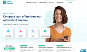
Directly underneath the hero image, they include social proof to show reliability and gain trust with users followed by a list of their benefits from low rates, easy online applications, and personalized support. They could experiment with the imagery used in this section with the Taplytics Web Visual Editor or try adding a video or animation. In addition, they could experiment with the order of the value propositions or use Taplytics Genius AI to generate AI copy suggestions.

At the very bottom of the home page, they have 3 boxes showcasing how the product works. However, once a user clicks on “explore our products” they’re simply taken back to the very top of the page rather than to another landing page explaining the products in further detail. A recommendation would be to create a new landing page once a user clicks on explore products that give a user more details on Splash Financial’s offerings.
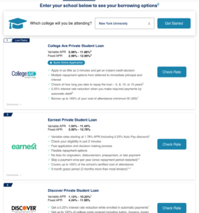
Student Loans
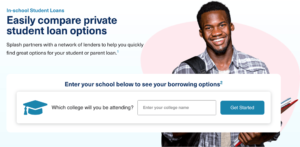
On the student loans page, they have a box where students can input the university they will be attending. After clicking on the get started button, they’re shown a list of borrowing options that clearly state each variable and fixed APR. A great thing about this page is that they rank the options which is incredibly useful for students who may not be financially savvy and allows users to quickly find the best loaning options for them. They also highlight the perks of each loan. Upon clicking on a rate, a user is taken to another site for the borrowing option they selected.
Frequently Asked Questions
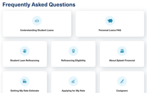
Splash Financial has a minimalistic and easy-to-follow FAQ page. It’s not overwhelming and easy for users to navigate, however, they could experiment with the placement and format of the boxes. In addition, they could include videos explaining how their service works or videos explaining concepts like what is a student loan, what is refinancing, and tips for students who need to take out a loan. If they create an explainer video it would be a great visual asset to include on their homepage since it provides immediate value to users.
Refer A Friend
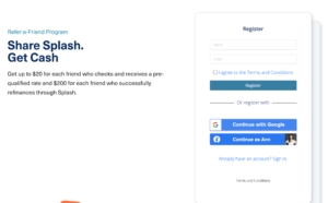
Splash Financial has a refer-a-friend program where users can earn and give money to friends who sign up for Splash Financial with their referral link. Their copy demonstrates clear value, however, they could optimize this page by experimenting with the copy and imagery. They include social sign-in options which create a seamless experience for users and they send an email as soon as a user registers which includes their unique link and reiterates the value of referring a friend.
Learn More With Taplytics
Despite Splash Financial’s simplistic website, there are several areas they could optimize through A/B testing and experimentation. From testing the imagery, copy, and format of their pages, they have the opportunity to increase engagement with their users. They could easily create these experiments with Taplytics Web Visual Editor to replace the images and change the layout of the site while leveraging Genius AI to create new copy suggestions.
Learn more about why teams pick Taplytics over Optimizely and how our pricing compares.