The 6 Best Mobile A/B Tests To Run In Your App

There are endless amounts of mobile experiments you could run to increase in-app conversion rates and user retention. (For example, just testing the app icon alone has been proven to improve conversion by +30%.)
However, the limitless possibilities make it tough to figure out where to begin with mobile A/B testing.
Based on the success we’ve seen from our customers, we’ve identified six key areas of your mobile app where you can start split testing on to make an impact the fastest.
Get more mobile app A/B testing best practices and ideas in our free Mobile Experimentation Guide.
1. Menu Type
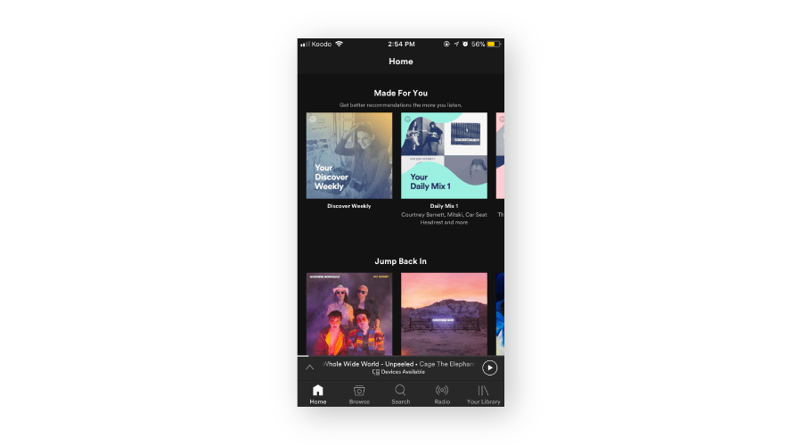
There are four main menu types; the classic hamburger menu, a sliding menu, a tab menu, and a swipe menu. Experimenting with these options can help you figure out which technique works best to help users find and explore all of your app’s content. Spotify uses a tab menu, which helps the user easily see the core functions of the app.
2. Promotions
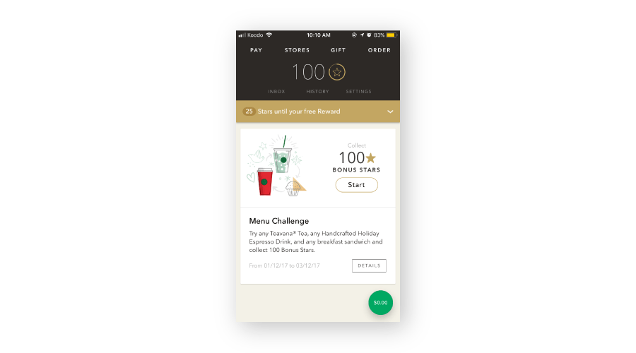
If revenue is a key metric for your app’s success, another area to test is how and where you communicate your promotions. Deciding where to place your promotion in your app, how to make it stand out, and what text accompanies your message can dramatically affect how your users interact with your sales. Starbucks makes their promotion appear right when the user opens the app so they’re immediately tempted to run out to their nearest coffee shop!
3. Checkout Flow
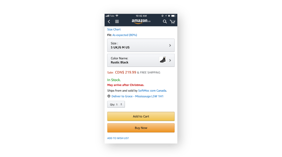
The checkout flow is key in a mobile app because it’s where your money is made. That’s why it’s so important to test different experiences in your checkout flow. Amazon has one of the best checkout flows out there with its one-click shopping cart and clear shipping price. Note how the ‘add to wishlist’ is in small writing, encouraging the user to buy now. Ensuring the checkout process is fast and simple will encourage purchases in your app.
4. CTA’s
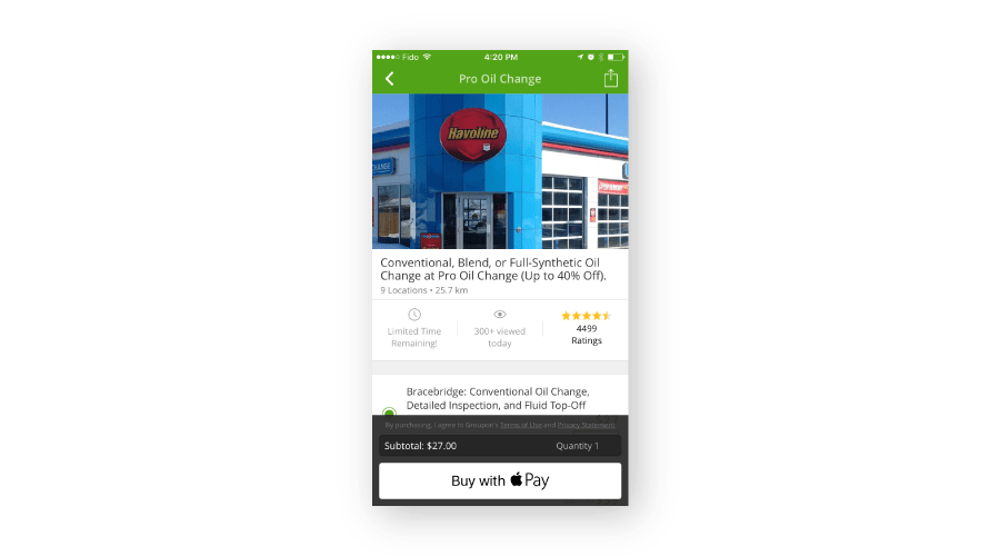
Try testing your CTA’s to see which colors and text make the most impact on conversions. For example, does “add to cart” or “buy now” convert more users? Does red or yellow make the biggest impact? Where should your CTA be located? Try testing out different options to see what creates the most impact. Groupon uses a floating CTA that allows users to instantly purchase using Apple Pay.
5. Context for Push Notifications and Location Opt-Ins
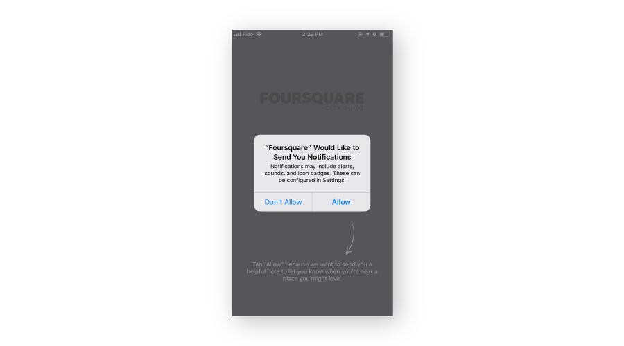
Users don’t like to give everyone their personal information. Foursquare does an incredible job of encouraging their users to opt-in for push notifications and location services with a clear CTA and an explanation of why they need the information and how it will benefit the users. Testing out different ways to encourage users to allow notifications and location services will help you keep in touch with them.
6. Onboarding Flow
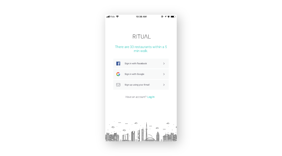
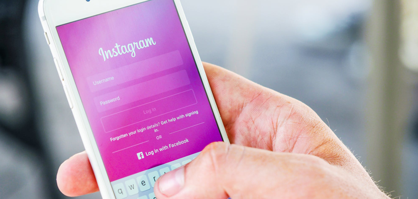
Test your onboarding flow by giving users choices for different ways to sign up for your app. Ritual gives the user an option to signup with Facebook, Google, or email address. A lot of users will sign in with Facebook because it’s a lot faster than entering in all their information manually. Having the onboarding process as short as possible can help increase signups.
The key to A/B testing is to iterate on your tests and to remember that no test is too small. So, get testing today! Contact us to learn how easy it can be.
Looking for more? Download our Ultimate Guide to Mobile A/B Testing.
This blog was originally published in December of 2017. It was last updated in late 2018.