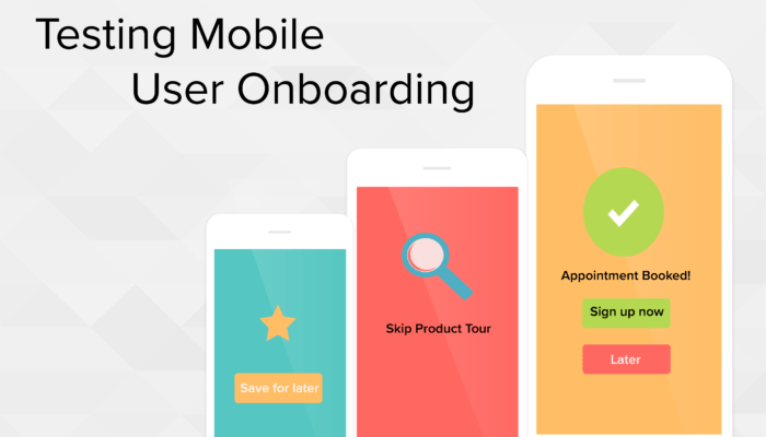
Optimizing user experience by creating a positive onboarding solution

When you build an app, you know what your product can do—but if you can’t communicate that clearly and quickly to your users, they’ll leave. People lose interest so easily that the average app loses 86% of its new users in their first use.
The key to retaining new users is onboarding: the process of explaining how your product works and why it’s worth their time. The way that you onboard users determines their first impressions of your app and whether they’ll stick around.
You won’t get onboarding right the first time, so it’s important that you experiment with how you’re communicating value to your users and iterate on the results. Testing different versions of your onboarding should be methodical and disciplined since this user journey stage is so critical.
To get started, we’ll identify quick yet powerful ways to experiment with your onboarding. Implement these tests to refine your onboarding so you can communicate the value of the app better and faster.
Learn mobile experimentation best practices to drive conversions for onboarding, engagement and retention in our free Mobile Experimentation Guide.
Defining Successful Onboarding
The first step in testing your app’s onboarding is setting your expectations. What does successful onboarding mean for your app? To determine your onboarding goals, growth advisor Casey Winters recommends asking yourself:
- What is your frequency target? (How often should we expect the user to receive value?)
- What is your key action? (The action signifies the user is receiving enough value to remain engaged)
Understanding what you’re trying to achieve through experimentation is crucial because it keeps you focused. Instead of making random tweaks to the colors of your calls-to-action or sign-up flow, you’re making methodical changes that allow you to show users the value of your app faster and more frequently. With each alteration you make, you can measure how frequently users are getting value from your app and whether they’re getting enough value to stay engaged.
Here are three areas of onboarding where you can get started quickly
- Product tutorials
- Sign-up options
- Notifications
These onboarding components can all be easily varied to test on users and evaluate. With an effective onboarding process set after experimentation, users understand your product’s value and are driven to use your app frequently.
Test Your Product Tutorials
To appreciate your app’s value, a user has to understand how your product works. At the beginning of onboarding, you typically have about 3 to 5 screens to teach users the basics with a tutorial.
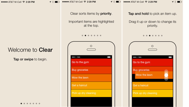
The tutorial for Clear, an app for building to-do lists.
[Source]
The temptation is to overload your tutorial with everything your app can do. The problem, however, with giving users too much information is that they won’t pay attention. Instead, they’ll get bored and close your app. At the same time, providing too little information leaves users anchorless. They don’t have enough knowledge to use your app and appreciate its value.
Testing multiple versions of your app’s tutorial illuminates the best way to educate users. Test different tutorials and measure users’ responses to your different versions. With this feedback, you can identify how to teach users in a captivating way while still providing the necessary info they need for using your app.
Here are a couple of quick ways you can start testing your tutorials.
Experiment with the number of pages
The more pages that need to be swiped, the more barriers there are between the user and your app. If you already have a multiple page tutorial, experiment by creating another version with fewer pages. Set up an A/B test with both tutorials and measure how app usage is affected by page count.
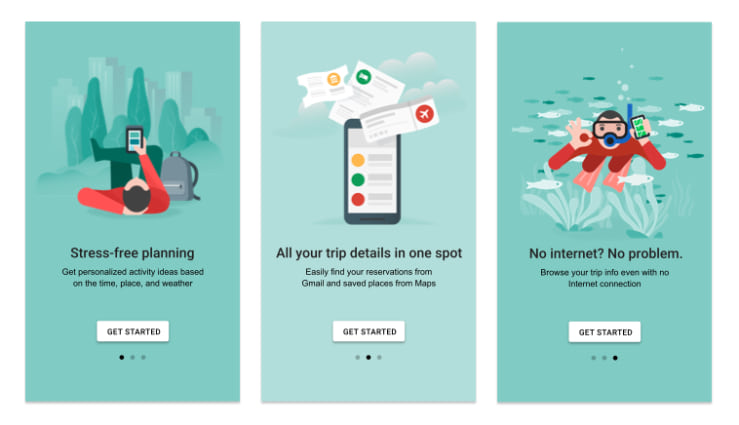
If you don’t think you’ll be able to cut down your pages, check out Google Trips as an example. Their app completes their tutorial in three pages while still providing key information about their product’s features.
[Source]
Avoid stuffing tutorial pages as a way to reduce your page count. Sticking the same amount of content on fewer pages will most likely create information overload for users. Instead, aim to cut out any unnecessary, supplementary content in your original tutorial to reduce your page count.
Experiment with the amount of info
Users are more distracted and less engaged by a ton of words. Vevo found in their testing that most users swipe through tutorials without reading any text.
Human psychology explains why visuals tend to be more captivating. People can process images in 1/10th of a second and understand visual content 60,000 times faster than words. Since users are anxious to start using your app, they would rather quickly process images than slowly read text in your tutorial.
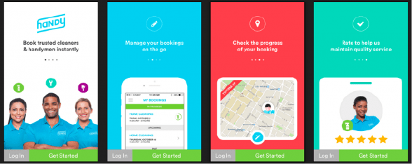
Handy, a platform for hiring service professionals like home cleaners and handymen, manages to convey the best features of their app with mostly visuals. With bright colors and very little text, the tutorial engages users who are eager to start using the app.
 If your app requires a lot of knowledge to use, don’t expect users to remember detailed instructions in a product tutorial. Communicate a couple of key points, and then get them to learn by doing within the app. Allowing the user to actually engage with the app as they’re presented with instructions will make the steps more memorable.
[Source]
Testing Sign-Up Options
Getting a new user to sign-up for an account is one of the most important milestones you can achieve during onboarding. When a user creates an account, your brand begins a relationship with them. You can use their sign-up information to connect with the user on a deeper level, such as personalizing their shopping experience and sending customized emails.
The problem is signing up is also a big point of friction. Users are just getting used to your app when all of a sudden, they’re asked to create an account with a long list of steps — entering their email, creating a password, submitting a code from a confirmation email.
But sign-ups are too valuable to miss — they’re the starting point of your app’s relationship with the user. Test sign-up options to find a way to invite users that’s frictionless and encourages users to create an account.
Experiment with the time of sign-ups
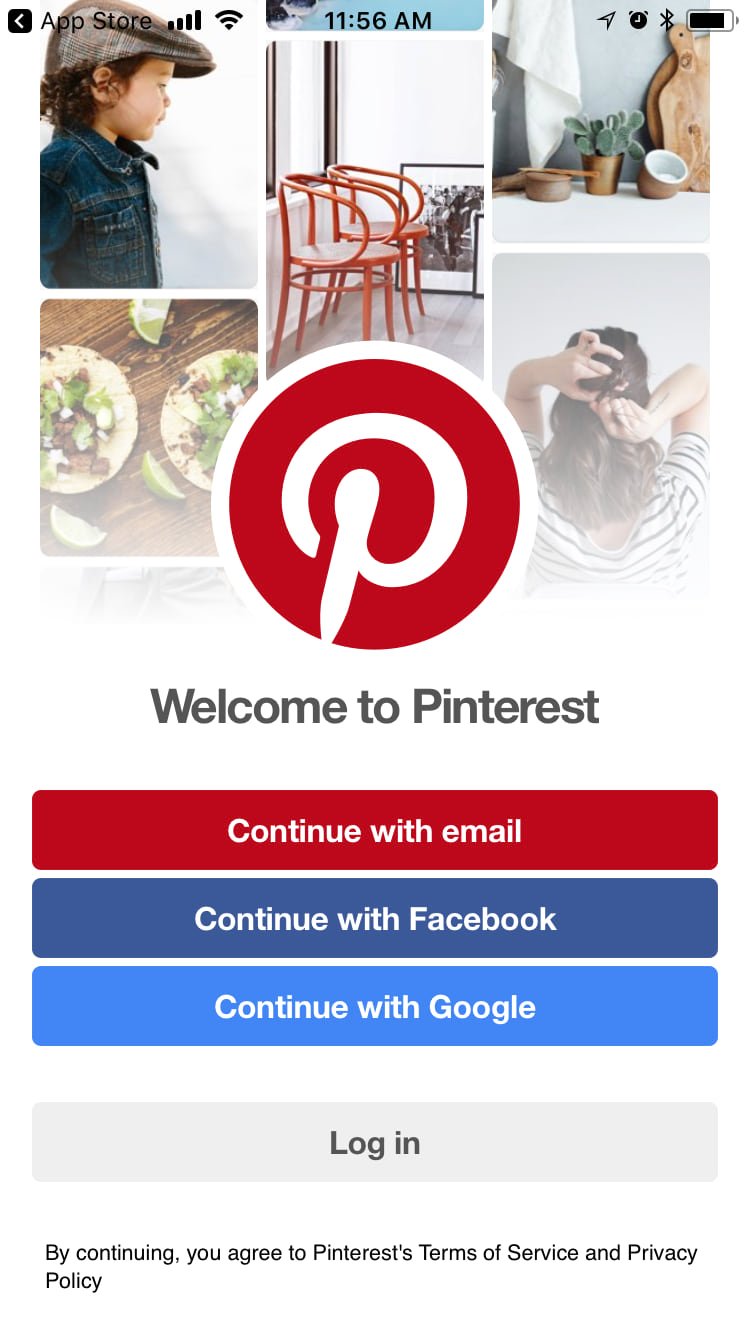
In an ideal world, you’d have ample time to show users the value of your app before suggesting that they create an account. In reality, when you force users to sign up all depends on the purpose of your app. Pinterest’s app, for example, isn’t functional without signing up. The social platform delivers users with a personalized feed of images based on their interests and the images they save.
Without an account though, users can’t save images and Pinterest can’t suggest images— so the app is useless. As a result, Pinterest forces users to sign up immediately when they first open the app.
Other businesses, however, have apps that are less tied to having an account. Many e-commerce apps, for example, don’t force users to immediately sign up since browsing products don’t require having an account. Sephora, in the image below, allows users to immediately start shopping without signing up after they download the app.

With your app’s purpose in mind, create a test version of your sign-up process that allows users to explore your app and see its value a bit more before needing to set up an account. If an account is required in order to use the app, your test version might only have a small alteration, such as adding a video to the sign-up screen to show users why your app is great. For apps that can be used without an account, create a test version where users have an option to sign up later and start using the app instantly.
Experiment with how users sign up
A lot of sign-up friction stems from the amount of information that’s requested when creating an account. People would often rather close an app than go through multiple annoying sign-up steps.
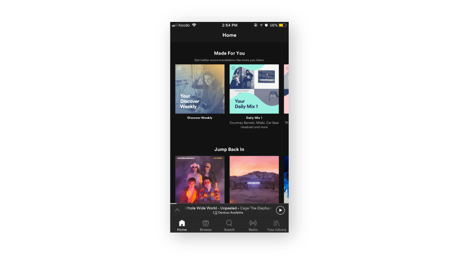
To reduce the number of users dropping off, experiment with sign-up systems that require less user information. Create a test version, for example, that allows users to sign up with a pre-existing account. Spotify, in the image below, reduces sign-up friction by allowing people to use the app through their Facebook account.
Be wary though of overloading your social sign-in options. Offering too many ways to create an account can overwhelm users and create a drop-off in sign-ups.
A test version might also reduce sign-up friction by reducing the account information to a single page. Spotify, in the image above, only asks users for five pieces of information to create an account. Users aren’t required to navigate through multiple pages or confirm their account via email, so the sign-up process feels less burdensome.
Testing Notifications
Notifications give you the power to increase your app’s usage. You remind users to engage with your app through notifications so using your app becomes a daily habit.
The trouble is convincing people to allow notifications. A user who is just becoming familiar with your app probably doesn’t fully trust your product yet. At such an early stage, they’re going to feel hesitant to allow reminders and share personal information with the app, such as their location, and may stop using it if you force these requests.
To encourage users to allow notifications, you have to prime them with the right incentives. Show users how enabling notifications will benefit them instead of blasting them with the request.
You can find the right way to ask users about notifications through testing. After experimenting, you’ll have more users allowing notifications from your app so you can connect with them easily and encourage regular usage.
Experiment with allowing users to move forward
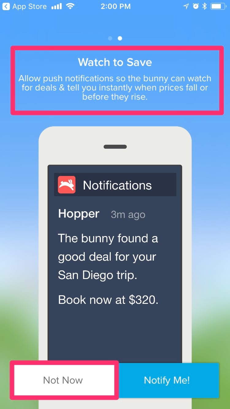
Like asking users to sign-up, requesting notifications all depends on your app’s concept. With some apps, such as the travel planner app Hopper, allowing notifications is critical. Their product is useless if it can’t remind people of flight price drops.
Even if your app depends on notifications like Hopper’s, create a test version that gives the users the ability to opt out of these requests while still stressing the importance of allowing them. Hopper, in their onboarding, has a “Not Now” button to delay allowing notifications, but it also explicitly states why allowing notifications makes the app so useful.
Instead of closing the app and never returning, users who are hesitant to allow notifications can explore your product with the “Not Now” button and see its value firsthand. Experimenting with allowing users to move forward will show whether retention improves or weakens by forcing notifications.
Experiment with the language of your requests
Requests to allow notifications can often feel cold and demanding with direct language. See whether retention improves by experimenting with a personal, friendly tone in a test version of your onboarding. Expensify, for example, calls their notification system “Concierge” and uses warm language to request notifications from users in their onboarding.
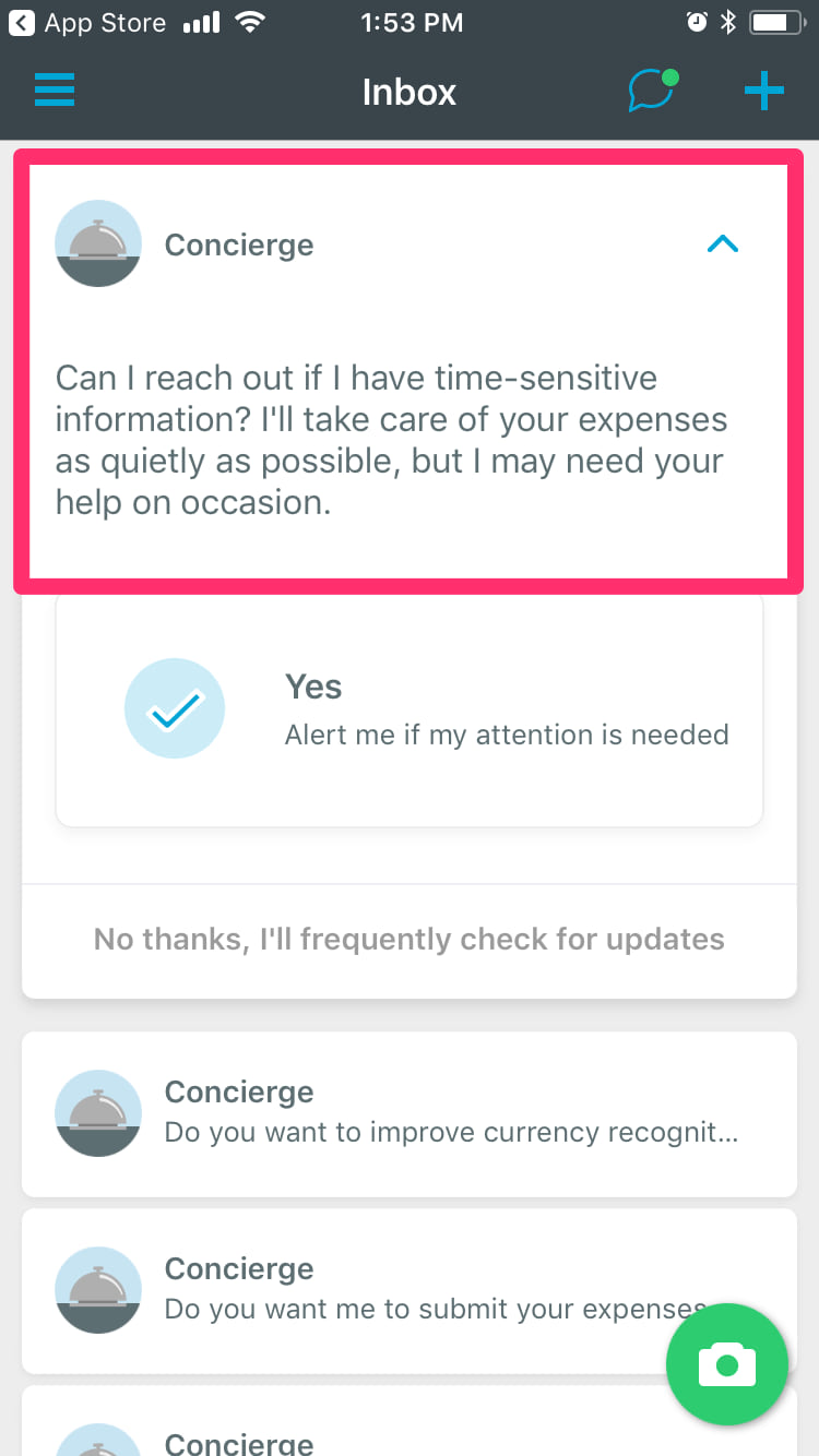
Using conversational, polite language to ask about allowing notifications makes the request feel less invasive and more helpful. With this change in tone, your users may feel more willing to allow the notification and continue using your app instead of dropping off.
More Experimenting, Better Onboarding
The first draft of your app’s onboarding flow isn’t going to be the most engaging version. It’s nearly impossible to predict how users will interact with your app, so your onboarding has to be refined by testing it with users. Tracking users’ responses to different test versions of your onboarding highlights the problem areas of your onboarding. With these insights, you can change any features that need adjusting to make your onboarding more engaging.
Experimenting to make your onboarding captivating and frictionless pays off in the long-run. By testing, you create an onboarding experience that makes a lasting positive impression. People understand how to use your app and why it’s valuable, so they’re motivated to become regular users. The more you test and improve your onboarding, the more it will drive your app’s long-term growth.