4 Steps for Optimizing Fintech & Finserve Mobile Apps

Building finance apps isn’t easy. The data privacy, security and regulation challenges make earning and retaining mobile users harder than almost any other app type.
However, there are a few key areas finserve and fintech mobile apps can focus on improving if they want to build user trust faster and make their platforms stickier.
In this post, we’ll walk through a 4-part framework we use to help our financial clients evaluate and optimize their mobile apps—which you can conveniently use to assess your own app. 😉
Read on to get our top insights for refining your onboarding flow, use of in-app personalization, UX/design, and push notification strategy, based on experiments that have been run on our platform.
p.s. Want to skip this blog and get us to assess your app instead? Sign up here for a complimentary assessment teardown.
Fintech/Finserve Mobile App Optimization Area #1: Onboarding
When people use a mobile finance app routinely, it’s usually because of effective user onboarding. Efficient onboarding teaches users the core value of the app early on, so they build a habit around using it from the start.
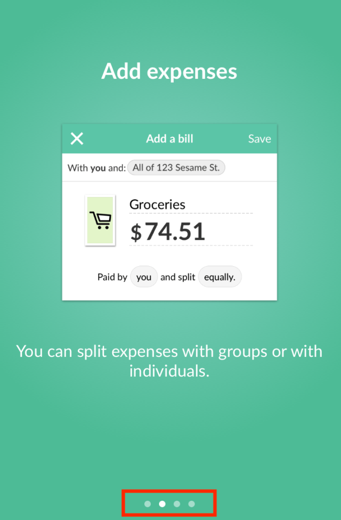
However, many onboarding flows in finance apps are lengthy (and sometimes, a bit scary) because of the personal data and permissions required from the user—which causes drop-offs mid-registration.
Here are a few ways you can optimize your registration flow so more users complete it—thus giving you the information you need to create an app experience that is personalized and engaging from the start.
To evaluate your onboarding, ask:
A: How many screens does your flow have? Are there any steps that you could eliminate, and have users complete once they are inside the app?
Testing the number of screens in your onboarding is important so you can find out if the length of your process is reducing signups.
To reduce friction in your onboarding flow, you may want to consider collecting information like goals, preferred communication methods and account verification after the user has created their basic account. Tutorials or tips that you want to communicate are often best when presented in-app as pop-ups or inbox messages once the user logs in vs. being explained in the signup flow.
B: Is there a progress bar, or indication of how much further there is to go?
Users like to see a light at the end of the tunnel, especially when it comes to flows that are on the longer side. According to research by FirstRound, adding a progress bar can increase conversions by 40%.
C: When in the flow do you ask for key information?
Consider asking for essential information (like name and email) as early as possible in the flow. By getting the user’s name and opt-in for push or email communications, you can contextually reach out to remind them about their abandoned progress with a message like:
“Brooke, you could have earned $60.00 by now – complete your registration to get earning!”
D: Do you explain why you’re asking for personal information?
When you need to collect personal information from users, they often question why you need it. If you give your ask more context, users will be less hesitant to share their information with you.
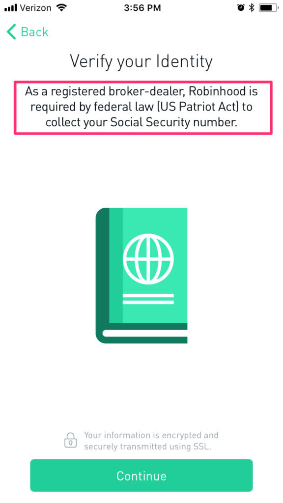
You may want to explain the financial regulations impacting your app, the benefits of granting your app access to your users’ information, or your app’s security features so users have less questions and feel more comfortable moving forward.
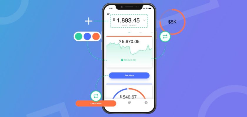
Fintech/Finserve Mobile App Optimization Area #2: Personalization
Because each of your users is unique, their experience in your app should be personalized, too. This is particularly relevant for finserve and fintech apps, where each users’ goals, tolerance for risk and finances will be extremely different.
To evaluate your use of personalization, ask:
A: How are you using customer attributes to personalize what offers and communications users receive in-app?
Depending on what type of services you offer, you could use customer attributes (demographics, goals, products used, etc.) to communicate targeted suggestions and offers in-app that feel relevant to your users.
For Example:
- If a customer’s rewards level is Gold, then show them an option for using those rewards, or explain how they can get to the next rewards level, on their homepage or in their inbox
B: Do you personalize the in-app experience based on user data? Are you rolling out features to only relevant users?
Many times, new features or products are announced broadly and rolled-out to all users. However, testing what products or features users see in the app based on their preference or usage data can be a better experience for them since they aren’t being hit with irrelevant offers or notifications.
Testing roll-outs with different subsets of users based on behavior can also give your team a better understanding of how to present new features or products so they are adopted (vs. a broad launch that may miss the mark with some users).
For Example:
- If a customer qualifies for a new insurance product, then have the new product tab appear when they log in
C: How are you personalizing push notifications for each user?
Too many irrelevant notifications can cause users to opt-out of further communications. Personalizing push and email notifications are one of the best ways to re-engage users.
For example:
- If a customer has visited the app less than 4 times this month, then send them a personal push or email message nudging them to come back.
Note: We’ll cover more on push strategy in section 4!
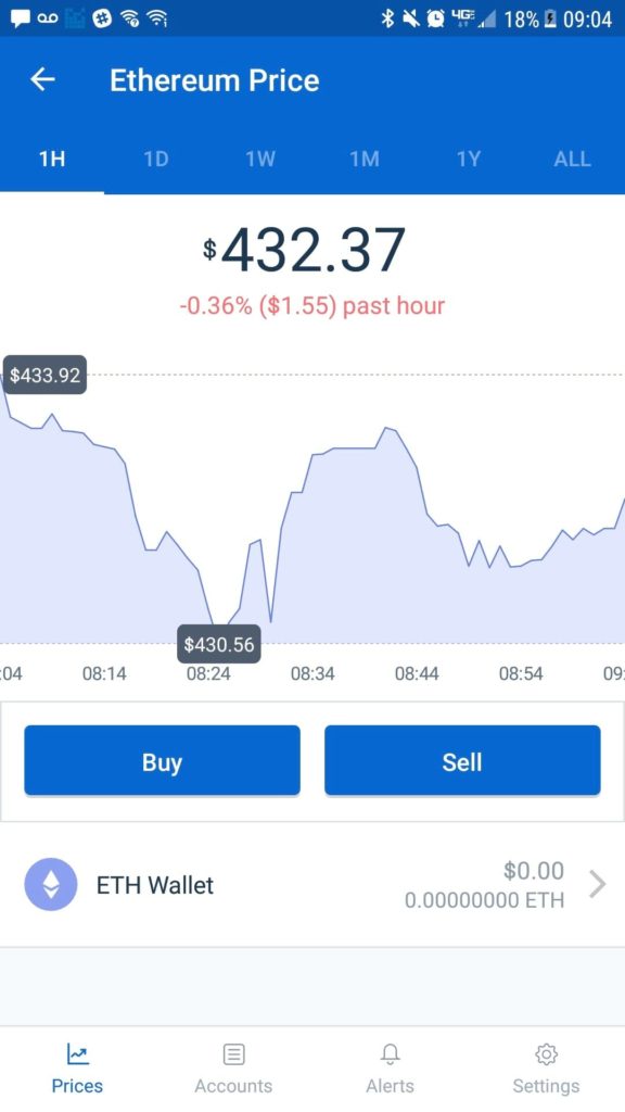
Fintech/Finserve Mobile App Optimization Area #3: UX Design
Designing your mobile experience with users’ interests in mind can reduce the friction points finance apps often face. By continually testing your design and simplifying your UX, you can reduce user effort, increase trust, and make personal finance less intimidating to your users.
To evaluate your app’s ease-of-use, ask:
A: Can users of all sophistication levels easily find what they’re looking for?
According to Think with Google, 64% of people say they find their favorite finance apps valuable because they are easy to use and navigate. Ease-of-use is extremely important in transaction-focussed apps, especially given the range of technical-proficiency users may have.
Simplifying key metrics and financial dashboards, as well as your navigation, are all key to creating a painless app experience.
Additionally, providing easy access to customer support in-app is crucial to show your users that you’re committed to helping them achieve success.
B: How often are you testing small changes to color, copy, etc to optimize the app and verify user behavior?
Seemingly small changes to elements like buttons and text can have a large impact on your app’s ability to convert users. For example, Lottery.com saw a CTA click increase of 60% from a simple button color experiment.
Considering experimenting with:
- Key conversion points
- Navigation structure and feature names
- Homepage design
- Dashboard layouts
- Ad CTAs
C: If you have in-app ads or prompts, where and when in a user’s session do they appear?
Your users typically log in with a specific intention. Whether they want to check a balance, make a transfer or browse for information, they came into the app on a mission. Big pop-ups can create friction and gets in the way of what they were trying to accomplish. Consider placing these offers like these after the user completes their session when they will be more willing to browse other products.
Similarly, if you are trying to draw attention to new features or offer usability tips, ask yourself if they’re being sent too often in the same format, which may be conditioning users to ignore them. Sending messages via email is a popular alternative to encourage feature adoption vs. relying on push notifications.
D: Is your app cluttered with features? What do people primarily use your app for?
Sometimes, apps strive to achieve parity between their websites and mobile apps. For some finance companies, this makes the app stuffed with features users may not want to use an app.
According to a Think With Google report on finance apps, the top activities performed on mobile devices are checking purchase history, making a payment and transferring money.
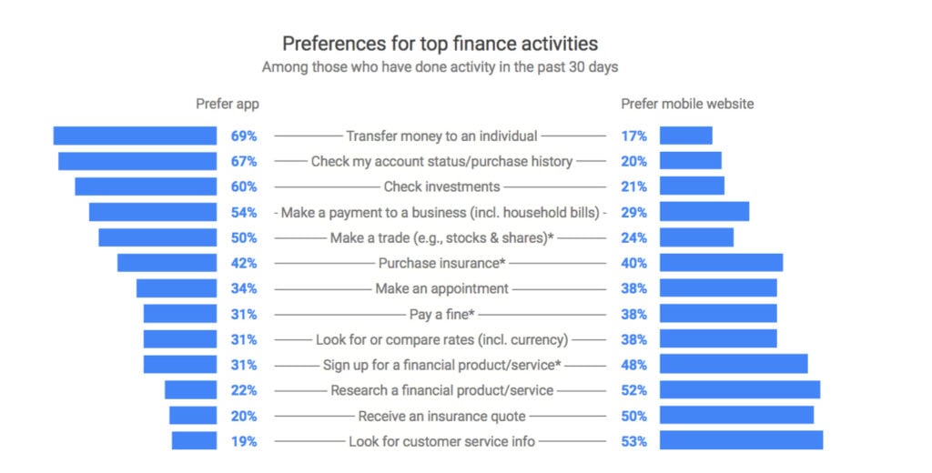
Consider focusing on making your core functionalities easy to find and use.
Here are some other behavior norms that may help you decide on the key features and values your app is going to most prominently offer:

Fintech/Finserve Mobile App Optimization Area #4: Push Notifications
Push notifications can increase engagement and retention, no matter the industry. Sending user-specific offers, tips, and reminders can all enhance your users’ experience and bring them back into your app.
To make sure that you’re effectively leveraging this channel, consider not only the content of your push notifications, but also how you’re respecting user preferences and privacy.
To evaluate your push notifications, ask:
A: Do you explain the value of receiving pushes when asking users to opt-in?
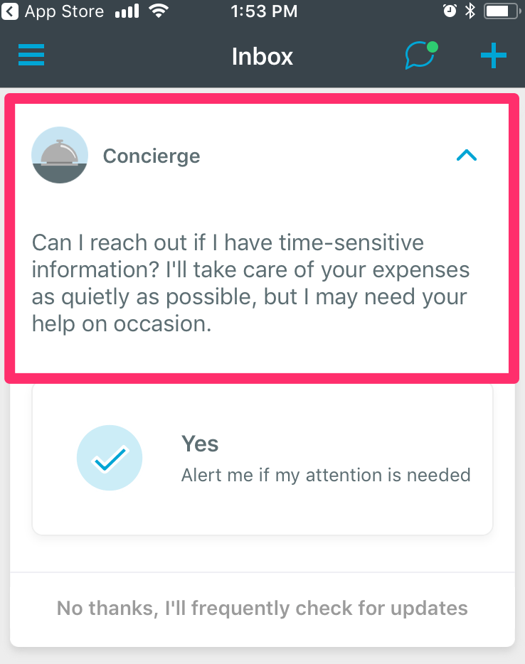
By explaining what value your push notifications offer, you’ll create more of an incentive for users to opt-in. This step is especially important to create on iOS apps before users are presented with the generic push access prompt (which they often decline). Catching your users’ eye with something other than the default opt-in request will incentivize them to allow notifications.
For example, “Concierge”, Expensify’s notification system, uses friendly language when it makes a case for notification opt-in during onboarding. It tells the user that they will only receive notifications when their attention is required for an urgent matter.
B: Is the content you’re sending them customized to their preferences?
It’s helpful to offer different settings and preferences for push notifications, such as how often they wish to receive pushes, what type of content they would like to receive, etc. This ensures you’re only sending content you know they want.
Think With Google research found that finance app users say that the most useful notifications are for:
- Possible account privacy or security concern (according to 55% of users)
- Transaction updates (56%)
- Financial update of their account (e.g. balance or deposit alert) (54%)
- App upgrade notices, including new features availability (38%)
- Appointment reminder (32%)
Outcomes of a Finserve or Fintech Mobile App Optimization Assessment
By assessing these four key areas, you’ll have a better idea of areas you can optimize in your mobile app to increase registrations, improve the in-app experience, and keep users engaged in the long run.