Spotted: Spotify’s Multi-Feature Rollouts

It’s becoming increasingly common to see an update in an app without having to update through the App Store or Google Play Store first – this just means that you are part of a rollout. Rollouts are a very common tactic that companies use to release new features, UI, and functionalities to groups of users at a time. It’s always interesting to compare these surprise updates with other users to see if they got the new feature too.
Spotify Rollouts
Interestingly enough, over the past two weeks, several people in our office noticed that they were part of three different rollouts in the Spotify iOS app, and all at different times with different combinations of the variations.
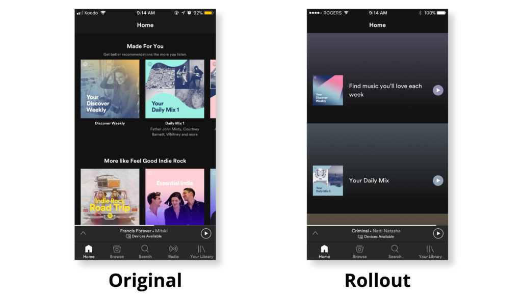
Homepage Layout
On the original home page, users scrolled through the variety of playlists horizontally and when they selected one, they were brought right to the full playlist. In the rollout variation, the playlists were to be scrolled through vertically and when selected, they only expanded to show the first four songs, making the user have to click again to access the full playlist.
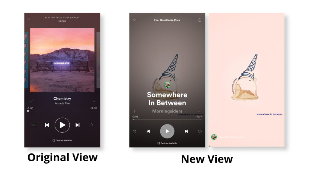
Animated Album Artwork & Full Screen Viewing
Hard to say if this is the work of Spotify or just a crafty artist trying to stand out on the platform, but we found an animated album artwork for the first time.
However, the tradeoff for this is that when you click to see the animation full screen, you no longer get to see the song title or controls.
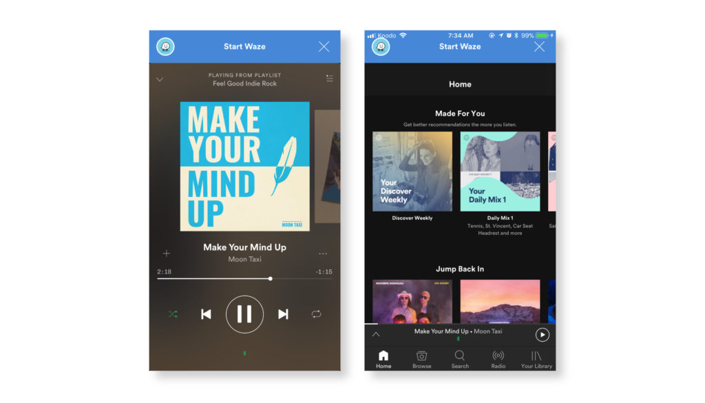
Waze banners and popups
This feature is old news – Spotify forums were on fire last spring with users complaining about the intrusiveness of the Waze banners and popups in their Spotify apps soon after the two announced a partnership. However, none of us in the office has the Waze popups until the last couple of weeks. Only one user saw this update, and it was in combination with the full-screen viewing mode update.
The Waze update can be annoying! Even if users don’t have the app downloaded or integrated, the pop up continues to intrude the listening experience.
Why do Companies use Rollouts to Release New Features?
- Control which users get new updates first: Creating control groups to manage who experiences your new release helps you understand how different types of users react differently to the update.
- Measure immediate impact: By controlling the rollout and sending out the release in small increments, it’s easier to monitor and measure its impact as it happens.
- Mitigates risk: Having the ability to rollback if something doesn’t go to plan is key. If these new features were mass released with several undetected bugs that caused a surge of negative online reviews and attention, it would be hard for Spotify to take them back and make fixes before the full user base was exposed without the use of a feature flagging tool.
What’s really interesting about this particular set of feature rollouts is that the update with the vertically scrolling homepage playlists did not stick around for very long – after a few days, the user opened the app to find that the layout had reverted back to the original. This indicates that Spotify had rolled back the change. And apparently it was done rightly so, as the user said that the experience was not great- you could only see 2 playlists at once and when you clicked on one you only got to preview the first 3 songs.
Have you been getting any of these Spotify updates, or any others that we haven’t included here? We’d love to hear what you’re thinking and seeing!
app version – Spotify v 8.4.28
Device – iPhone 6S
OS – iOS 10.3.3


