Really Good UX Decisions from Customer-Centric Teams

People think style is the key to great UX—an app with sleek graphics and elegant design has the “right look,” so it should perform well with users.
But prioritizing the aesthetic of your app actually leads to bad UX. You place an unnecessary design element in your app because it has a cool feature, and the fancy addition only leaves users annoyed or confused.
Great app design—the kind that motivates users to engage with the app—is driven by users’ preferences and behavior, not just stylistic judgment. When UX is crafted from the perspective of customers, the design actually satisfies users’ wants. Adding buttons, menus, or other digital objects to fix customers’ issues is what keeps people excited about using your app.
Understanding how great UX decisions serve customers is the key to boosting app engagement. Below we’ve broken down four success stories of great UX in major apps. Understand these wins, and you can refine your design to create a better, customer-centric app experience for your user.
Learn the best practices of personalization for push notifications to deliver delightful app experiences in our free guide!
Success 1: Build the UX Around Variable Rewards
Increasing app engagement isn’t always about what rewards you offer—these rewards also have to be presented in a way that incentivizes users to come back for more.
Users keep coming back to apps when their UX offers rewards in an unpredictable fashion. When rewards are given in an expected way, users’ brains give off a stable level of dopamine so they don’t feel especially engaged. Variable rewards are different—when we’re constantly anticipating a reward because we don’t know when it will be given, our brains release even more dopamine.
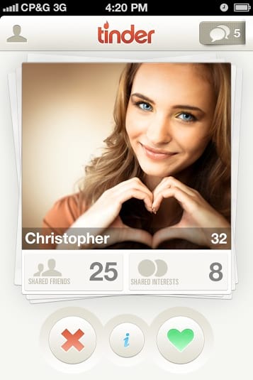
With this behavioral psychology, Tinder makes the fundamental action of their app—swiping left and right—incredibly addictive through variable rewards.
[Source]
Each “yes” right swipe presents a potential reward—you don’t know whether the person could be a one-time date or a lifetime lover. Users aren’t sure which person will be the best match, so they maximize their chances of success by continually swiping. The lure of that major reward drives the user to continue using the app until they finally meet the right romantic partner.
Tinder motivates users even more with this variable reward system by making swiping a low-investment activity. There’s no cost to swiping—users can move through as many photos as they like on the app for free. And it’s low effort as users simply have to touch photos to pick them up and move them left or right.
Offering variable rewards that require little user investment, the UX of Tinder keeps the app’s engagement high. Users are excited by the prospect of meeting their perfect romantic match, so they keep swiping and using the app to eventually achieve that reward.
Success 2: Improve Personalization with User Data
Personalized UX is more than including a user’s name in an app screen. It’s individualizing their experience in a way that makes it feel more familiar so they’re comfortable using your app.
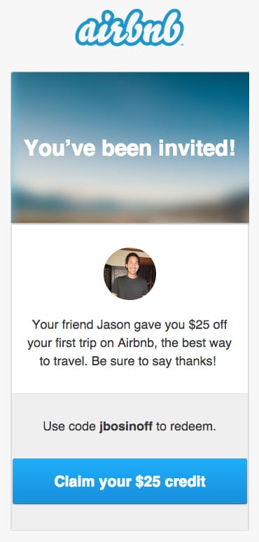
Airbnb found a clever way to personalize their app referrals and make their product much more user-friendly. Rather than just sending users a referral link from friends, Airbnb personalizes the app download page with the same referral information to build user trust.
The referral process starts with an Airbnb user sending a friend or family member a referral. That person receives an email with a message saying that they’ve been referred to Airbnb from whichever person they know.
[Source]
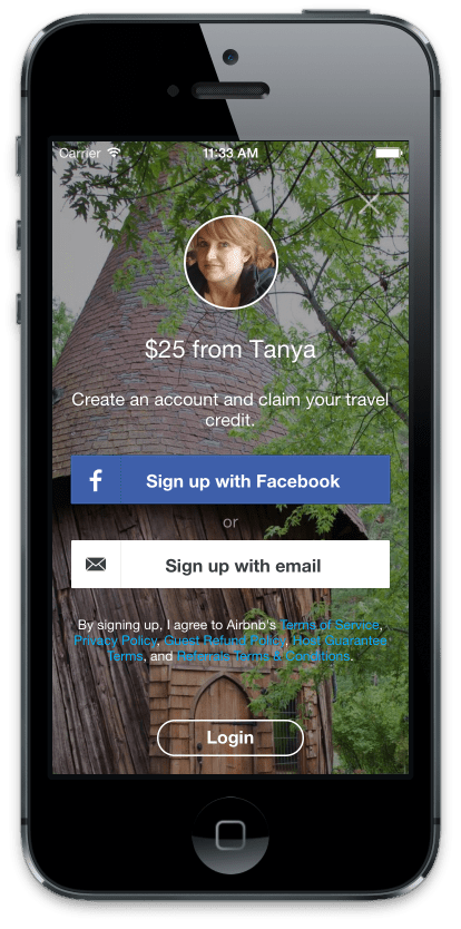
Using the deep-linking tool Yozio, the fingerprint of the user that clicked the referral link is tracked by Airbnb. When that user downloads and opens the Airbnb app for the first time, the company recognizes that person and presents them with a customized landing page: an image of their friend or family member who referred them to Airbnb.
[Source]
Most companies would have stopped their personalization efforts at the easy-to-send referral email, but it’s much more powerful to also have that referral photo at a bigger moment—when the user has to create an account on the app. Tracking the fingerprint to show the referral photo establishes the social proof that the user needs to feel confident in committing to the app and creating an account.
Airbnb used personalization to make their app more user-friendly. Instead of just personalizing to personalize, the company used user data to create a UX that builds greater trust in their app.
Success 3: Push Users to Progress
Users are addicted to completing tasks—according to the psychological Zeigarnik effect, people remember uncompleted tasks much more strongly than they remember completed tasks. This focus hooks users on completing tasks so apps that encourage users to make progress are especially engaging.
The weight-loss app Lose It! is particularly engaging because its design is oriented around users meeting their goals. From the moment you onboard, the app asks for your current height and weight and asks for your goal weight.
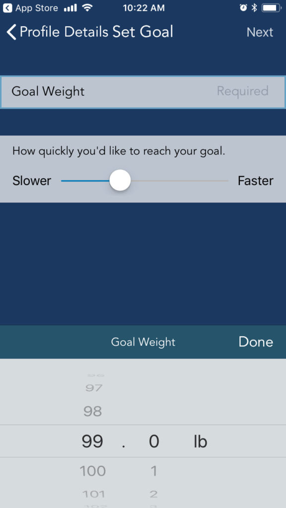
Knowing the user’s goal from the beginning, the app can help the person track how close they are to meeting their ideal weight and encourage them to meet their goal even further.
Based on your ideal weight, the app sets you up with a food plan that shows how many calories you can eat per day to achieve your goal. Lose It! uses colored charts to show how close they are to meeting their calorie limits and their weight fluctuations over time.
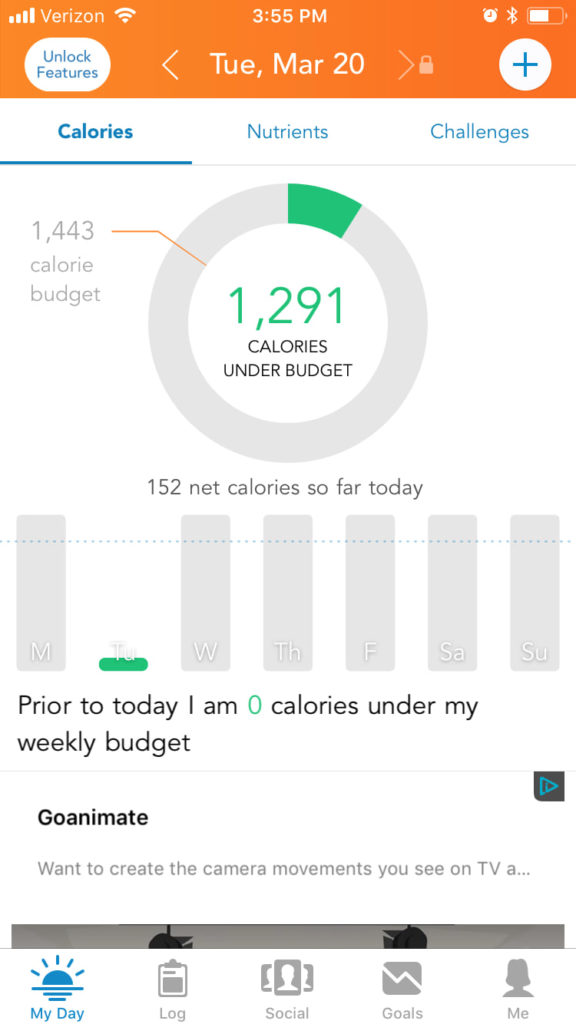
With these visual indicators, users can clearly see how well the app has helped them meet their weight-loss goals.
The app doesn’t just show users their performance—it also encourages them to maintain their progress with reminders. Users can set reminders for logging their weight and their breakfast, lunch, and dinner foods in the app’s settings. The app can only help users meet their goals if they’re consistently logging their calories and weight, so these reminders are exactly what users need for the app to be valuable.
The app also helps users stay motivated in completing their goals with badges. Like a pat on the back, Lose It! will notify users when they have earned a badge for completing an activity, such as entering their first weight log.
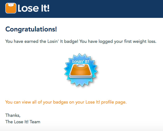
This reward leaves users feeling successful and drives them to continue using the app.
The Lose It! UX sets users up to find the app valuable. Its design identifies exactly what a user wants out of the app, encourages them to meet that goal, and reminds them when they are successful so they stay motivated.
Success 4: Focus on Your Core Product Value
When your UX is overloaded, users get confused and distracted. Losing sight of what your product can offer them, users are likely going to abandon your app.
To keep users engaged, it’s better to create a simple UX that focuses on the core value of your product. People on your app won’t lose sight of what your app is offering—they’ll just be focused on its great benefits and why they should continue using it.
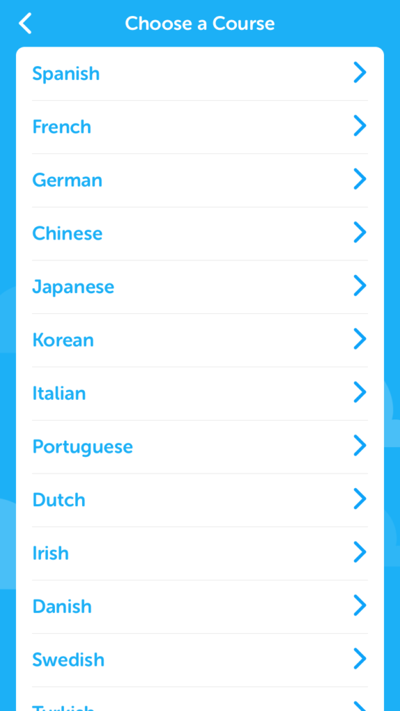
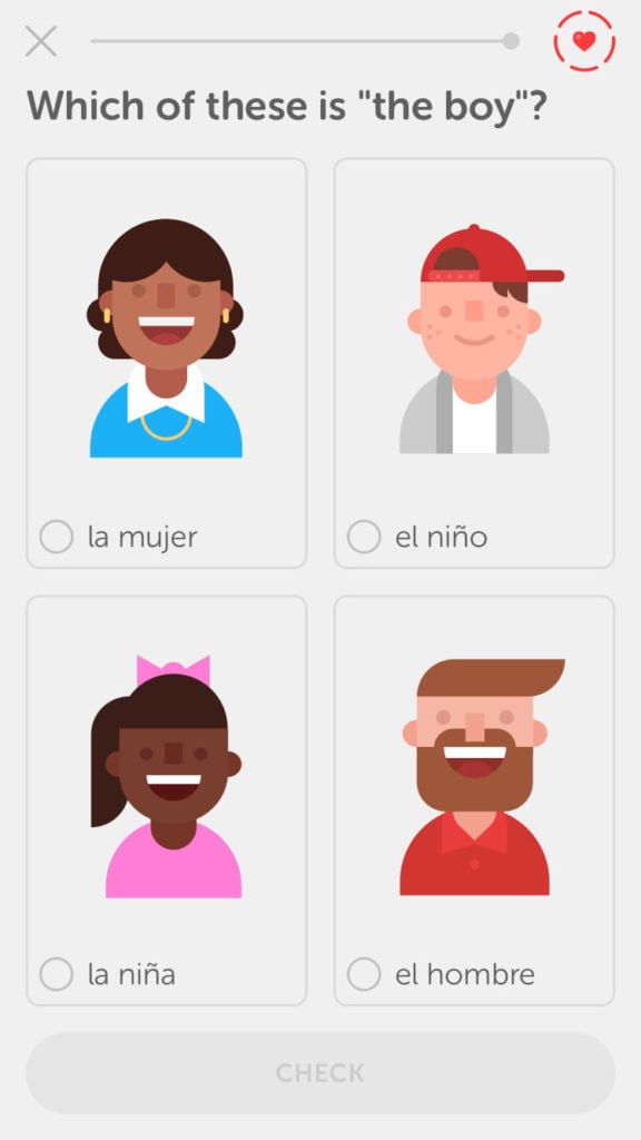
Duolingo keeps new users excited about starting their app with a simple onboarding flow that focuses on the product’s core benefit: teaching users a language. Rather than asking users to fill out personal information before signing up, users can start learning immediately through the app without creating an account.
To begin onboarding, the user is asked what language they would like to learn.
They then enter their skill level.
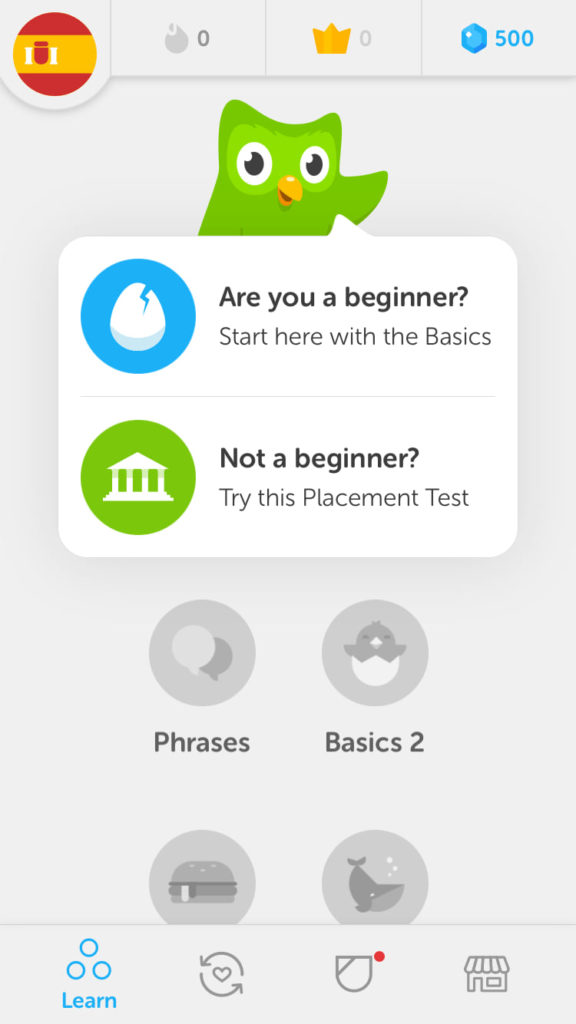
And with just that info, they begin their first lesson.
Duolingo discovered that letting people use the app before signing up was the best way to focus on their product’s value through A/B testing. Moving the sign-up screen until after users complete a lesson increased the number of daily active users by 20%.
With its simple, value-focused UX, Duolingo’s app keeps users engaged. Not only is it clear and understandable, but the design also reminds users of the reason they came to the product: to learn a language.
Great UX Comes Back to the Customer
Your app’s UX is inconstant—what works today in your design almost certainly won’t work 10 years from now. When your customers’ needs and behavior change over time, your UX has to be adjusted accordingly so that the product is still helpful and easy to use.
The key to adaptive UX is consistently reconnecting with your users. Understand what they want and how they would like to interact with your app. Then, just like the companies in this article, consider how your app’s design can align with these user interests and preferences. With the UX serving your customers’ needs, users will stay engaged on your app.