How Fintech Apps Use UX To Build Trust

You’ll never see a UX blog advocate for more inputs in an app—asking for more work from the user typically means less engagement with the app. But for fintech designers, adding friction is a job requirement.
Fintech apps have to ask users for a lot of personal information to meet financial regulations and fulfill their functions. To properly and safely handle users’ money, these apps also have to add extra features, such as additional log-ins and notifications, which can feel burdensome.
The key is for the UX to balance simplicity and safety. The most successful fintech apps are designed to offer a convenient, user-friendly experience while including extra features to safely manage users’ finances.
To see how the best fintech products achieve this balance, we’ve outlined the key UX principles powering personal finance apps. Breaking down the mechanics of these apps’ UX shows just how these designers satisfy users’ needs while facing industry-specific challenges.
Learn how to improve your customer retention with our Product Manager’s Guide to Improving Customer Retention.
Designing for Security
Fintech apps can’t function properly without the friction of asking for inputs. If they don’t have access to users’ financial information, these apps are often violating government regulations. The apps also need users’ information to complete money-management functions, such as saving for users or tracking their expenses.
This friction is inevitable but can be made more bearable for users by providing a comforting UX. Apps should be designed with safety features and explanations that make users feel confident about entrusting the app with their money and personal info.
Create a Feeling of Security
With fintech apps, there’s a fine line between annoying users with too much friction and comforting users with security measures. You may think that asking users to answer a security question or enter a pin is too burdensome, but these requests often make users feel more secure.
Capital One’s mobile app has features that might feel intrusive in other apps, but in fintech, those features make users feel more comfortable with the product.
The bank’s app requires users to sign in every time they open it, and it automatically signs users out if they leave the app open without using it for a period of time.
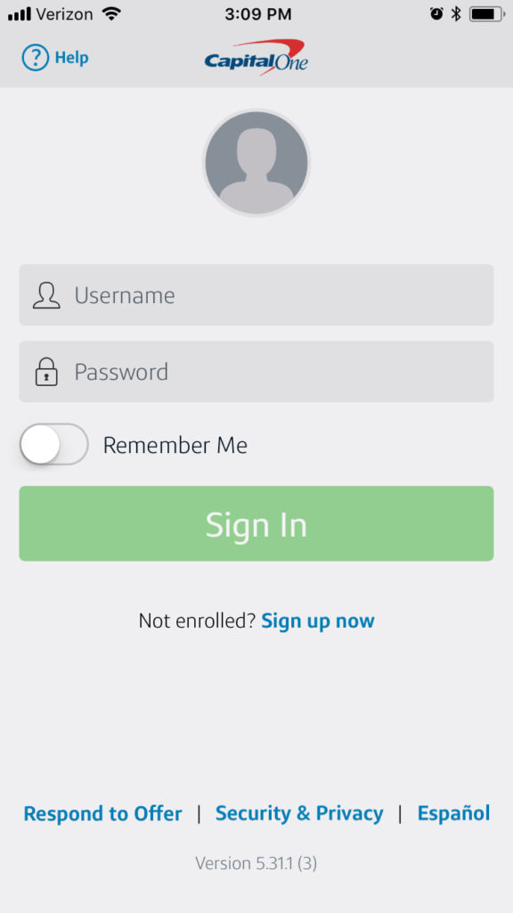
If a phone is left open or if it’s stolen, others can’t access the user’s financial info by opening the app.
As an additional safety measure, the app automatically sends notifications every time a purchase is made.
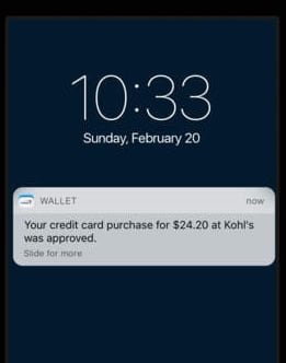
Automatically enabling notifications is sometimes seen as a UX mistake that’s too invasive and annoying for users. But in the case of Capital One’s app, the alerts create a positive, safe experience. If the user receives a notification for a purchase they don’t recognize, they can immediately check with the bank to see if fraud has occurred.
Requiring extra log-ins and sending notifications might feel too invasive on a game or music app. But for a fintech app, these UX features make the experience more comfortable and trustworthy for users.
Explain What You Ask For
Requiring so much information from users is a major hurdle for fintech apps. Due to regulations, these apps have to collect more information than is normally asked for to securely verify users’ identities.
Users often feel uncomfortable sharing personal information with an app they just downloaded. They don’t know whether their information will be abused, so they either dismiss the app or submit false information.
To encourage users to submit accurate info, fintech apps explain why they need this information. Offering a valid reason for requesting personal info allows users to have confidence in the app. They understand why the app needs the info to function properly, so they accurately share their info.
The stock-trading app Robinhood keeps users in the loop about why their info is needed for onboarding. The app offers clear explanations when asking for personal info to set users up, such as when following U.S. federal laws and preventing money laundering.
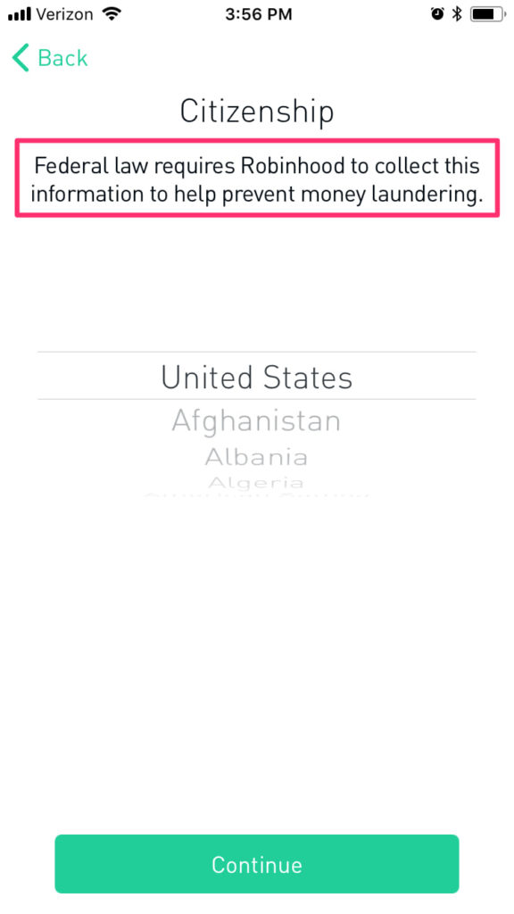
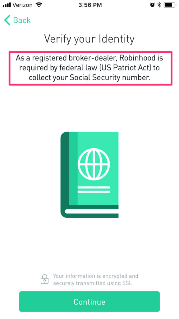
Adding a reason for requesting personal info smooths the user experience. Rather than feeling unsure about sharing their identities, users understand why the app needs it, so they feel comfortable submitting their info.
Designing for Simplicity
Fintech apps come with an inevitable amount of friction—but that doesn’t mean these products can’t be designed with users’ interests in mind.
For these apps to become popular, they have to be more than just safe. Their UX should be simple, requiring little effort from users, and should avoid the technical, intimidating elements of personal finance. Designing to create this seamless UX compensates for the unavoidable friction of fintech apps.
Require as Little Work as Possible
Fintech apps often take longer to set up than other apps. Whether it’s syncing with a bank account or adding personal info, the onboarding for these apps is often cumbersome for users.
The app Digit makes up for the initial hurdles of a fintech app through its simple, easy-to-use interface. Rather than forcing log-ins or in-app processes, Digit allows users to easily set savings goals, transfer savings, and receive account updates through texts.

Allowing users to manage their savings without needing to open the app and log in reduces the friction of a traditional banking experience, where users must log in and navigate different pages to set up deposits and withdrawals.
Digit makes saving through texting even more convenient by messaging through rule-based chat technology. The app is designed to respond to specific commands, so it can immediately provide users with info about their accounts.
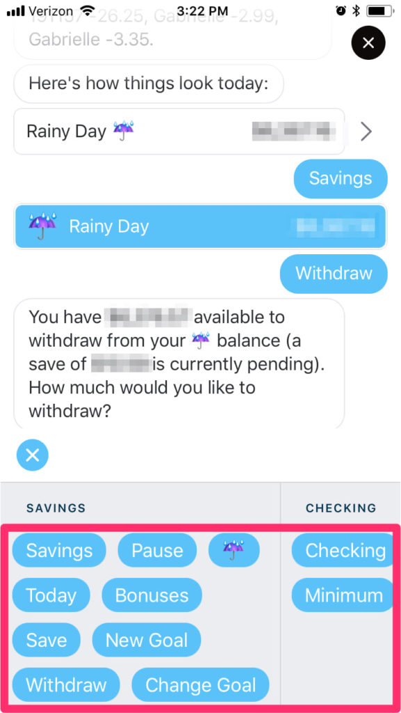
With its texting capability, Digit offers an easy way to save. Users don’t need to complete the extra work of opening the app or signing in—they only need to go to their texts to quickly manage their money.
Add an Element of Fun
Typically, people aren’t excited about personal finance. It’s oriented around numbers and being responsible, so it doesn’t exactly scream fun.
To make users excited about using their apps, personal finance companies have to create a UX with entertaining elements. If the design is as stale and boring as an IRS form, people will put off using an app, just like they delay doing their taxes.
Venmo makes their UX more approachable and lighthearted with their social features. Rather than completing just the basic information of a transaction, Venmo users can add emojis and a message to their transactions for their friends and family to see. Looking at their feed, Venmo users can see the goofy messages their friends have sent to each other in payments. The feed doesn’t share transaction amounts, so users’ privacy is protected and a lighthearted, enjoyable spirit is maintained.
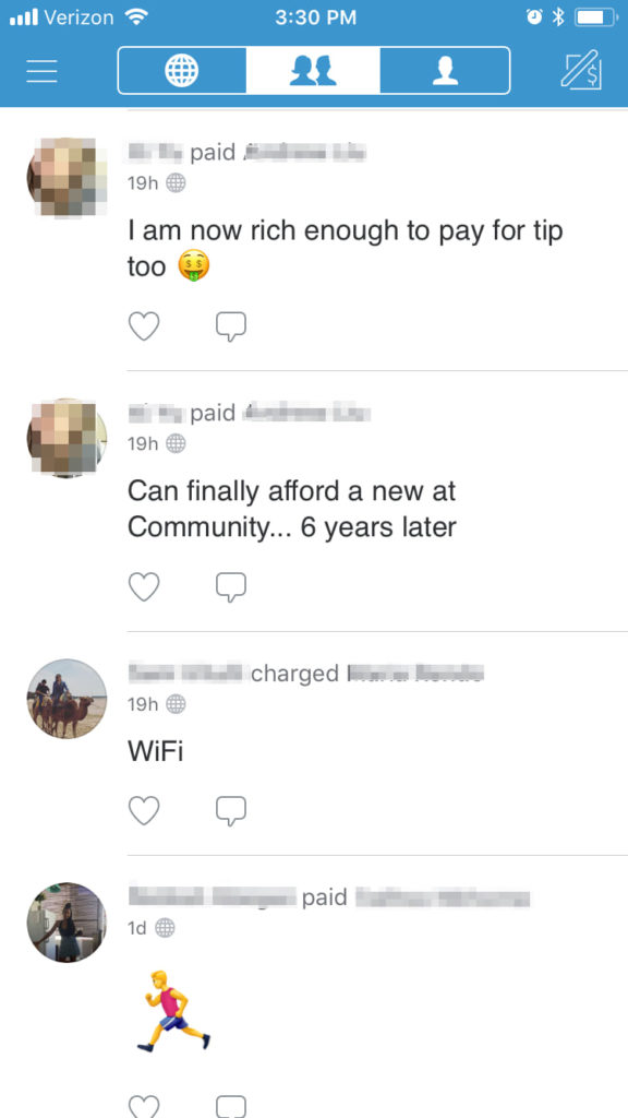
As the main view of the Venmo app, this feed emphasizes the fun, social element of the product rather than the technical transactional aspects.
Balancing Safety & Simplicity To Create a Better Fintech User Experience
Fintech apps come with an expected amount of friction—to meet regulations and complete their money-management functions, these products include more inputs and permissions than most apps. With these obstacles, fintech products need designers who can create a seamless UX alongside the friction.
The trick is to balance safety and simplicity. These apps should include security features, even if they are filled with friction, to ensure that users’ money is being properly handled. At the same time, the UX of these apps needs to be easier and more convenient than competing fintech products in order to attract users. Achieving both safety and simplicity builds users’ trust in the app while offering an engaging, enjoyable experience.