How Disney+ Maximized Their User’s Overall Experience to Build Their Customer Base
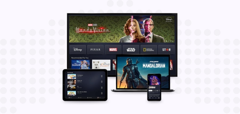
Like everyone during the lockdown, I’ve been spending a lot more time watching TV. I have Netflix, Amazon Video, Fibe TV, and Disney+ which I mostly watch on my laptop or Roku. When I heard that Disney+ was adding Star to their collection I was thrilled to have more bridge-worthy content to add to my list of shows and movies to watch.
I’ve had a Disney+ subscription for quite some time now and was a relatively early adopter having used the platform for the first time in December of 2019, shortly after they launched in Canada on November 12, 2019.
When I first got Disney+ back in 2019 I was underwhelmed with the amount of content and user experience. Luckily, a lot has changed since then and one of the biggest changes has been the acquisition of Star. Star has several movies and shows such as Family Guy, How I Met Your Mother, Grey’s Anatomy, and movies like Deadpool 2 and Borat.
With all the attention Disney+ has been getting around the Star addition, they’ll probably have a lot more people watching on their site, app, and T.V., so let’s take a look at Disney’s OTT experience.
Gearing up to Compete with Netflix
It’s no surprise that Disney’s main competitor, especially on any OTT platform is Netflix. Netflix has a seamless user experience and has a strong culture of experimentation. On Netflix’s research site, they state that they “use controlled A/B experiments to test nearly all proposed changes, including new recommendation algorithms, user interface (UI) features, content promotion tactics, originals launch strategies, streaming algorithms, the new member signup process, and payment methods”.
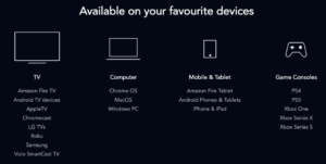
Knowing how much Netflix focuses on continuously experimenting and improving their user experience, as I dive into the Disney+ OTT experience, I’ll be adding suggestions of experiments they can run or changes to their user interface that I believe will help them compete with Netflix’s seamless OTT experience.
Onboarding
A Disney+ subscription is $11.99 per month or $119.99 a year which converts to a monthly cost of $9.99. With a subscription, you can have up to 7 profiles per account compared to only 5 with Netflix at $14.99 a month for a standard subscription.
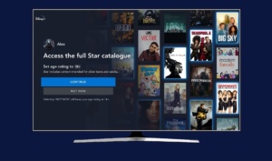
When you first start using Disney+ on your TV you’re asked to log in. Their login screen is very straightforward and simply asks you to enter your email.
The first time you use the OTT experience with the Star addition, Disney shows a short video highlighting the addition of Star to their collection. It then transitions to a message saying “You have access to the full Star catalog!”
Home Page Experience
One of the main parts I think Disney+ can improve is their homepage user experience. A home page is extremely important since it’s the first touchpoint a user has with your OTT experience once they’ve onboarded. This is where they’ll find new content and decide what to watch.
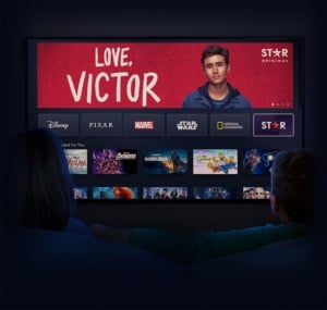
Once you log in you’re brought to the home screen which shows 10 hero images promoting TV shows and movies along with each of the channels available. These include Disney, Pixar, Marvel, Star Wars, National Geographic, and now Star. I really like the layout of having each of the channels separated since it easily lets you find shows or movies you’re looking for.
Currently, Disney+ has “New to Disney” as the first row under each of the channels. The next row is “Star Highlights”, followed by “Continue Watching”. I tend to continue watching the same shows, so I would recommend that Disney+ put “Continue Watching” as the first row to reduce the number of clicks a user takes. I understand that they may be using the “New to Disney” and “Star Highlights” to promote new content, but since they already have a rotating hero image, it’s too much promotion of new content. Also, if a user wants to watch a new show they’ll be more willing to scroll to find something.
|
Current Home Page Layout |
Recommended Home Page Layout |
|
|
Following “Continue Watching” was “Because You Watched”. What I found interesting was that they only gave recommendations based on one show you watched, rather than having multiple “Because You Watched” sections. I also didn’t think the recommendations were highly relevant. My “Continue Watching” was for Cosmos (a great show about space if you’re into documentaries). Some of the shows they recommended were relevant since they were other documentaries, but The Simpsons, The Mandalorian, and Guardians of the Galaxy also come up in the recommendation list which have nothing to do with space documentaries. (I might give them a pass on Guardians of the Galaxy, just since it has the word “Galaxy” in the name).
I think Disney+ should take its “Recommendation for You” section that’s based on all the content you’ve watched and put that as the second row right under the “Continue Watching” row. This way, users can easily pick up where they left off while still seeing new content without having to scroll down. Currently, this section is all the way down on row 9 which means a user has to scroll very far down to find this content.
They also have a “Trending” section on row 11. One of my favorite ways to find new content on Netflix is to see the “Top 10” shows and movies. Having social validation that other people are watching something means it must be good so I trust that anything in Netflix’s Top 10 will be worth watching. Disney should move this trending row up at the top, as row 3 under “Continue Watching” and “Recommended for You”. This will allow users to find new content that they’re more likely to enjoy without having to scroll to find it. One thing I didn’t like about the OTT experience on Disney+ is that I always feel like I have to scroll for a long time before finding something I want to watch.
After the top 3 rows, that’s where Disney should start dividing content by genre. Some of their current genres include “Comedy Series”, “Animated Movies”, and “Action and Adventure”. Those were the top genres that came up on my account and I thought those were genres I would be interested in. A good experiment for them to run would be to test the order of the genres for each user based on their watching habits.
Show Previews
Another area for improvement in the Disney+ user experience are show previews. Currently, when you hover over a show or movie all you’re shown is a few rotating images of stills rather than a video preview. There’s no audio included either and I think a quick summary of the show or clips from it would help a user to get the gist of what it’s about.
If you want to learn more about a show or movie you have to click on it to read a summary and even those are pretty short. Take the summary for the movie 127 Hours. The summary is “a mountain climber becomes trapped under a boulder while canyoneering alone near Moab, Utah, and resorts to desperate measures in order to survive”. While this does do a good job of summarizing the movie, it would take me more information to commit to watching a movie if I had never heard about it. Even a few short clips from the movie or adding a trailer would help improve a user’s experience. They should also show a preview just by hovering over the show to eliminate the need for users to click on a show.
If you do want more information on a show or movie, you can click on the “Details” tab which gives a much more detailed description along with the duration, release date, genre, rating, director, and who it stars. While all the information may not be important for a user to see at first glance, I believe they should replace the short description with a more detailed version. This is especially important since they don’t have a video preview.
In addition, Disney+ could add a rating where other users could rate shows and movies or Disney+ could replicate Netflix’s percent rating on how likely you are to enjoy a show.
What’s new with Disney+
Star Addition
I was genuinely impressed with the Star addition to Disney+. I think they did a great job at promoting it when you first signed in, plus I’ve been hearing about this addition for quite some time now. I saw they were featured on Twitter’s “For You” section and when I took a walk on the day they launched, I was surprised to see that they had bought the biggest billboard at Yonge and Dundas in downtown Toronto to promote the Star addition. (For any Torontonian reading this, it’s the massive billboard above the Eaton Center’s east entrance by the H&M).
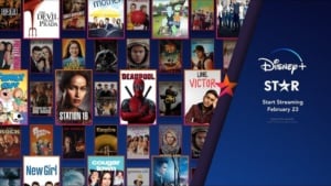
Along with the promotion comes the real reason we care about which is the new content. Before logging into my Disney+ account I only knew about the movies and shows they were promoting on social media, but I was pleasantly surprised to see just how much great content they had.
Once you click on the Star tab they have a featured section followed by each genre such as Romantic Comedies, Drama Series, Critically Acclaimed, and Action Movies. Some that I added to my list include The Rocky Horror Picture Show, Good Morning America, Pretty Woman, and Die Hard.
GroupWatch
Something that’s new to Disney+ is GroupWatch which launched in late 2020. This is a feature where you can use the Disney+ mobile app or website to invite up to 6 friends to your group. From there you can start a stream and watch it in real-time with your friends. This is a great new feature that not only encourages you to use the app but is very relevant for COVID. The release happened just before the holiday break which is perfect timing for Disney+ users. I used to use the Nextflix Party Chrome extension to watch Netflix with my friends, but Disney adding it right on the app or OTT experience is much easier and gives users a reason to spend more time on Disney+.
Experimentation is more important than ever. With the growing competition of streaming services, having great content isn’t enough. You have to always be testing and optimizing your user experience to make changes to your app, website, or OTT to gain and retain users.
__
For more information about Taplytics and how we help companies optimize their apps and websites, feel free to reach out – we’d love to chat!
