A/B Test Idea: Make your CTA buttons contrast in color and size
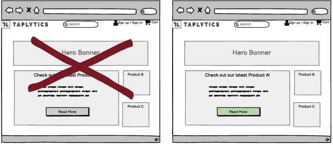

A Call-to-Action (CTA) button’s purpose is to draw attention and encourage your audience to perform a desired action. In this instance, you should make your CTA buttons contrast in color and size.
Most people are busy and have a short attention span. Let’s face it, no one is going to scroll up and down your page trying to find the link to click on. Neither will they click on every link on the page to find what they are looking for.
Why we think this is a Good A/B Test:
Our eyes are naturally drawn to things that are different, things that stand out. When you put a notably different item on your page, your visitors will be drawn to it. The research behind this phenomenon is the Von Restorff effect.