A/B Test Idea: Nudge your visitors with a CTA with arrows and other cues
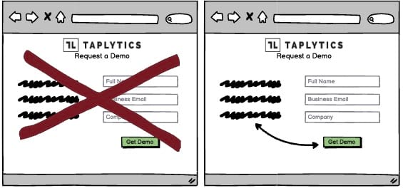

Your visitor’s brains are immediately drawn towards familiar visual elements, like arrows. Their brains notice and understand these visuals more quickly than any other information on the page.
Utilising this kind of visual stimulus is therefore an effective way to draw immediate attention to your call-to-action (or anything else you want), which will increase the chances in turn that you visitors complete the desired action (clicking on the button, etc.). Here are some other elements you can introduce and experiment on.
Buttons
Buttons have become the norm on the web. If you want to tell your users to do something, use a button. It’s not rocket science, but it’s important.
Icons
Icons are pure visual shorthand. Rather than using words to explain what your site does, you can use icons. They’re easy to understand and don’t require your users to learn any new vocabulary.
Cartoons
Cartoons are often used to inject a little personality into your site. They can be used to introduce your company, tell a story, or even to draw attention to your call-to-action.
Cartoons are fun, and they can make your site stand out from the crowd.
Why we think this is a Good A/B Test:
There’s no need to reinvent the wheel. Incorporate these elements into your site, and you’ll be on your way to creating customer experiences that convert!