A/B Test Idea: Trim the number of categories in your navigation bar
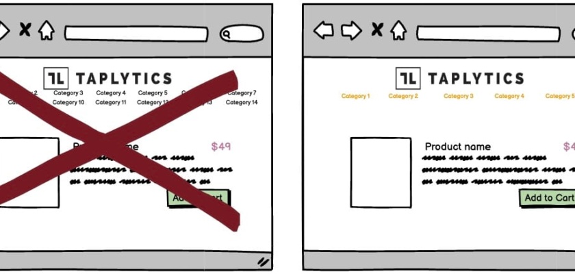

By condensing the number of categories in your navigation bar(s), you’re helping your audience with a better overall user experience by not overwhelming with them too many choices.
Studies have shown that presenting too much information can lead to the paradox of choice and deter potential customers from following through with their purchase intent.
Why we think is a Good A/B Test:
Instead of providing too many navigation or menu options, try to condense your categories into something that’s more easily navigable, and then provide subcategories according to your product or service offerings. Anything that helps for a better user experience and allows your potential customers find what they’re looking more easily is a win in our books!
With Taplytics Web Visual Editor, you can easily deploy this experiment with either hiding elements and/or re-ordering them as well.