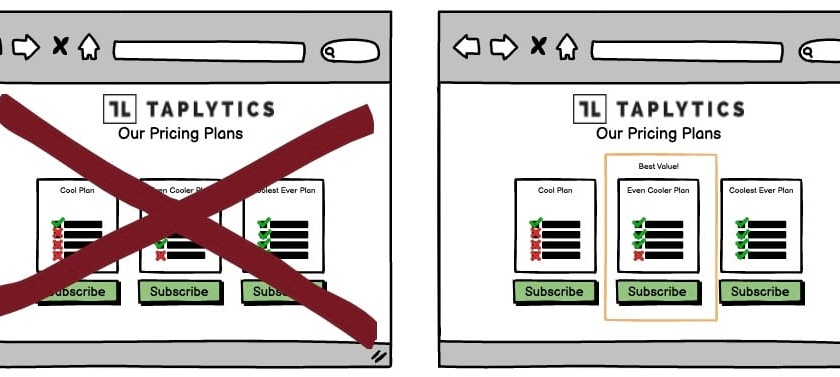
A/B Test Idea: Use the principle of default bias in your pricing pages

There is a fascinating phenomenon called default bias which suggests that, given the same choice, people will prefer the default option every time.
This is true even if they know that the default option is more expensive or offers more than they need. Default bias also works in the opposite direction. People will often choose a cheaper option even though they know that their finances could easily stretch to the default.
The reason for this is that default options are so attractive because, firstly, they offer a passive choice, which is often preferable to the cognitive effort of making our own decisions.
We also tend to view a default option as “the most popular”, choosing to believe that the reason it is the pre-selected, default option is because it is the one that most people choose. We tend to choose the same things as other people as it feels “safe”.
There’s also tendency to believe that the default option given provides the most value. By highlighting the default option, you’re helping your audience understand the features and benefits in your package, so consider other options can trigger loss aversion in missing out the extra value given by the default option you have given.
Why we think this is a Good A/B Test:
Default bias is a powerful tool that you can use to your advantage and easy to deploy. It encourages people to purchase more of your product, without them even realising that they’re doing so. With Taplytics No-Code Visual Editor, you can execute this experiment without writing a line of code.
