6 Examples of the Best Retail A/B Tests
With so many opportunities for you to run A/B tests in your retail apps, it’s hard to know where to start.
Read on for testing ideas that can help you make the biggest impact on your user experience, help you retain shoppers and get them adding more to their cart.
p.s. Want to know which tests you should run on your mobile app? Request a complimentary assessment from our team of optimization pros.
1. Onboarding Flows
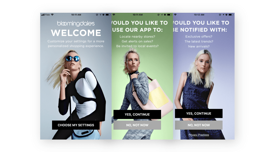
Users are impatient and want to be able to navigate and use your app as soon as possible once they sign in for the first time. Tightening up your onboarding flow will help your users know what to do when they first enter and understand the value so that they keep coming back. In your onboarding flow, you can test the number of screens and prompts to warm up users to opt into notifications and location services while still giving them enough information and guidance to be able to use it.
2. Menu Type
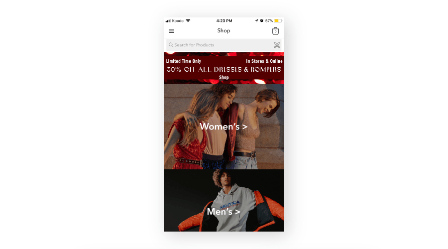
There are lots of different menu types to choose from. The infamous hamburger menu is a popular choice, important to consider and test how users react to slide out menus, swipe pages, and tabs. Urban Outfitters chose the typical hamburger menu, as seen in the top left corner which keeps the view looking clean and simple.
3. Page Layout
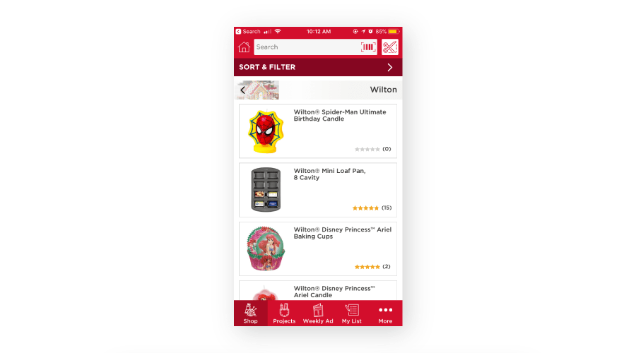
It’s important to consider how many items you have displayed on any of your pages and how this number could affect your app’s conversion rate. Michaels shows 3 items on their shopping page, and the company chose to have the bottom item cut off so the user knows they can keep scrolling.
4. Promotions
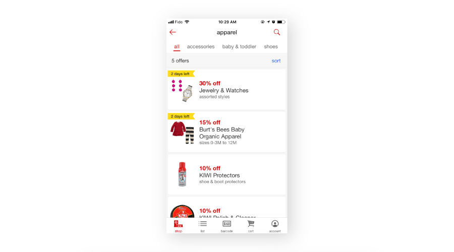
Make sure you test how promotions are displayed throughout your app. Target chose to place all their offers at the top of the screen and make them stand out with red text and a warning of how many days are left of the sale, which encourages the user to get purchasing today.
5. Personalization
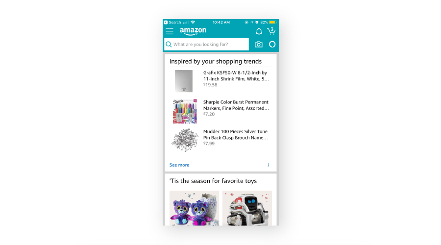
In order to increase retention, your app definitely needs to be personalized. Algorithms should display items based on what the user has previously viewed and purchased. Showing nearby locations and items nearby is also a great way to personalize your app.
6. Checkout Process
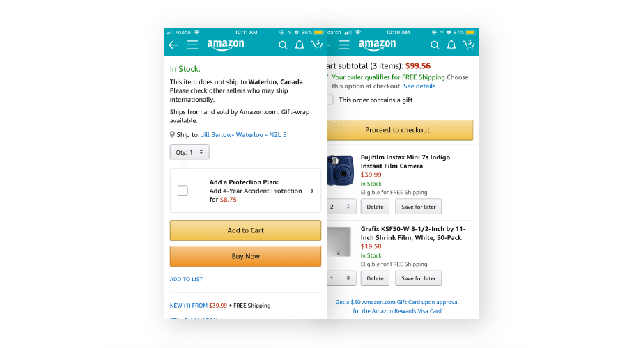
The checkout process is “make it or break it” for your app. If the checkout process is too long or difficult to work through, your users may not complete their purchase or come back to shop with you again. Test the length of your checkout, like a single click or add to cart process, and different payment options.
Make your app the best it can be by tightening up your onboarding flow, honing in on your menu type, optimizing your page layout, strategically placing your promotions and personalizing for every user. Inspired to get started? Quickly test the alternatives with A/B tests to see which best creates the best experience to help your users shop ‘til they drop.
The Taplytics Difference
With Taplytics, you can create, deploy, measure and improve your customer’s experiences on your retail apps. You get everything you need in your toolbox whether you’re a marketer or developer in order to execute high-velocity experimentation programs. We offer no code tools or fully featured APIs and SDKs to help you understand what works best for your customers and overall app experience.

