16 App Personalizations In Media and Entertainment
Companies like Netflix, Amazon, and Facebook have raised the bar for app personalization. And, in the process, they’ve increased the expectations users have for all brands when it comes to delivering personalized experiences. In fact, according to Salesforce research, 59% of consumers say tailored engagement (based on past interactions) is very important to winning their business.
Brands that ignore the personalization trend will struggle to acquire and retain users—especially those in the media and entertainment application spaces, where serving users with relevant content is critical to keeping them engaged.
In this blog, we’re sharing inspiring personalization examples that can be used at every stage of the user journey to drive content consumption and subscriber retention.
p.s. Want customized advice on improving your brand’s use of personalization? Sign up for a complimentary assessment with one of our optimization experts.
Personalizing Signup & Onboarding
The best sign-up processes get users into a platform or onto a subscriber list—and interacting with content they love—fast.
Even though you may not know a lot about users at this stage, there are ways you can personalize their experience so that they are more likely to complete their registration—and share personal data that will allow you tailor their experience later.
A) Acquisition & Pre-registration
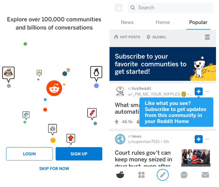
Consider demonstrating your platforms’ personalization features before users have to create an account.
You can offer them content based on location, browsing activity, or the keyword they used to discover your platform. Or, you can let unregistered users explore your application and preview the personalization features you offer to registered users. Seeing the benefits and features upfront will encourage them to sign up.
Example: Reddit’s personalization preview
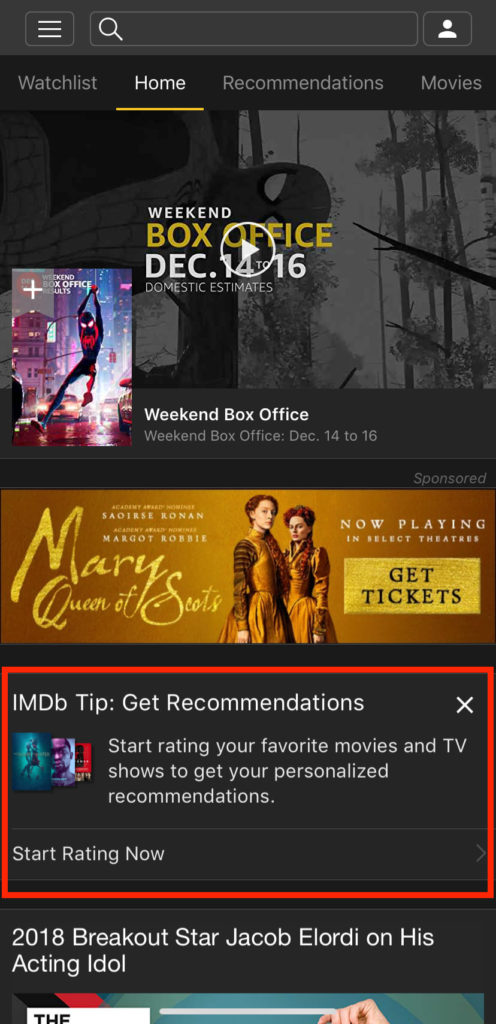
Example: IMDb’s Recommendation feature explainer
B) Optional Product Tours
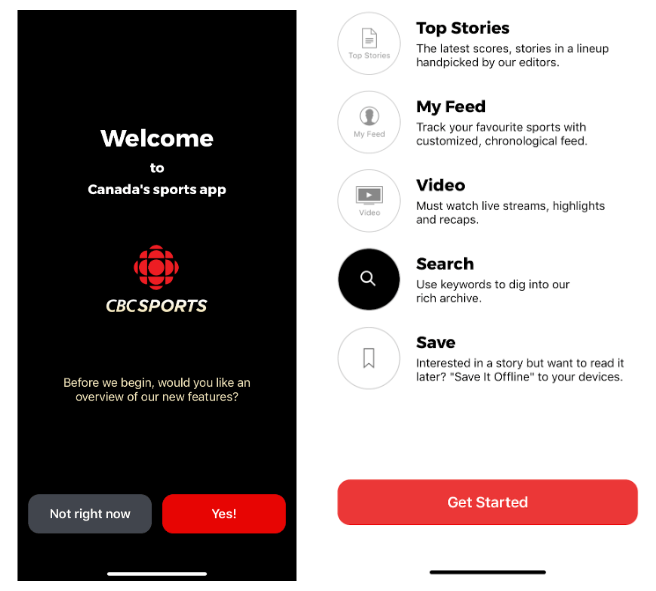
Product tours are helpful for teaching users about your platform’s features. However, some users may want to explore on their own, or they may find your tutorial too long and abandon the process if they can’t exit easily. So give them the option to skip it if they want to. (This technique works well if users have to register to use your application. Then, you can send them tutorials and tips in the weeks following sign-up via email or push—which can help them build a habit around regularly viewing your content.)
You can also consider condensing your tour to one screen with the most helpful tips or top used features. Then, let users opt-into the tour at a later time.
Example: CBC Sport’s skippable tutorial
C) Personalize What Information Is Collected
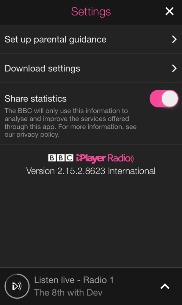
During the sign-up process, make it clear why you want information before asking for permission to collect it. Users may fail to complete signup if they don’t clearly understand how you’ll use their data and why you need it.
You can also delay collecting some personal information until after users sign up. This way, you can educate them on why they should share more details with you once you have their contact information.
Example: BBC iPlayer Radio data privacy options
Increasing Content Consumption with Personalized Recommendations
Serving up relevant content is the key to long-term user engagement. Get this right, and you’ll have a better shot at increasing content consumption, ad revenue, and paid subscriptions.
Here are a few personalization features that will encourage users to keep viewing your content:
A) A Customizable Feed
Your users’ home screen should have relevant offers based on their actions or content they’ve consumed in the past.
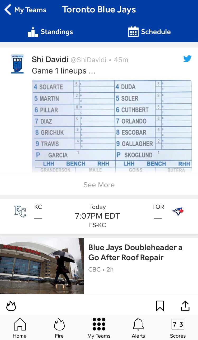
Aside from using your own recommendation engine to generate this, you may want to let users set up preferences for their feed. This way, they can tailor their experience even more.
Example: The Bleacher Report “My teams” feature
B) Robust Discovery Features
Making it easy for users to discover relevant content is critical for demonstrating how personalization can make their experience better. To get this right, you’ll need to experiment with where you place recommendations. (This could be done using targeted ads—if they aren’t too disruptive to your users’ experience.)
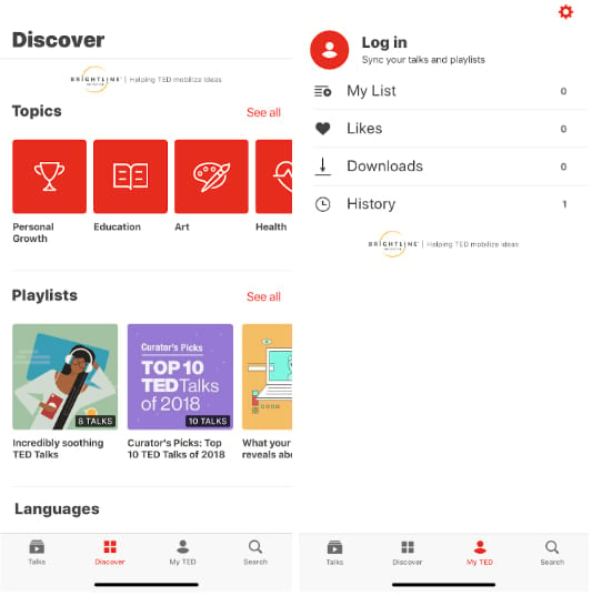
You can also create a whole section for content discovery (often called a “Discover” or “Search” section). Make sure users can filter results to better hone in on content that will interest them vs. relying solely on your recommendation engine. The more invested users are in creating their own experience, the more likely they’ll be to become long-term subscribers.
Example: TED’s “Discover” tab
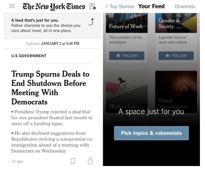
Example: The New York Times “Your Feed” feature
C) Cross-platform Consistency
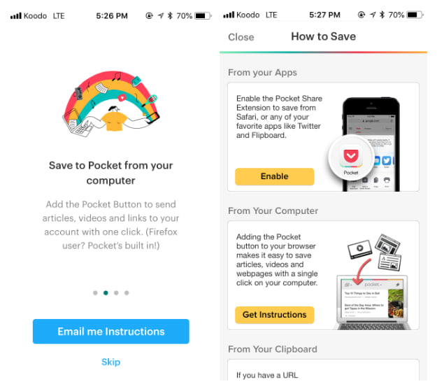
Giving users a consistent experience across their devices is critical to owning their attention and increasing loyalty. Make it clear early on how users can sync devices and accounts, and make sure viewing data and preferences are consistent no matter where or how users access your content.
Example: Pocket’s multi-channel consistency
D) Viewing Settings
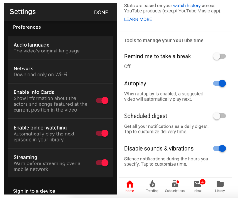
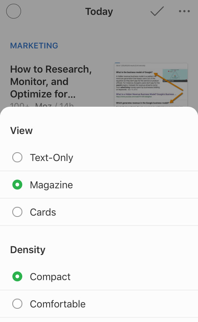
Give users options for personalizing how they view content, so they’ll feel like your platform is tailored to them.
Example: Youtube’s Video and Music apps’ custom streaming options
Example: Feedly’s content viewing settings
Personalized Re-engagement Tactics for Media & Entertainment Brands
Push, browser, and email notifications can all be effective re-engagement tactics. But, if they’re used too often, or their content isn’t relevant enough to users, they can cause opt-outs or unsubscribes.
Here are a few personalization techniques you can adopt to increase active users and long-term retention:
A) Highlight the Benefits of Opting-in
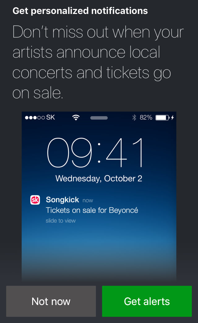
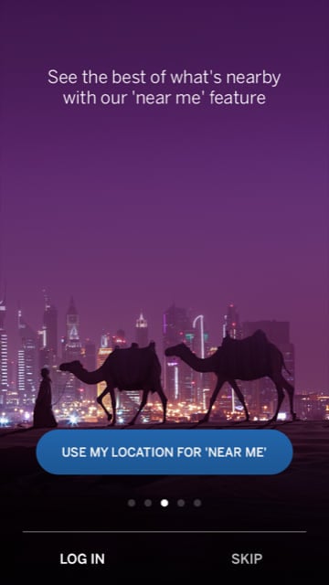
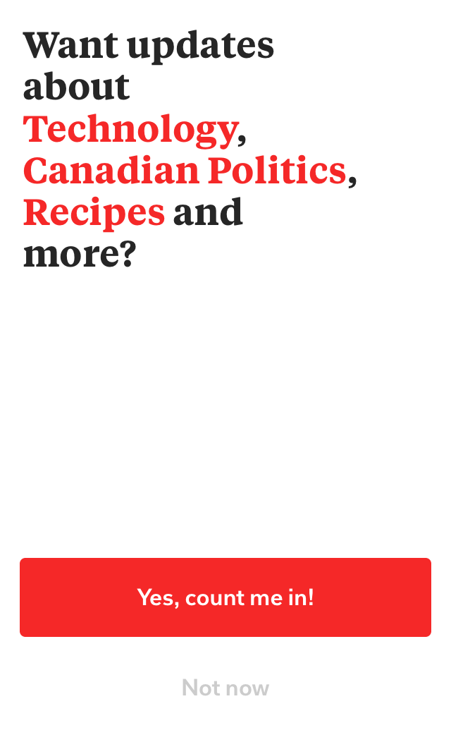
Don’t serve up generic push or email subscriber opt-in messaging. Users will often ignore or decline these requests because they’ve seen them so many times before. Before showing an opt-in screen, explain why users should give permission for notifications and how it will create a better experience for them.
Example: Songkick’s opt-in explainer
Example: The Lonely Planet’s geolocation opt-in prompt
Example: Flipboard’s personalized opt-in message
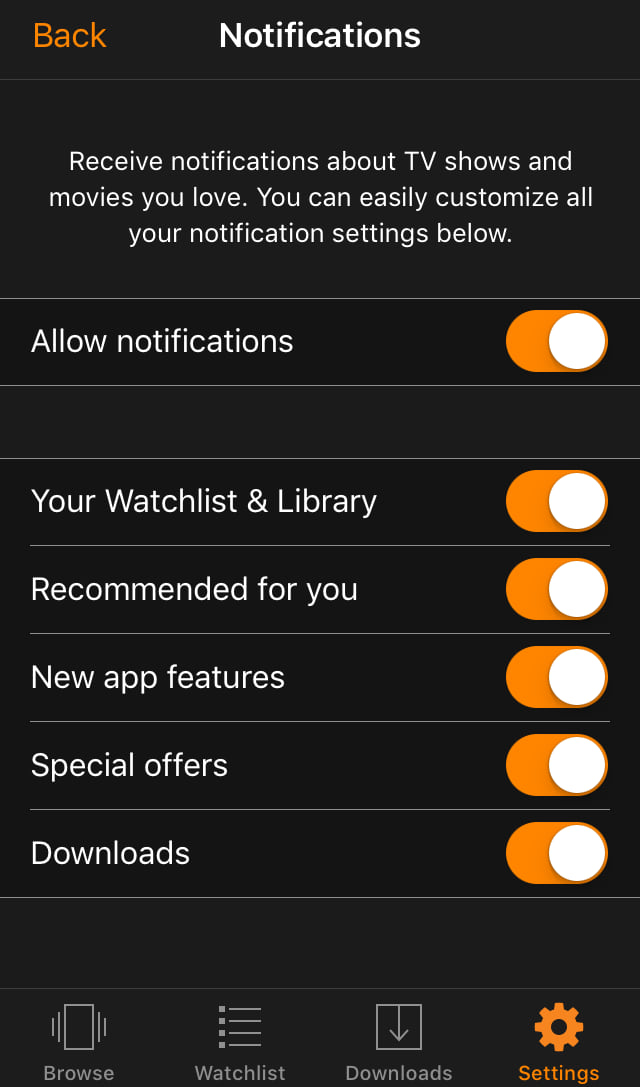
B) Offer Customizable Notification Settings
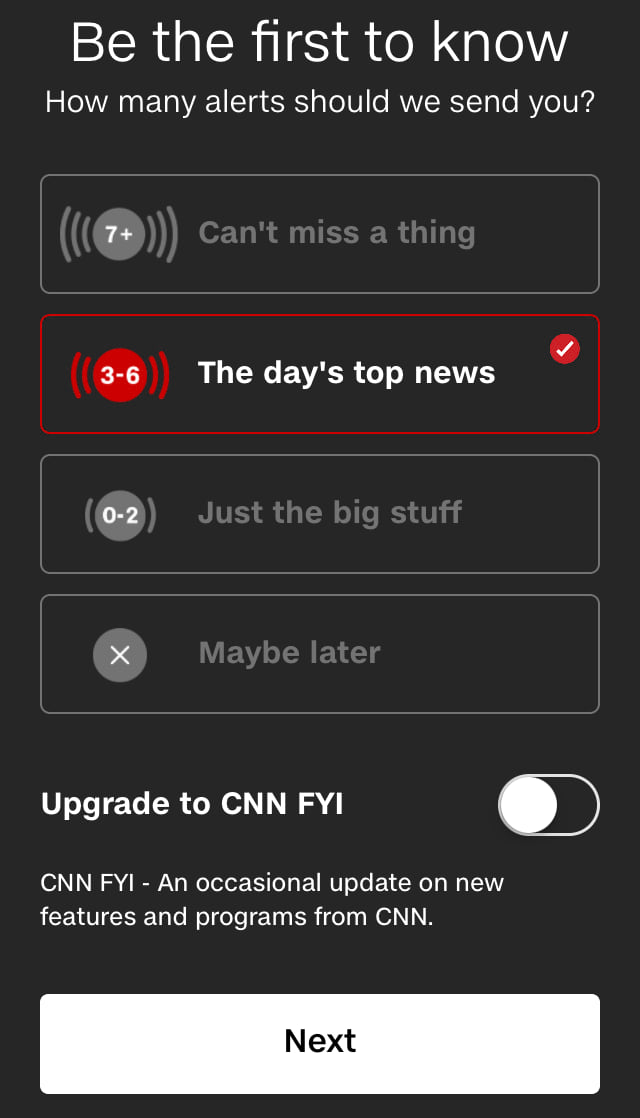
Let users customize how and when they’ll receive communications from you. The more options they have, the more likely they are to remain subscribed. You can base these notifications on frequency (ex: once a week, daily, etc.), notification type (push, email, browser, SMS, etc.), content categories or reason for outreach (like relevant updates and offers).
Example: CNN’s Push notification timing settings
Example: Amazon’s Prime Video Push notification options
C) Base Re-engagement on User Preferences or Behaviour
The best way to personalize re-engagement messaging is through either relevant content offers or user-based behavioural triggers.
For content, this can mean an email of new material that is similar to your users’ past choices, a list of what their friends have recently viewed, or a notification when topics they follow are updated.
On the behavior front, this could mean a push notification when users haven’t logged in for a while, when they started—but didn’t finish—a piece of content, or when a friend likes or shares a relevant post.
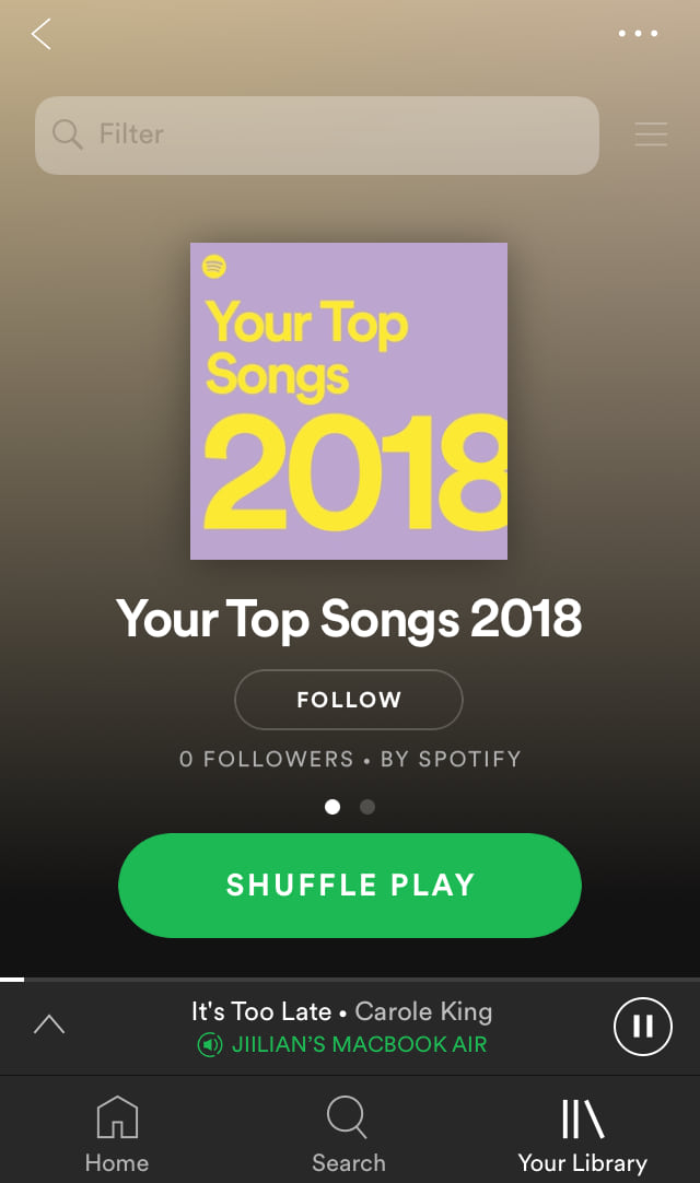
Example: Spotify creates playlists based on their users most frequently listened-to songs, which brings them back (and keeps them) in the app.
