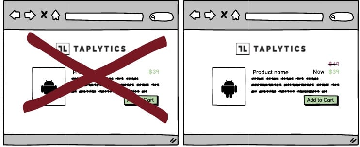
A/B Test Idea: When prices have changed, have it stand out

If you have ever seen this at a grocery store, they often use a” Previous Price/Now Price” format for their offers. where you see a big price displayed on the shelf, and then a smaller price crossed out or underneath it.
There’s a lot of research, that shows that people will misattribute a physical distinction to a numerical distinction. In other words, the more different these two prices appear to looks, the greater people will perceive the difference in price to be. So if you’re displaying a previous, higher price alongside your current price, consider visually distinguishing the two.
Why we think this is a Good A/B Test:
It’s a simple experiment that can change the perception of how people will value your offerings. You can experiment with different colors, font size, placement, and language to see how your customers will react.
