A/B Test Idea: Make your free plan less prominent

When structuring your pricing page, consider making your free plan less prominent or visible. By doing so, you’ll help your audience focus on other (more profitable) plans that you offer to help them stand out vs your free offering.
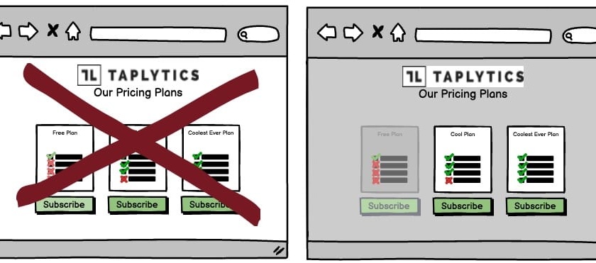
If you do offer a free plan, you should definitely display it. But when it’s made more prominent, your potential customers will consider the free plan equally compared to your other plans, and they might be deterred to try your paid plans when they see your free plan first.
Setting up your experiment:
Here are several ways to make your free plan less prominent:
- Put it in a dropdown
- Place it at the bottom of the page
- Highlight your “Best Value” plan
Putting your free plan in a dropdown is an easy way to hide it while still keeping it available to those who want to find it. This will work well if you have lots of plans and want to keep the page looking neat.
When you place your free plan at the bottom of the page will limit users’ visibility of it and they will be more likely to consider the other, more prominent plans above it.
You can also make your free plan less prominent by reducing the font size, changing the font colour or type, or reducing the amount of information you display about the plan.
Why we think this is a Good A/B Test:
You’re leveraging two psychological pricing tactics in this experiment. Perceived value pricing, and the anchoring effect. By utilizing these tactics, you can influence and persuade your users to focus on the plans that you want them to convert on. With Taplytics No-Code Web Visual Editor, you can deploy this experiment in less than 30 minutes.