A/B Test Idea: CTAs in your blog content
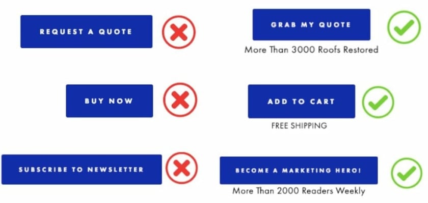

Call-to-action (CTA) buttons command attention and obviously a desired action from your audience.
Embedding CTAs across your all of your blog content can help drive more conversions such as requesting demos or subscribing to your newsletter for instance can help drive revenue and pipeline further down the line.
Where should you place your CTAs? Here’s a list to help you start on your CTA experimentation efforts:
- Banners that hug the top of bottom of your website or app
- Pop-up or slide in forms based on exit intent
- Within your blog content at the beginning and/or at the end.
- Within live chat popups based on time on site or if they’ve visited certain categories
Why we think this is a Good A/B test:
Any of the above ideas can provide a great start in terms of generating more conversions towards a desired action. If you’re regularly posting content, visibility of these CTAs only grows and should increase linearly if the CTA is lined up with the content that it’s embedded in.