A/B Test Idea: Experiment on your CTA text
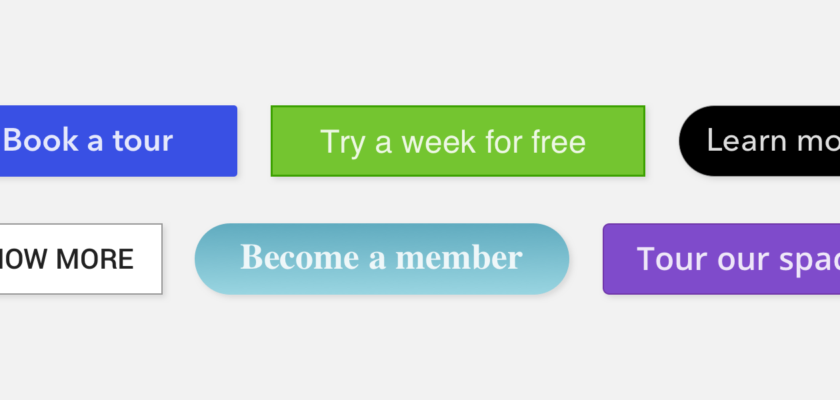

Understanding what your goal is with call-to-action (CTA), within a page, blog post or within your app should fit its context. As such a good CTA button should be easy to find and easy to understand so that your audience knows exactly what their action should be should they choose to act on your CTA.
It also goes without saying that your CTA should also be placed in a spot where it gets the most attention from your visitors.
Why we think this is a Good A/B test:
You ultimately don’t know how your audience will react to your call to action. Copy like “Submit” on a form might be clear to some, but maybe if it was an email newsletter “Subscribe” would be better. CTAs are ripe area of experimentation and can lead to results that you might not have expected in your overall site conversion rate!