Top 3 Alternatives to the Mobile Hamburger Menu


If you’ve been keeping tabs on the anti-hamburger menu movement, you might be convinced that they’re not the way to go. They hide content, and add extra steps to app navigation and can be hard to reach on phones with large screens.
If you’re on board for no more hamburger menus but stuck on determining the next best option, look no further! Here are three other great options for app menus, including a tabbed menu, swipe menu and slide menu. Try testing these options to figure out what will help create the best user experience and increase conversions in your app.
1.Tabbed Menus
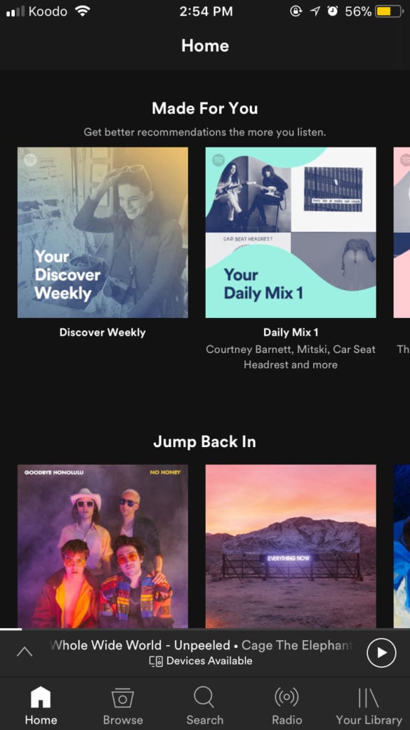
A tabbed menu is recognizable by its row of icons at the top or bottom of the screen, a feature that makes it easy to navigate the app at all times. Spotify has all of its key features in its tab including a home menu, a browse menu, the search function, radio, and your library.
| PROS | CONS |
| Core features and functionalities are visible on the main screen | Limit to how many items you can have on the menu |
| Easy to recognize which screen you are currently on | Clear and concise iconography is necessary so app users know what each icon represents |
| Bottom tabs are easy to manually reach | |
| Quick navigation for users to efficiently and effectively streamline the experience |
2. Swipe Pages
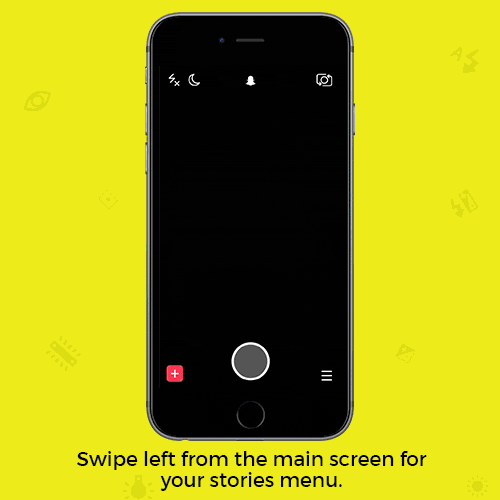
Snapchat is a big fan of swipe menus. Swipe to the right, and you’ll access stories and news sources. Swipe left and you’ll access your snaps. Swipe up and you can relive your memories. Swipe down and you can see top stories.
| PROS | CONS |
| Cleaner user interface because there is no menu icon | First-time users without prior knowledge will be confused on how to use the app |
| Screen real estate can be used for presenting users with the core value for your app | No easy way to know what page the user is currently on |
| Bottom tabs are easy to manually reach | No direct navigation so users must swipe through parts of the app they are uninterested in |
| Quick navigation for users to efficiently and effectively streamline the experience |
3. Slide Out
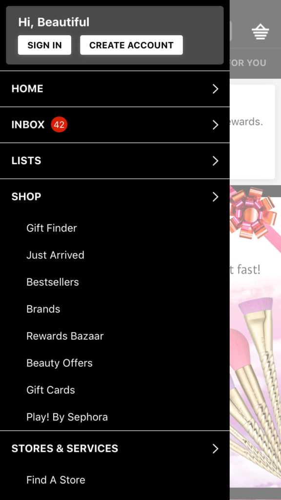
Sephora’s app uses slide out menu that’s organized by headings and subheadings that help users get exactly where they want to go in the app.
| PROS | CONS |
| Menu bar/tab doesn’t take up space on the screen | Users could click the wrong button trying to open the navigation bar |
| Menu bar is easily accessible with the natural reach of your finger | Can’t incorporate swipe pages into the app because the motion is associated with the navigation bar |
| There is direct navigation to different pages | Slide out functionality is unknown to users until they discover it |
| Content can sometimes get hidden, lost or hard to discover |
It’s a great idea to A/B test app navigation menus with tools like Taplytics to determine which style, or even what combination of styles, works best for your company. Navigation interface is very important for mobile where convenience, speed, and efficient use of screen real estate are no longer just wanted, but expected. If you’re thinking of saying goodbye to the hamburger menu, what is your favourite go-to?
Read: Ultimate Guide to Mobile A/B Testing