Streamline User’s Digital Experience by Creating a Seamless Consumer Journey


We’ve talked previously on this blog about the problems in mobile development with regards to improving user retention. The fact is that essentially 80%+ of an app’s users download the app and use it only once or twice. There are definitely no silver bullets to this problem and to truly combat it you need to ensure that what a user sees when they open up your app for the first time matches their expectations. The App Store hasn’t made this any easier by making it a challenge to adapt and test different languages in your app description, so as a developer you are left with modifying the first-time user experience until you find something that resonates.
This post will go through 5 essential A/B tests, on the login flow and first-time user experience of a mobile app, that will make sure you are in the best position possible to have super-engaged users. I’ve structured these tests from beginner to advanced, but no matter what your skill level you might want to proceed in this fashion. At Taplytics we believe mobile A/B testing should be iterative because each test will reveal something unexpected. In that way, if you start small you will help inform your more complex tests through the learnings of your quick and simple tests. It’s a great way to make development more fluid and see greater results over time.
Learn the best practices for omni-channel experimentation in our free mobile experimentation guide!
Button/Image/Text Properties
The problems of user retention come about because people either don’t understand what to do when they get into your mobile app or they think your app is not what they were looking for. So the main goal of improving retention is to improve your users’ understanding of your app. One of the simplest ways of achieving a greater understanding is to adjust the content, copy, and design of your initial screens. Take the Starbucks mobile app for example. This is their first-time user experience:
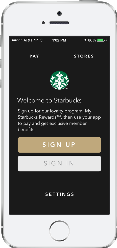
This may be great for Starbucks as it’s simple and to the point. They assume everyone coming to the app knows what the app is for and all they want to do is either sign up or sign in and move on with buying their coffee. At Taplytics we firmly believe that if this page isn’t being tested by Starbucks they are leaving money on the table in lost users. Starbucks should be testing the wording they are using to see if more, less, or different information drives more people through to sign up or sign in.
They should also be testing different calls-to-action in their buttons for the same reasons. And while you may not think it makes a difference, another simple early test they could try is adjusting the layout of this page with the sign-in above sign up, or with the text below the buttons. Anything you can do to better understand how your users read your pages and interact with your mobile app can mean the difference between a leaky funnel and amazing user retention.
Page View Controllers
You may or may not know what Page View Controllers are in mobile apps, but you’ve definitely seen them and used them before. They are the side-scrolling pages that generally tell you about different aspects of an app when you first download it, and before you have to log in. The Hunt has a great example of a Page View Controller in their first-time user experience:
The Hunt specifically takes advantage of these pages to lightly introduce people to the features of their app and to let them know what
to expect when they sign in. This is a great idea, but when you first launch your app, and even well into your app’s lifecycle, it can be very hard to know if you are presenting the right information at the right time.
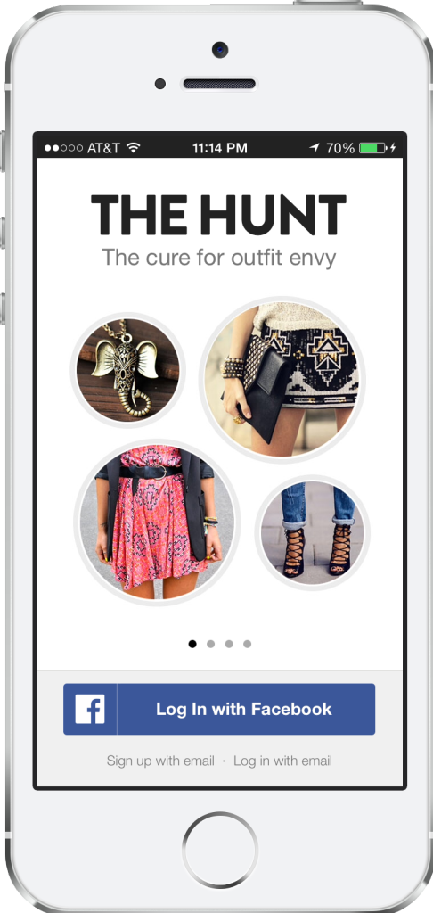
As a mobile product owner you should be taking advantage of mobile A/B testing tools to change the order of these pages, test different imagery and different wording to see how this changes someone’s likelihood of signing in and using your app. These tests more complex than the first set, especially when it comes to understanding user behavior, so don’t sweat it if it takes a few experiments to find a variation that shows significant results.
Tutorials (Content/Images)
The tutorial or the walkthrough has become ubiquitous in apps whether on mobile or the web. They come in all different shapes and sizes. Some take over the whole screen of an app, and some use tooltips or popup speech bubbles to introduce you to features or different parts of an app that you might have missed in your first or early sessions. These can happen before or after login, but they are tremendously effective at improving engagement with your mobile app when done right. The Home Depot has a great example of a tutorial screen in their mobile app:
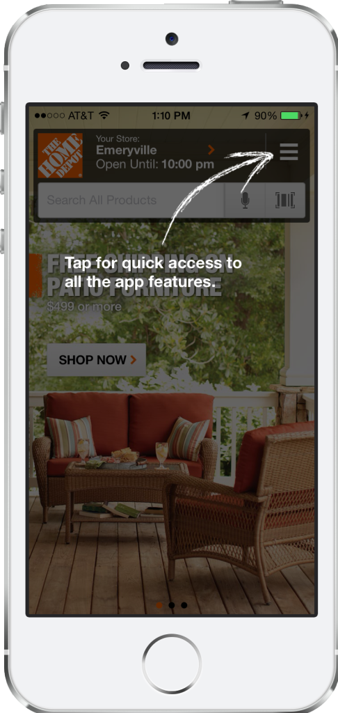
The Home Depot uses a very popular form of a tutorial in their mobile app. They grey out the page and use callouts with text to show their new users features or parts of the app they may not know about. This is a great first step to educating users and encouraging them to try different parts of an app. But once you have your tutorials or walkthroughs in place you need to test your language, positioning, and timing. If you’re using a mobile A/B testing tool like Taplytics you can try different text, design, and positioning in your tutorials to see how the content affects new users.
You can also go more advanced and use code-based experiments to test different timing and location of tutorials. This can be very powerful because it is possible that a user doesn’t want to be bombarded with information right away, the first time they use an app. It may be better to take a gradual approach and highlight different features or areas of the app over time. It’s basically like finding the happy medium between a pushy salesman in a store and someone who stands in the corner not talking to customers. You need the appropriate balance to make customers, as well as mobile app users, feel comfortable and welcome. And finding the balance is all about testing.
When you finally go to sign up or sign in, the mobile app probably has some combination of different ways in which you can share your information. The most popular these days is Facebook, but some apps will have you sign up for your Google+, Twitter, email or other accounts. You can see the myriad selection of options in an app like Jackthreads:
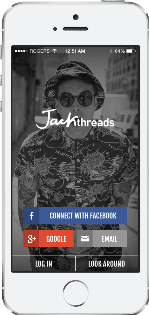
The interesting piece here is that, while personal user information is the most valuable thing to an app, the reason most apps choose one sign-up service over another is generally conventional. Rarely have I seen a mobile team that has put a significant amount of effort into choosing which services to present to a user. If you and your team are different, then consider yourself one step ahead of the competition. Since this is so crucial, you should definitely be testing the effectiveness of each service, particularly when it comes to converting people into signed-up users.
This test can get advanced because the major assumption here is that some users will prefer to sign up with one service, while some other set of users will prefer a different service. To handle this, you should be looking at your segmentation options when creating an A/B test. Effectively you will want to be making assumptions as to which types of users prefer Facebook login over Google+ and then verify those assumptions through A/B tests. Good A/B testing software will allow you to segment by different characteristics such as device type, app version, and more, so you can narrow the delivery of your experiment to the right subset of your users.
The most overlooked piece of the first-time user experience is when exactly should you be asking your users to sign up. Most apps just assume they need to set up a wall right from the start, that forces users to sign up. This comes from seeing so many popular apps with this requirement. But not all apps do this. Take One Kings Lane for example. They allow users to peruse their selection of products without an account:
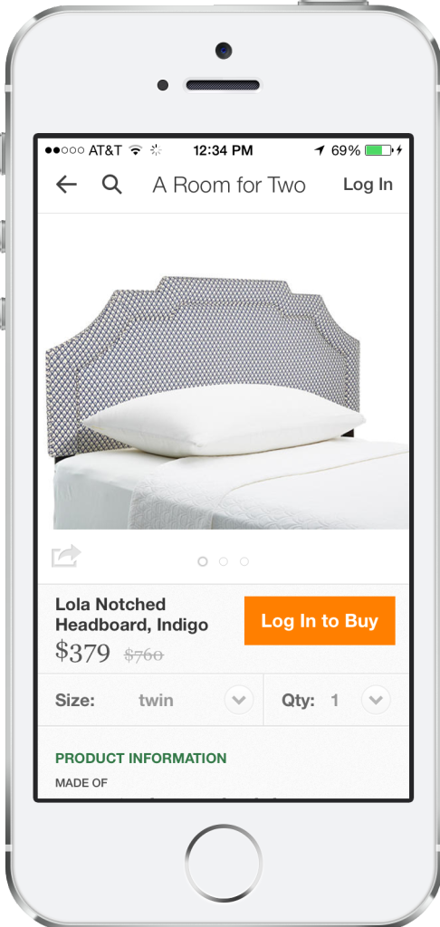
Now it’s impossible to say what’s right for your situation. Your app may require personal information just to function, or you may be able to keep users anonymous for the vast majority of the time. Either way, testing your assumptions of sign up timing can be very powerful. While this is the most complex test in our article and requires developer involvement, it is the type of test that can show some of the greatest results.
Think about all of the “try-before-you-buy” scenarios that encourage a purchase and you can understand why letting someone explore your app before they have to commit could drastically change the number of users that stick around beyond one or two sessions in your app. The challenge here is you will be making a tradeoff. A tradeoff between the number of users and the quality of data around your users. The key is clearly to find the balance that works for you by running some detailed tests.
These types of experiments and areas of focus are great ways to start improving your mobile app’s user retention. We have seen very clearly with our customers that even small improvements in retention can pay dividends when it comes to your growth strategies. Just think about how much more effective your mobile app install ads will be when you have improved retention by 20, 30 or even 50%. That means you can either be using the same marketing budget to double growth, or you can redeploy your scarce dollars to other important areas of your business. Either way, if you need help getting your users to stick around longer, feel free to reach out. You can email me directly at cobi@taplytics.com or you can leave a question in the comments below.

![]()
Taplytics is a fully integrated mobile A/B testing, push notification, and analytics platform providing the tools you need to optimize your mobile app.