How Etsy A/B test’s their navigation filters

This was originally from the GoodUI blog. Here, they showcase how Etsy ran an experiment on their navigation filters on their product discovery page.
The experiment:
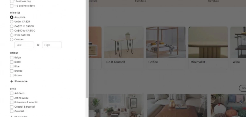
Etsy ran an experiment across two variations where they exposed the available filters as the original variation. Their second variation had collapsed filters to drive more product discovery to give their product listings more screen real estate, while the third was a combination of the second and a horizontal row to shop by interest as well.
Why we think this is a good A/B test:
Understanding what helps your audience drive the most engagement, add to cart actions, and eventually revenue is a great experiment to see how they want to filter and give them more relevant product listing options.