Our Push To Component-Based Design for the No-Code Web Editor


As a developer, it’s important to work closely with the product and design teams to create seamless and user-friendly interfaces, while still keeping consistent velocity to push out robust features.
At Taplytics, we’ve committed to adding new no-code features to our Web Editor, including element rearrangement, inline style changes, and background style edits. With these new features came new interfaces, and we decided to look to component-based design to develop these features as efficiently and consistently as possible.
Why Component-Based Design?
Component-based design focuses on creating the architecture for a user interface using the composition of various individual functional or logical components. These components are clearly defined in terms of names and structures, and are easily reusable across various pages. Component-based design contrasts page-based design, a more traditional form of web design where an application is broken down into groups of pages and each page serves a specific purpose.
Let’s say we’re building this simple interaction with the pizza gif shown below.

A team working in page-based design might mock up the interaction in Figma like so:

Six screens! And there’s a separate screen for each hover interaction too! Each page in page-based design serves a purpose and the components may be separate designs between each page. Looks like a lot of work for the designer to mock up and for the developers to break down to build.
Now let’s look at component-based design. Less screens, and interactions can be captured with the mockups of components themselves.

Check out the components broken down from the screens above: these are the building blocks that form the screens!

With component-based design, designers are able to design the states of a component independently from a page, and skip the tedium of mocking up every possible state of a page and its components (like in page-based design). Any modifications that a designer makes in the centralized component designs should be reflected everywhere in the mockups, which also prevents the duplication of existing components that are very closely related.
All these pros for the designer carry over for the developers as well. Developers are able to independently test a component for those states, so that front-end testing no longer needs to verify a page’s entire collection of possible UI states. In both development and testing, developers can now focus on the logic that builds the user experience, rather than test (and re-test) a new button component each time one appears onscreen.
You may also already be familiar with how one of React’s key features is structured around compositions of components for developers. Since our no-code Web Editor is conveniently built in React, we felt that the transition to a more formalized Component-Based Design system would be beneficial to the designers and developers at the same time!
Some Components and Where We Drew Inspiration From
With new UIs and new components to build, we had two options when it came to introducing a freshly-designed component: build a new component, or retrofit an existing component to suit the new designs (as well as the old ones)!
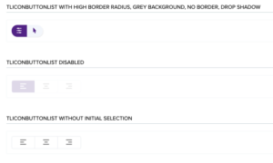
TLIconButtonList
This component is a newly-built component, allowing a user to select exactly one out of many options, where each option is shown with an icon and an optional hover tooltip.
The TLIconButtonList, in true component-based development fashion, is composed of other components as well, including TLIcon (for the icons) and TLHoverTooltip (for the optional tooltip describing what each icon means).
We added some notable props for this component. Props are inputs to components that a developer specifies for a component so that it gets rendered the way the developer wants it to. For example, the icon can be customized with the iconColor, iconSize, selectedIconColor, and hoverIconColor props!
Here are some variations of the TLIconButtonList:

TLSmallButton
This component had some new design variations with the new incoming UI, so we retrofitted an existing component with boolean props that toggled styling and let the developer access different variations.
At its core, the new variation required for this component still retained the same basic features as the existing TLSmallButton: it included text on the button and had a click handler. The main differences were a border onHover, a drop shadow, and Sentence Case letters. Instead of building a new component for the new button, we retrofitted the existing TLSmallButton with props toggling each difference. All other instances of TLSmallButton retained their existing styles, but if a new prop was toggled to true, we could introduce some variations on top of the default styles.
Here is the final product, TLSmallButton and its variations:


The Transition, and Where We’re Headed Next
As developers, we’ve also moved to TypeScript (instead of JavaScript) to create our newest upcoming components, while still being backwards-compatible with the older JavaScript components. By using TypeScript, we are able to clearly describe prop types when constructing components, leading to self-documenting code that allows future developers to clearly understand the purpose and use case of the props. In the development process, we also test each component individually before it even hits the interface. With already hundreds of existing components, the move will be gradual, but we are dedicated to this initiative with new code review standards and clear communication between developers.
Moving to component-based design is no small feat, requiring commitment from all the stakeholders involved in seeing the application through. This work would not be possible without continued collaboration and support from the design and product people involved as well.
We hope you’re just as excited as we are, to try out the new and improved Visual Web Editor featuring a more formalized component-based design system!
