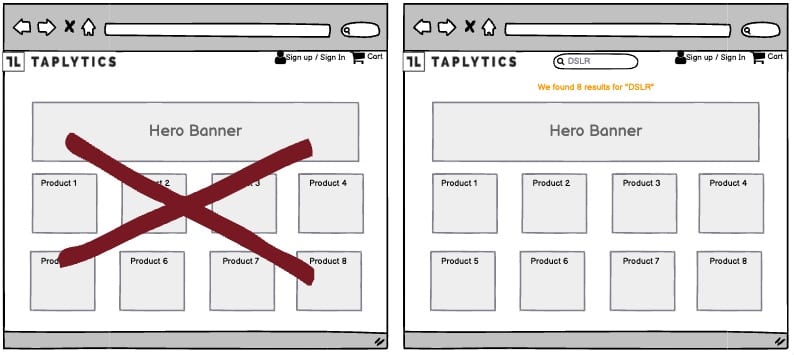
A/B Test Idea: Provide a dedicated search bar for categories of products

Online stores today face a challenge. More products than ever are being sold online, which means more choice for customers. But a new problem is created. Too much choice means confusion, and confusion means customer frustration.
Customers often land on a product category page, such as “cameras”, and realize they want a narrower range. Perhaps they want to find only DSLR cameras or Instax cameras. The problem is that when they enter “camera” into the search bar, they get a site-wide search result, which widens their search instead of narrowing it.
To avoid customer frustration, you need a search bar that helps them narrow their search instead of widening it. This means giving them a search bar that only searches within a specific product category, so that they can refine their search.
Why we think this is a Good A/B Test:
The key to a successful product search is narrowing the results, so that customers can find exactly what they’re looking for. It’s a little extra effort on your part, but it will pay dividends in the long run. This taps into the paradox of choice, whereby having too many options can overwhelm users, and lead to your potential customers to not following through with their purchase.
