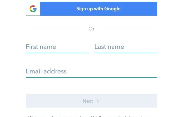
A/B Test Idea: Form placeholder text

Placeholder text in forms are a form design cue that informs the person who’s filling out the form of what they should input by providing an example that’s faded.
Depending on your audience, whether it’s B2C or B2B, you can ask the user to fill out your@personalemail.com or your@workemail.com vs something generic like “email”.
Why we think this is a Good A/B test:
It’s easy to execute (especially so with Taplytics Web & Mobile Visual Editors!) and can help guide your users of what email they should be submitting to you. Using footer text that personal emails or vice versa for work emails will not be considered can help nudge.
