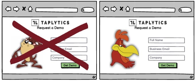
A/B Test Idea: Use human faces that gaze towards your CTAs

Human beings have the inclination of following each other’s gazes. An example of this is when you see someone looking up, you’ll be curious to follow what they’re looking at as well. This is the phenomenon called “Gaze Cueing Effect“.
In order to utilize gaze cueing effectively, you need to know what you want your visitors to pay attention to. There are a number of ways you can do this. The most obvious is to use your gaze to draw attention to your call to action, whether that’s a “Subscribe” button, a “Buy Now” button or even a “Click Here” link.
You can also use your gaze to draw attention to some important piece of information or to nudge your visitors towards other actions you would like them to take.
Look in the Right Direction
Once you know what you want to draw attention to, you need to make sure your gaze is directed at the right element on your page. In order to do that, you need to understand how your website visitors tend to look at your page. The most common pattern is called the F-Pattern (or the F-Shaped Pattern).
This is how it works:
- First, your visitors will look at the upper left corner of the page.
- Then, they will scan the top portion of your page, looking for any keywords that are relevant to them.
- Next, they will look to the upper left again to see if there is anything else of interest in that area.
- Then, they will move their vision down the left side of your page, scanning the next few words on each line.
- Finally, they will return to the top left corner once again and scan from there to the middle of the page, looking for key terms.
So, where should you look when you want to draw your visitors’ attention? As you can see from the explanation above, you should look at the upper left corner, or perhaps slightly to the right of that. The more you look towards the center of the page, the less effective your gaze will be.
Note that if you use a cartoon or an animated character, your gaze will not have the same effect. That’s why it’s always a good idea to use a photo of a real person’s face.
Why we think this is a Good A/B Test:
This is a simple test that leverages social psychology, and requires only images, so it’s easy to set up within a day. Try this experiment out as a variation and see how it affects your conversion rates!
