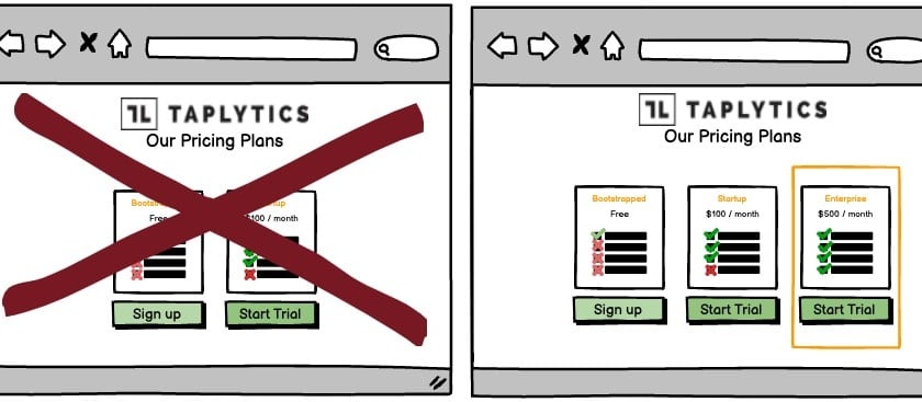
A/B Test Idea: Display a decoy product to change perceived value of other plans

What if we told you that if you displayed a decoy product at a high price will increase sales of your other products? Got your attention? Good.
When faced with two choices, people have a hard time choosing. But if you add a third option, people will tend to purchase the middle option. This is called the decoy effect.
In a study published in the Journal of Consumer Research, researchers offered students three subscriptions to The Economist.
One option was a basic subscription. The second option was a subscription that included a free book. The third option was a subscription that included a free book, but cost $100 more than the regular subscription.
The researchers found that 84% of students purchased the subscription that included a free book, even though it cost $100 more than the basic subscription. The $100 more expensive subscription with the free book seemed like a good deal in comparison to the $100 more expensive decoy.
The decoy effect works because people have a hard time comparing options when they have different features. The $100 more expensive subscription with the free book had the same features as the cheaper subscription with the free book, so it was easy for people to compare them.
Why we think this is a Good A/B Test:
This is a relatively simple experiment. The decoy effect works for any number of options. But the more options you offer, the less effective the decoy effect becomes because it’s harder to compare them all.
You can use the decoy effect to sell anything, from magazine subscriptions to ebooks to software. To use the decoy effect, create three options of your product: one basic option, one premium option, and one option that is priced slightly more than the premium option, but has fewer features.
