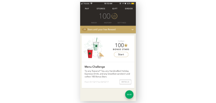
How Starbucks A/B tests their promotions

A key area to test for food apps is where they highlight promotions and how it ties into driving loyalty and retention. In this example, Starbucks makes it clear to their users upon opening the app. From A/B testing the placement of the tab and whether or not it’s front and center for the user, along with any of the accompanying copy and imagery are great candidates for viable A/B tests.
Why we think this is a really good A/B test:
Driving visibility and usage for key parts of the app such as loyalty engrains the habit of using the app continually along with showcasing where users are on their loyalty journey can drive repeat user behavior in the long run.

