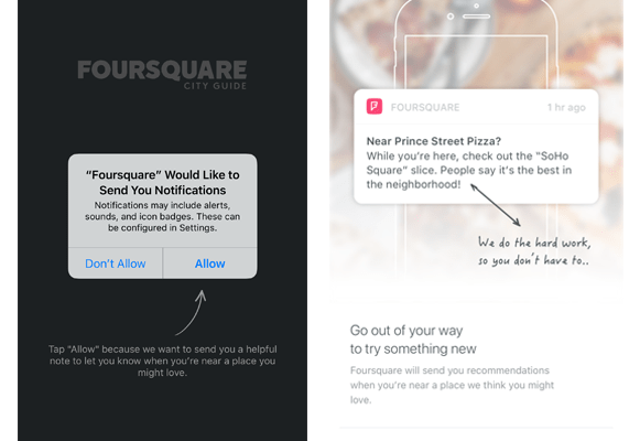
How Foursquare A/B tests’ their permissions screens

While users generally don’t like to hand over their personal information for apps to consume and use freely, as long as you’re making it clear to the user about what the benefits are and how the information is used, they’ll generally give you permission.
With the example of Foursquare, they do a fantastic job in convincing their users to opt into push notifications and location services.
How they do this is with clear CTA and an explanation of why it makes for a better app experience. Testing out different ways to encourage users to allow notifications and location services will help you keep in touch with them.
Why we think this is a good A/B test:
Optimizing the messaging and the why through copy or imagery can help simplify the decision making process for the end user. By iterating on these screens much like Foursquare, you can help deliver personalized experiences and messaging.
