Revenue Insights From Our New Dashboard


Today I’m happy to announce a brand new section of the Taplytics platform, our new dashboard. I’m super excited about this one because it is just the beginning of some amazing new features we have coming down the pipe.
What makes the new dashboard so special? Well for one, it once again over-delivers on our promise to give you insanely useful tools to grow revenue from your app, without having to write any extra code.
At this point, I bet you’re wondering what exactly is on this newfangled dashboard. Well, here comes a little show and tell for ya.
The new dashboard is split into three sections; Acquisition Performance, User Engagement, and User Retention & Cohorts. Each of these sections shows you something different, so I’ll dive into each individually, to let you know what the dashboard is all about.
Acquisition Performance
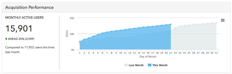
In this section, we show you your monthly active users. The data here shows you how many unique users have opened your app broken down by day. More specifically though, this graph gives you your performance in monthly active users compares to the previous month. We also show totals as well as percentages vs. this time last month. It’s a great way to quickly see how you’re doing in terms of growing your user base.
User Engagement
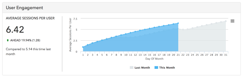
Monthly active users are one thing, but it’s nothing without also understanding how engaged your users are on average. That’s where this section comes in. Here we graph the growth in average sessions per user across the current month as well as the previous month. We also give you the total and percentage difference based on this time last month. Again, it’s a great quick view that you can check back on daily to see if you’re on track to be hitting a key metric.
User Retention & Cohorts
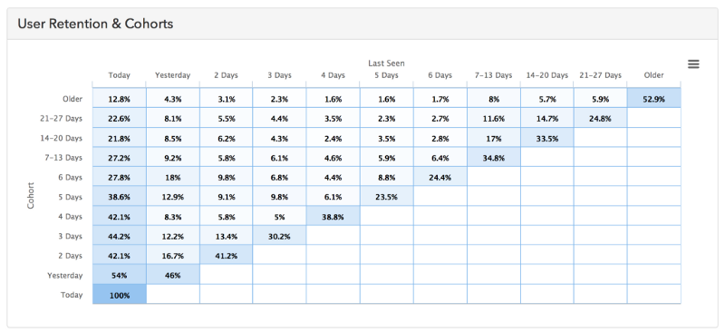
The final graph actually dives deeper into the user engagement picture to tell you how cohorts of your users are behaving. Specifically, this graph is showing you how often your users are coming back to your app based on when they originally installed it. If this is your first time seeing this type of graph it may take you a bit of time to orient yourself, but once you do, this will become an invaluable tool in understanding how changes you’re making over time are affecting user engagement.
After seeing the additions, I hope you’re as excited as I am. I think it’s extremely cool that without any coding beyond installing our SDK you can now not only run powerful experiments, but you can also see very specifically, day-to-day, how those experiments are affecting some of your most important metrics. And if you’re excited about this, I can’t wait to show you what’s coming next! As always, we’re constantly looking for feedback, so if there’s something that you want to be added or changed in this new dashboard please shoot me an email or feel free to make your suggestion in the comments below. We love feature requests and feedback!