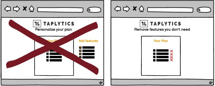
A/B Test Idea: Allow the removal of elements rather than adding to personalize plans

An excessively complex pricing plan is a recipe for disaster. The more options you include, the more people will be confused, the more they will feel like the pricing is unfair, and the more they will feel like they’re getting a raw deal.
There’s also a lot of evidence to suggest that adding more options does not result in more sales.
he Paradox of Choice
There’s a psychological phenomenon known as the Paradox of Choice. The theory is that the more options you offer, the more people feel like they are making the wrong choice.
It’s the feeling you get when you’re presented with a 20-item menu. You suddenly feel overwhelmed by the sheer number of options and unable to decide which one you want.
The Power of Defaults
When you are designing a pricing plan, it’s important to remember that people love to stick with the default option.
If you offer a bunch of features, but only include two of them in the default plan, you’re likely to sell a lot more of the default plan than the custom one.
Why we think this is a Good A/B Test:
A good pricing plan should be simple and default to the option you want most people to choose. When you present things differently that affects how your potential customers perceive the value you’re offering, you’re able to help persuade them to eventually follow through and purchase your offerings.
