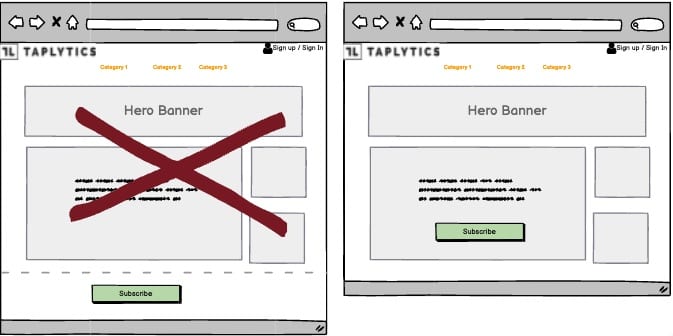
A/B Test Idea: Your CTAs should be above the fold

“Above the fold” refers to anything that is visible on your page or app that doesn’t require the user to scroll to see the rest of your content. Calls-to-Action are the key elements on your app or web page to drive your potential customers to a desired action. As such, your CTA buttons should always be placed above the fold so that it is immediately visible when people arrive on your page. When it’s not immediately visible within the first few seconds, your customers won’t be able to do the the you want them to do.
By placing your CTA above the fold, you’re making it crystal clear for your potential customer or lead of what next actions they need to do to proceed to learn more about your product or buy it.
Why we think this is a Good A/B Test:
If your users can’t see or access your CTAs without much effort, it’s as if you don’t have any CTAs at all. By placing your CTAs prominently above the fold, you’re giving your users a good user experience, and a way to help drive more business and leads! It might be a good opportunity to include multiple CTAs that are prominent as well.
