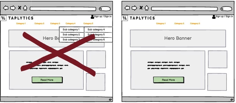
A/B Test Idea: Remove dropdown menus from your homepage navigation bar

When designing a website, it’s easy to fall back on the tried and tested ways of doing things. But just because it’s the usual way of doing things, doesn’t mean it’s the best way.
Take the drop-down menu for example. Whilst it’s a familiar sight on a website, it’s not always the best way to present your product categories to your site visitors.
Why drop-down menus can be bad
Drop-down menus often offer a poor user experience, with very little information and no images. This can make it tough for your customers to decide whether to click on a category or not. If you have a lot of categories, you could have a long list of items in the menu, which makes it hard to see what’s available.
The drop-down menu will also disappear if someone moves their mouse off of it. This can be frustrating for your users as they may not have been able to reach the category they wanted.
How to improve the user experience
You can improve the user experience by removing the categories from the menu bar, and instead highlighting your categories on the page itself.
The list of categories should contain at least a title and an image, and ideally a quick description. This will help your visitors to have a visual overview of the type of products that are available on your site.
Why we think this is a Good A/B Test:
A better user experience will help your visitors to understand what you offer and have more confidence in making a decision to click. You’ll also see more consistent traffic to your website and your customers will be more engaged. This will result in a higher conversion rate, and ultimately more sales.
