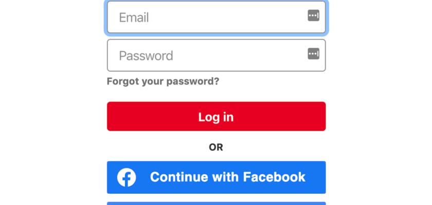
A/B Test Idea: 7 experiment ideas for your login page

In order to make sure that the content of your login page is the best possible, it is essential to test it. It’s a good idea to have a hypothesis to start with and then conduct a series of small experiments to test the validity of your assumption.
Here are a few ideas for experiments that you can run on your login page:
1. Make it easy to sign in with email.
Many users are reluctant to sign up with their Facebook or Google account because they don’t want their email to be spammed, and they are concerned about their privacy. Make it easy for your users to sign up with just their email and password.
2. Add a recaptcha.
A recaptcha helps ensure that there are no bots trying to sign up on your site. It’s a good idea to have one on your login page to make sure that only real users are signing up.
3. Add a signup button.
When users come to your site and they want to sign up, make it easy for them by adding a signup button to your login page in case they navigated there by accident.
4. Add a forgot password link.
If a user has forgotten their password or wants to change it, make it easy for them to do so by adding a forgot password link on your login page.
5. Add a signup form alongside the sign in form.
If you want your users to be able to sign up with just their email and password, make it easy for them to do so by adding a signup form to your login page.
6. Add a welcome message.
If you want to welcome your users when they come to your site, make it easy for them to do so by adding a welcome message to your login page.
7. Add calls to action for a webinar or some other piece of content
There’s quite a bit of valuable screen real estate that would otherwise not be used. Why not call attention to new events such as a webinar or conference that you’re hosting or a premium piece of content that you just produced? Maybe your customers would appreciate it as well.
Give some of these ideas a try and let us know what you think!
