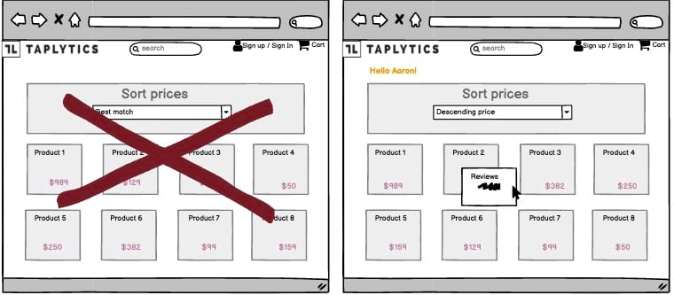
A/B Test Idea: Display more information when hovering over a product

As UX practitioners and growth marketers, we are constantly monitoring user behavior to identify opportunities for improvement. Often, users are quick to jump to the product details page when they find a product they like. But, as we all know, there’s much more to an eCommerce site than the product details page.
It’s worth getting users to explore a little more of your site before sending them to the product details page.
How do you do that? By showing them product information in a condensed manner, you can encourage users to hover over products to find out more.
This is where a pop-up product card comes in. When customers hover over a product, display a pop-up product card that offers them condensed information. This can include a product image, price, title, and a brief product description.
Why we think this is a Good A/B Test:
By showing only carefully selected information about the product in this way, customers won’t get overwhelmed by information and will be more likely to find the product of interest, leading them to then click on to the main product page and ultimately be more likely to make a purchase.
