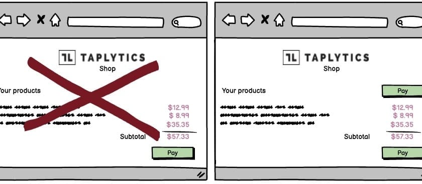
A/B Test Idea: Add multiple primary calls-to-action in your pages

The idea of a ‘Call To Action’ (CTA) is one that is often thrown around when talking about website design and yet it is often poorly executed.
A CTA is an instruction or message that encourages your visitor to take a specific action, and it is critical that when you are trying to get your visitors to take a specific action that you make it as easy as possible for them.
It is often better to display your CTA as a button rather than a simple link as it will both attract your user’s attention and make it clear that it is a CTA ready to be clicked on.
What’s more, it’s a good idea to not just display your primary CTA once on a page but twice or even more times. Of course, having it displayed more than once will increase the likelihood of people noticing it and there not being any issue of the CTA simply being “missed”.
By offering the CTA to people at different moments (at the top of the page and right at the bottom after they’ve scrolled down perhaps) you increase the chance that it is available at the time a visitor feels most inclined to act; perhaps they weren’t ready to go through to the next step when they first arrived on the page but will be after reading its contents.
Why we think this is a Good A/B Test:
By placing a duplicate CTA at the bottom of the screen you are making it easy for them to click rather than needing to scroll back up, look for the button again, etc. Studies have also shown that people react more positively towards stimuli that they have already been exposed to as it becomes somewhat familiar and we are more likely to engage with the familiar. So showing the CTA button twice or more will allow for this bias to occur and increase your chances that they end up clicking.
A CTA is not just about making a sale either. If you are looking for people to sign up to your newsletter, download a free PDF or even just get in touch with you then you need to make them aware that they can.
In a nutshell, if you are trying to get your visitors to do something in particular, you need to tell them to do it and make it as easy as possible for them to do it.
