Examine How A/B Testing Improve ASOS Consumer Web and Mobile Experience
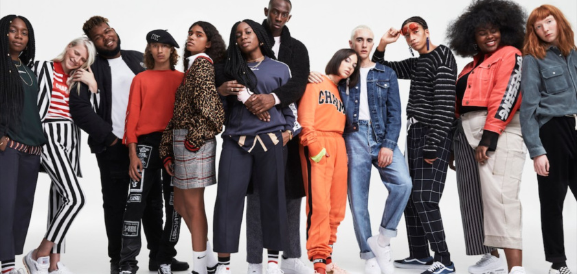

ASOS is one of the global e-commerce leaders specializing in fashion and beauty products. With over 850 brands sold on their site along with their own line of items, they target young adults in their 20’s and sell an extensive range of trendy items. In April 2020 alone, they had 53.7M visitors on their website and mobile app. Founded in 2000, they’re based in the United Kingdom and ship worldwide.
We’ll be looking into both their web and mobile app experiences to see where they differ, how they can improve their user experience, along with providing experiment recommendations.
Table of Contents
Website
- Home Landing Page
- Inspirational Pages
- Product Organization
- Product Page
- Shopping Cart
- Checkout Experience
App Teardown
- Onboarding
- Account Creation
- Search Options
- Recommended Items
- Shopping Cart
- Inspiration Boards
- Home Page
- ASOS Exclusive Community
Takeaways
Website
Home Landing Page
Upon entering the website as a first-time visitor, users are given a coupon for 15% off site-wide. This offer is shown at the top of the page in small text. In order to make this more visible ASOS could experiment with having a pop-up that highlights the deal along with a prompt to create an account so the promotion is added to their account for use at a later date. This would allow ASOS to collect new users’ information early on and re-market to users through email if they leave the site or have something in their cart before leaving the site. This way ASOS could use the new users’ email to reach out to them, reminding them to make a purchase or offer them a deal on one of the items in their cart so they make that first purchase.
They could also experiment with the color of the banner and the messaging. In order to make quick copy changes, they could use Taplytics Genius AI to automatically generate AI copy suggestions for their experiment.

On the home page, they have 1 photo as their hero image. They could experiment with replacing the hero image with a video or a carousel of images. This way users could be shown more outfit inspiration.
ASOS is a UK-based company, so the location for a new user is automatically set to the UK, however, they ask if you want to update it upon spending a bit of time on their site. One thing to note is that the ASOS site has a slight flicker effect. They should work on improving the speed on their site as a website with a flicker effect can deter new users and negatively impact SEO.
Inspirational Pages
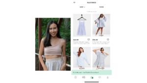
ASOS divides its clothing categories by gender. Once a user clicks into a gender they’re automatically taken to the sale section to be shown the best deals. This is a great strategy since it shows users their highest value items as their first interaction with the brand. Users are also shown style inspiration.
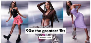
For the women’s section, users are shown a hero image of 90’s trends. ASOS could experiment with what trend is shown to new users through an A/B test. An example of this would be testing if 90’s fashion trends or summer trends perform better as a hero image. They could also test the images shown or experiment with the way images are shown such as replacing the static image with a carousel.
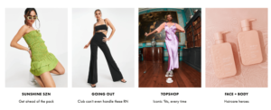
Under the hero image, they show different styles and categories from Sunshine SZN, Going Out, TopShop, and Face + Body. Under each image and category, they have a small amount of copy that uses language targeted at their younger audience. Another opportunity for experimentation could be to test the copy using Taplytics Genius AI to automatically created AI-generated copy recommendations or experimenting with the images shown.
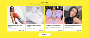
The targeted messaging to their younger audience continues in their style feed which highlights fashion trends, monthly drops, along with celebrity and beauty inspiration. ASOS clearly knows their audience as their language emulates that of a Gen-Z and they play on Leo season since astrology is extremely popular with Gen-Z’s along. They also use popular Gen-Z slang like “main character energy”.
At the very bottom of their page, they have a social media bar with links to their social platforms, however, they didn’t include Tik Tok. They should add Tik Tok since their content is targeted at a younger generation who probably use the social media platform more than Facebook which they did include.
Product Organization
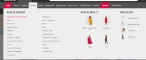
Once a user hovers over one of the product selections they’re shown several filter options including “shop by body fit” and “shop by edit” which highlights modest fashion, responsible edit, wedding, and workwear which filters down some common themes a shopper may be looking for. They should try testing the names in this section as “responsible edit” doesn’t tell the user much about the kind of clothing this is. The dropdowns are incredibly user-friendly as it allows shoppers to quickly narrow down only the clothes they would be able to wear in the categories such as modest fashion or based on their body type.
Once a user clicks into a more specific category such as “dresses” there’s a large amount of copy that ASOS should experiment with as it’s unlikely a user will read all the copy. They also have an extensive list of filters which could be overwhelming to a new user.
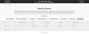
A way to help users easily find clothing options tailored to their style would be for ASOS to offer a style quiz when users come onto their site or app. ASOS has thousands of options. The section for dresses alone had 11,661 options so it’s unlikely a user will see all the styles available meaning they may miss out on seeing options they would be interested in.
This style quiz could show multiple images of types of clothing and users get to select the photos that resonate most with their style. They could also ask questions about what colors they like to wear to make the results of the quiz even more personalized along with asking users about their size so they’re only shown items that are in stock for their style and match the results of the style quiz. This would ensure that users see items they would be more likely to purchase, leading to an overall better user experience.
Product Page
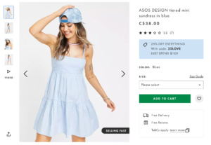
Once a user clicks into a product they are shown images and information on the product along with a video of the model walking with the clothing on. This is a differentiator as several of ASOS’s competitors don’t offer videos. There’s also the option to share the item on Facebook and Pinterest. They should include more options on the web such as copying the link, texting it to a friend, or sharing on Instagram since their target market doesn’t use Facebook or Pinterest as their main form of communication. In addition, being able to share it with friends could encourage a user to buy it if their friend loves it or it could introduce the brand to someone else.
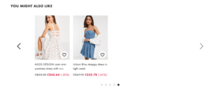
At the bottom of an items page they have a “you may also like” section, however, it ends after only 18 looks. Since ASOS has such an extensive selection of items, 11,661 dresses to be exact, they should experiment with adding more items in this section rather than only showing 18 other dresses.
Shopping Cart
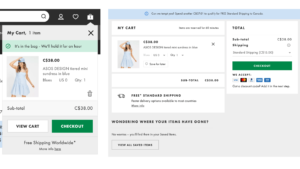
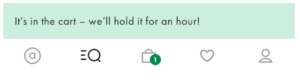
Once a user adds an item to their cart there’s a pop-up highlighting that it’s been added along with a messaging saying the item will be held in your cart for an hour. They could experiment with how long they hold it for or have a prompt that says “create an account to hold this item longer”. Having this messaging provides value for the user and gives them an incentive to take action by creating an account with ASOS.
Checkout Experience
Once an item has been added to a cart there’s a prompt at the top of the screen to spend more money to get free shipping. ASOS could experiment with the messaging, the color of the bar, or adding a CTA button that says “keep shopping” to bring the user back to the home page.
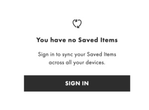
It’s important to note that on the ASOS site their “saved items” are separate from the cart which could be confusing to new users. They could include a pop-up or further detailed messaging explaining the difference between saved items and the shopping cart. Once the hour is up, the item in the shopping cart is moved to “saved items” so ASOS should experiment with how they communicate that to users or if moving the item out of the shopping cart to saved items helps or hurts conversions. Finally, when it’s time to make a purchase, a user is forced to create an account. ASOS could experiment with users creating a guest log-in.
Onboarding
Upon downloading the ASOS app, users are prompted to opt in to push notifications. ASOS does a good job at explaining the value of opting in to push notifications, however, they could experiment with the messaging or try adding emojis and images to make the message more casual like the rest of their copy to see if it increases the opt-in rate.

Users are not prompted to create an account upon downloading the app. This would be a great area for experimentation as a user has to create an account to make a purchase with ASOS, so experimenting with the time a user is prompted to create their account would be beneficial.
Account Creation
Once a user wants to create their account, which they do on their own accord, they’re taken to the ASOS website through a pop-up rather than having the experience directly in the app. While the user doesn’t have to leave the app, it’s a bit of a strange experience to have the login or account creation step in a pop-up.

The onboarding process had social sign-in options which made the account creation process smooth and there were options for what kind of notifications the user would like to receive.
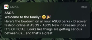
After completing the onboarding process users are taken to their account tab on the ASOS app and are sent an email regarding their successful account creation. ASOS could experiment with the copy of the first email which could be done with Taplytics Journey Builder to A/B test two or more variations of welcome emails.
Search Options
The app did not have the same new user discount code that the website did, however, it had several user-friendly features which help shoppers find exactly the style they’re looking for. The most notable part of the app is that users can search styles not only by typing in a description of what they’re looking for but also by using their camera or existing photos in their library.
A user can snap a photo of an outfit or upload a photo and receive instant recommendations that are similar to the photo they took. This works extremely well and matches the style, article of clothing, and color of the inspiration photo.
Another benefit of using the app compared to the website is that the more you browse, the more the app shows users’ styles based on their shopping habits. An alternative to this could be for users to take a short style quiz. ASOS could A/B test the success of users who are given recommendations based on their browsing history vs. those who take a style quiz. If they decide to create a style quiz, they could also experiment with the timing of when a user sees the quiz.

Recommended Items
An area of improvement for ASOS is its recommendations. After completing a search for “blue dress” and selecting an item, the recommendations section at the bottom showed dresses that were not blue nor matched the style of the dress selected. Since ASOS has such an extensive selection of items, honing in on presenting style recommendations that are truly tailored to the user or their search criteria is essential to their success and improving their user experience.
Shopping Cart
Similar to the website’s experience, once a user adds an item to their cart it’s only held for an hour. They should experiment with how long they hold it in your cart or if having a time limit is effective. Alternatively, if a user keeps an item in their cart for over an hour they should receive a push notification reminding them it’s in their cart and if they don’t take action it will be moved to their likes so they don’t lose the item.
Despite opting in to push notifications, users are only sent an email upon signing up for an account. Even after adding an item to their cart and not taking action after an hour, they are not sent any notifications. An experiment for ASOS would be to send push notifications to users when the hour is up informing users that the item has been moved to their saved items, or sending a notification when time is almost up to encourage them to make a purchase.
Despite opting in to push notifications, users are only sent an email upon signing up for an account. Even after adding an item to their cart and not taking action after an hour, they are not sent any notifications. An experiment for ASOS would be to send push notifications to users when the hour is up informing users that the item has been moved to their saved items, or sending a notification when time is almost up to encourage them to make a purchase.
Inspiration Boards
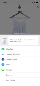
In the ASOS app, users can also create boards similar to how a Pinterest board is created and share the board with friends. Boards can be shared through a link or any social media platform, unlike their website which only allows sharing on Facebook and Pinterest. ASOS could experiment with the order of the sharing options on their app. Currently, they have Whatsapp first followed by Facebook messenger, Facebook stories, Twitter, and iMessage with “copy link” and “more options” as the final sharing option. They could experiment with the order of these sharing options since options such as Facebook stories are an uncommon sharing method.
Home Page
On the homepage of the app, they start with style inspiration at the top which replicated what’s seen on the website. They have the same 90’s style inspiration, followed by styles based on your shopping habits and “similar vibes to your saved items”. They should experiment with changing the order of these items to have the personalized sections based on your shopping habits and saved items on the top since it would show users items they’ve already proven they’re interested in which could lead to a greater chance to make a purchase. This could easily be done with the Taplytics Mobile Visual Editor which allows users to run A/B tests by simply changing the order of sections on an app without the need to code.
A new feature idea for the app would be to have a style quiz. This quiz could ask users what colors they wear most frequently, along with what clothing items they wear, and images with different styles. Based on the images they could select those that match their personal style the most. From there, ASOS could automatically filter looks that match the users’ preferences to show up at the top of the page when browsing items so a user spends less time filtering looks and scrolling through the thousands of pieces they offer.
This quiz could also add a section where users can fill out their measurements so they’re only shown items that are available in their size. A frustration for several shoppers can be seeing an item they love but isn’t available in their size, so this feature could prevent that from happening. It would also make a user’s experience more seamless since the app could automatically give size recommendations based on what they think would fit the user best based on the measurements they input rather than the user having to refer to a size chart each time they want to purchase an item.
ASOS Exclusive Community
The homepage of the app also has a CTA to join the ASOS “exclusive community”, however it does not state what the benefits of joining are. Upon clicking on the CTA, users are asked to type out their favorite style trend and information such as their age and gender. Even after completing the quiz, there’s no mention of the benefit of completing the questionnaire which ASOS should change so users feel compelled to start the quiz or feel like they earned something after completing it.
Takeaways
Overall, the ASOS website and app have a great user experience but there are several opportunities for improvement and personalization which could be achieved through A/B testing and experimentation. They could also optimize the website and app sections that are already performing well to drive more conversions and increase customer LTV. By adding personalized elements such as a style quiz, they could gain a better understanding of the styles their users are looking for while using the information to tailor the user experience. Finally, they should reduce the flicker effect on their website by using a tool like Taplytics to get rid of their high latency.
With Taplytics ASOS could experiment with their push notifications, no-code A/B testing on both web and mobile to increase engagement and drive conversions.
Learn more about why teams pick Taplytics over Optimizely and how our pricing compares.