Create an onboarding encounter that will increase your desired metrics

Take a look at your metrics, and you’ll find that one obvious number that directly correlates with monthly recurring revenue (MRR) is active users. The key time to create active users is during user onboarding; if a user is activated in this time, then they are much more likely to improve MRR.
For instance, Airbrake, an error tracking and discovery tool, found that activated users were 300% more likely to pay them in future.
Your users will only stick around if they are able to find value in your product during their first experience. This is why it’s imperative to focus on improving your user onboarding and continuously A/B test and find ways to get your users to that value quickly.
“Nobody cares about the thing you’ve designed, unless you can get them past the beginning.” – Julie Zhuo, Product Design VP @ Facebook.
Where does user onboarding begin and end?
First, let’s recap a few thing about user onboarding. We define user onboarding as:
The system of actively guiding users to find new value in your product.
- It’s a system: which includes process, channels, cadence, responsibility etc. It’s not simply a tour or an email sequence, but should be holistic.
- It involves guiding: it should proactively help users discover value, not just rely on “intuitive design” without engaging new users
- It’s about finding new value: this can happen in multiple places within the user lifecycle, but the most important is the first time they engage with your product
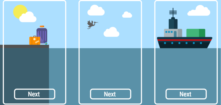
Your company’s user onboarding starts the moment a visitor begins the signs up process. From the number of form fields, to the screens they are presented, and the messages shared, it’s all part of the user onboarding experience. And, just like anything else in your company, these variables can all be changed and tested to optimize activation from the start of a user’s experience.
The first onboarding experience continues until they’ve discovered your product’s main Aha Moment, the time when a user understands and internalizes the real value in your product for them. But onboarding does not stop there; it’s important to continue to onboard users throughout their lifecycle – as they are exposed to changes in design, features or products.
For now, we’ll focus on the first user onboarding experience and review why it’s important to test, what tests you can run, and which tools to use.
Why user onboarding testing matters
Too often, companies and teams build and then forget about their user onboarding experience. Important designers, such as Julie Zhuo (VP, Product Design at Facebook) and Scott Belsky (founder of Behance and Chief Product Officer at Adobe) have emphasized how important it is to continue to focus on the beginning or first mile of product.
Not continuously iterating your user onboarding is dangerous; it misses changing user expectations as your product, market, and people evolve and can result in more churned users.
Note: If you’re building your user onboarding for the first time then review this user onboarding checklist, otherwise let’s focus on how to A/B test your user onboarding to drive improved activation and retention.
3 User Onboarding A/B Tests To Improve Activation
It can be hard to know what to test and where to begin, so below are three tests you can run that are low cost and easy to implement but can have a high impact on your user activation:
1. Your sign-up flow is low-hanging fruit
It’s understandable that you want to know everything about your visitors. You want to use their data to optimize their product usage, and make them successful users.
Asking for more form fields upfront usually means lower form completions. But we still see many companies ask for 5+ form fields when a user first sign ups for their product.
On sign up forms, smart companies only ask for data that is essential to providing a great first user experience and collect more data over time by asking for information at different points during a user’s journey.
Decreasing the number of fields is not the only way to increase your sign up conversion rate. Some companies leverage their first screens as an opportunity to hook a user instead of asking for contact information.
Calm, a meditation and mindfulness mobile app, starts by asking its user what their ‘Top Goals’ are. By listing different options, Calm makes very clear the various benefits a user can gain, before she has to sign up for the product.

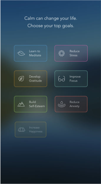
“People’s attention spans are really short, so you have a very short amount of time to show them what you’re about in the first instance.” – Alex Tew, Co-Founder & CEO of Calm
A sign-up flow is part of a users first impression, and it shouldn’t just contain a long contact form. Instead, it’s important to make it both engaging and beneficial to the user. Remember its all about the user and making their experience as positive as possible.
2. Onboarding copy is just as important as your product UX
Text is a critical component of your user experience and one of your strongest levers in creating a compelling value proposition. Language and the words you choose to use in your application’s messaging aren’t just simple directions; they impact your visitors on emotional, psychological, and action-related levels.
For a quick example, consider how you feel when you read the following statements:
- Create your account
- Try it free now
The first may not motivate you as much as the second, because the latter speaks more directly to your basic needs (save money / save time / make money). This might be obvious, but the catch is that the reverse might actually drive more activation.
It’s often easy to just assume that catchy copy will work when it comes to website content, but testing copy has proven over and over how important language is for signups and sales.
In this example, Monsido tested sign-up button copy and the results were counter-intuitive:
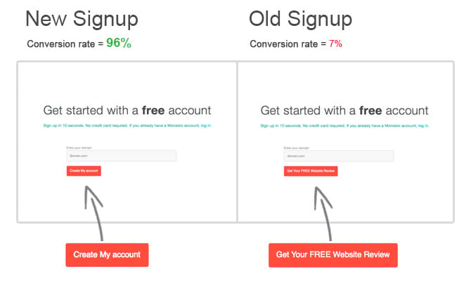
The original “Get Your FREE Website Review” was initially considered the most motivating CTA. But after trying “Create My Account” as a new CTA, signups increased from 7% to 96%.
This happened because there was another step in the sign-up process after this page that was adversely impacted by the expectations created when using the original copy. Users didn’t expect a second page and more form fields and so abandoned the flow. However when they clicked on “Create My account” they were knowingly committing and were more prepared to invest and complete the sign-up flow.
The point here is that you have to constantly test, because at first, you may miss the deeper psychological deductions that are occurring within a user’s mind. Even if you believe you have optimized and achieved “industry benchmarks”, because in your specific case there may still be a big opportunity for major increases in your KPIs.
3. Different “Aha!” Moments for Different User Groups
As a product grows over time, it usually gains more personas who love and depend on the application. Various personas and use cases are the main reason to constantly test segmented user onboarding and the Aha Moment.
Since users who do not find value quickly often leave and never return it is important to test and optimize the Aha Moment not just for one user or use case, but for every persona who is likely to use your product.
For example, Airbnb and many other products, offer different user onboarding flows for hosts and guests. It would seem obvious that these two groups of users would need different onboarding, but think about other groups that might need custom user onboarding, for instance, guests and hosts from other countries.
It makes sense to divide segments of users based on different demographics such as industry, job title, location, destination, age, and more. Ask yourself: what groups of users can we provide a better experience in the user onboarding process?
What tools to use for A/B testing?
These examples might be the most impactful for your situation, but you should first brainstorm a list of experiments and then evaluate the cost and potential impact before deciding your priority order. Look at where users are dropping-off or are clearly confused or struggling (identified by rage clicks or from user tests).
When you are ready to run your A/B tests you can leverage SaaS tools to help you easily experiment without engineering resources. Here are some that you might find useful:
- For designing and prototyping – Invision allows you to quickly share and get feedback on various design options.
- For email marketing – Intercom allows you to A/B test copy for any emails, and also for in-product messages.
- For in-product tours – Chameleon allows you to create and test targeted and personalized user onboarding flows within your product
- For your website and mobile app – Taplytics provides you the ability to run highly targeted tests for your website and has powerful mobile A/B testing functionality.
- For analyzing results – Heap or Amplitude offers good analytics capabilities and you can import your product usage data and then assess how your email/product/tour/website variant impacted overall product usage.
If you could take away anything from this article, it’s to always be testing your user onboarding.
There are a million tests that we could all run, but the key is to prioritize those that will have the greatest ROI for your business. Be sure to put in the time to research where in the customer journey there may be large points of friction and identify possible solutions or experiments you can run to test whether it can have a larger impact on your end goal.
Have any A/B tests you’ve recently launched with surprising results? Share them in the comments below!
PS: If you haven’t already, check out our Ultimate Guide to Mobile A/B Testing for tips, ideas, and tricks.
——
Editor’s Note: This article was written by Pulkit Agrawal, CEO & CO-Founder at Chameleon. Chameleon helps you take users from a platform to build and manage interactive product guidance without engineering.